# Introduction

Welcome to the Zingy Documentation Portal

Use the navigation sidebar on the left (or the **☰** menu for mobile devices) to directly access any section. Additionally, you can use our AI-driven search feature located at the top right corner.

Below are some quick links to important sections of the documentation:

### Dashboard

<table data-view="cards"><thead><tr><th></th><th data-hidden data-card-target data-type="content-ref"></th></tr></thead><tbody><tr><td><mark style="color:blue;">Manage your Apps</mark></td><td><a href="/dashboard/apps">Apps</a></td></tr><tr><td><mark style="color:blue;">Billing - Payment Methods</mark></td><td><a href="/dashboard/billing-payment-methods">Billing - Payment Methods</a></td></tr></tbody></table>

### App Editor

<table data-view="cards"><thead><tr><th></th><th data-hidden data-card-target data-type="content-ref"></th></tr></thead><tbody><tr><td><mark style="color:blue;">App Editor Tour</mark></td><td><a href="/app-editor/app-editor-tour">App Editor Tour</a></td></tr><tr><td><mark style="color:blue;">App Settings</mark></td><td><a href="/app-editor/app-settings">App Settings</a></td></tr><tr><td><mark style="color:blue;">Manage Pages and Forms</mark></td><td><a href="/app-editor/pages-and-forms">Pages and Forms</a></td></tr><tr><td><mark style="color:blue;">Role based authentication</mark></td><td><a href="/app-editor/app-users">App Users</a></td></tr></tbody></table>

### Page Editor

<table data-view="cards"><thead><tr><th></th><th data-hidden data-card-target data-type="content-ref"></th></tr></thead><tbody><tr><td><mark style="color:blue;">Page Editor tour</mark></td><td><a href="/app-editor/page-editor/page-editor-tour">Page Editor Tour</a></td></tr><tr><td><mark style="color:blue;">Adding content to pages</mark></td><td><a href="/app-editor/page-editor/adding-page-content">Adding Page Content</a></td></tr><tr><td><mark style="color:blue;">Working with Page Elements</mark></td><td><a href="/app-editor/page-editor/working-with-page-elements">Working with Page Elements</a></td></tr><tr><td><mark style="color:blue;">Use AI to design Pages</mark></td><td><a href="/app-editor/page-editor/using-ai-wiz-in-the-page-editor">Using AI Wiz in the Page Editor</a></td></tr><tr><td><mark style="color:blue;">Page Element Library</mark></td><td><a href="/app-editor/page-editor/built-in-elements">Built-in elements</a></td></tr><tr><td><mark style="color:blue;">Page Settings</mark></td><td><a href="/app-editor/page-settings">Page Settings</a></td></tr></tbody></table>

### Forms

<table data-view="cards"><thead><tr><th></th><th data-hidden data-card-target data-type="content-ref"></th></tr></thead><tbody><tr><td><a href="https://www.youtube.com/watch?si=uvE6f7ZAmged4urW&#x26;v=dmiyhGt75Oc&#x26;feature=youtu.be"><mark style="color:blue;">Forms demonstration video</mark></a></td><td><a href="https://www.youtube.com/watch?si=uvE6f7ZAmged4urW&#x26;v=dmiyhGt75Oc&#x26;feature=youtu.be">https://www.youtube.com/watch?si=uvE6f7ZAmged4urW&#x26;v=dmiyhGt75Oc&#x26;feature=youtu.be</a></td></tr><tr><td><a href="/app-editor/page-editor/working-with-forms"><mark style="color:blue;">Working with Forms</mark></a></td><td><a href="/app-editor/page-editor/working-with-forms">Working with Forms</a></td></tr><tr><td><a href="/app-editor/page-editor/using-forms"><mark style="color:blue;">Using Forms</mark></a></td><td><a href="/app-editor/page-editor/using-forms">Using Forms</a></td></tr></tbody></table>

### Dynamic Content

<table data-view="cards"><thead><tr><th></th><th data-hidden data-card-target data-type="content-ref"></th></tr></thead><tbody><tr><td><mark style="color:blue;">Dynamic Content overview video</mark></td><td><a href="https://youtu.be/T0b1ca6EhKI">https://youtu.be/T0b1ca6EhKI</a></td></tr><tr><td><mark style="color:blue;">Dynamic Content demonstration video</mark></td><td><a href="https://youtu.be/FjjvWWwys0U">https://youtu.be/FjjvWWwys0U</a></td></tr><tr><td><mark style="color:blue;">Add custom logic to pages</mark></td><td><a href="/app-editor/page-flow">Page Flow</a></td></tr><tr><td><mark style="color:blue;">Pre-designed logic blocks</mark></td><td><a href="/app-editor/page-flow/toolbox-blocks">Toolbox Blocks</a></td></tr><tr><td><mark style="color:blue;">Add content dynamically to pages and forms</mark></td><td><a href="/app-editor/dynamic-content">Dynamic Content</a></td></tr><tr><td><a href="/app-editor/page-flow/coding-in-page-flow"><mark style="color:blue;">Custom Code</mark></a></td><td><a href="/app-editor/page-flow/coding-in-page-flow">Coding in Page Flow</a></td></tr></tbody></table>

### Database

<table data-view="cards"><thead><tr><th></th><th data-hidden data-card-target data-type="content-ref"></th></tr></thead><tbody><tr><td><mark style="color:blue;">Database overview video</mark></td><td><a href="https://youtu.be/3h_bRxORBlY">https://youtu.be/3h_bRxORBlY</a></td></tr><tr><td><mark style="color:blue;">Database features</mark></td><td><a href="/app-editor/data">Data</a></td></tr></tbody></table>

### API and Third-party Integrations

<table data-view="cards"><thead><tr><th></th><th data-hidden data-card-target data-type="content-ref"></th></tr></thead><tbody><tr><td><mark style="color:blue;">Connections</mark></td><td><a href="/app-editor/connections">Connections</a></td></tr><tr><td><mark style="color:blue;">Available Integrations</mark></td><td><a href="/app-editor/connections/services">Services</a></td></tr><tr><td><a href="/app-editor/cloud-flow/sdk-library-integration"><mark style="color:blue;">SDKs and Libraries</mark></a></td><td><a href="/app-editor/cloud-flow/sdk-library-integration">SDK/Library Integration</a></td></tr></tbody></table>

### Custom logic in the cloud

<table data-view="cards"><thead><tr><th></th><th data-hidden data-card-target data-type="content-ref"></th></tr></thead><tbody><tr><td><mark style="color:blue;">Cloud Flow</mark></td><td><a href="/app-editor/cloud-flow">Cloud Flow</a></td></tr><tr><td><mark style="color:blue;">Cloud Flow Editor</mark></td><td><a href="/app-editor/cloud-flow/cloud-flow-editor">Cloud Flow Editor</a></td></tr><tr><td><mark style="color:blue;">Pre-designed logic blocks</mark></td><td><a href="/app-editor/cloud-flow/toolbox-blocks">Toolbox Blocks</a></td></tr><tr><td><a href="/app-editor/cloud-flow/coding-in-cloud-flow"><mark style="color:blue;">Custom Code</mark></a></td><td><a href="/app-editor/cloud-flow/coding-in-cloud-flow">Coding in Cloud Flow</a></td></tr></tbody></table>


# Overview

When you sign-in to your Zingy account, you are automatically led to the Zingy Dashboard.

The Zingy Dashboard allows you to:

* Manage your Apps

  Use the [**Apps**](/dashboard/apps) tab to create, edit and delete your Apps.
* View and Edit your account profile

  Use the [**Account Profile**](/dashboard/account-profile) option in the Settings menu to view and edit your profile.
* Manage members *(Feature coming soon).*

  Add/remove members to your account.
* View Invoices

  Invoices are available in the [**Invoices section**](/dashboard/billing-view-invoices) when you use the Billing option from the Settings menu.
* Manage [**Payment Methods**](/dashboard/billing-payment-methods)

  View the payment method being used to charge your Zingy account. You can also Add or remove payment methods.
* View [**Subscription Information**](/dashboard/billing-subscription)


# Apps

The Apps tab lists all the apps in your account.

<figure><img src="https://3401585094-files.gitbook.io/~/files/v0/b/gitbook-x-prod.appspot.com/o/spaces%2FmnBepgycwgisXr9ya1N4%2Fuploads%2F4CHCn0geJpHdTVkaUtJK%2Fimage.png?alt=media&amp;token=7e42d096-3156-4052-bdd8-5f0232b9d10b" alt="Zingy Dashboard Apps tab"><figcaption><p>Zingy Dashboard Apps tab</p></figcaption></figure>

***

## Create your App

Use the :heavy\_plus\_sign:**`New App`** icon to create a new Zingy app.&#x20;

### App License

When creating a new Zingy app, you can either add a new app license or use an existing credit/license.

{% tabs %}
{% tab title="Adding a New License" %}

<div align="center"><figure><img src="https://3401585094-files.gitbook.io/~/files/v0/b/gitbook-x-prod.appspot.com/o/spaces%2FmnBepgycwgisXr9ya1N4%2Fuploads%2FCjVwvcADL5b59rHGlhbd%2Fimage.png?alt=media&amp;token=1223c611-8899-4d4a-a415-bfa169f45d07" alt="Create Zingy app using a new license"><figcaption><p>Create Zingy app using a new license</p></figcaption></figure></div>

To create a new Zingy app, choose your App's edition license. The monthly pricing for each of the editions will be displayed. For details about the features included in each app edition please visit <https://www.zingy.app/pricing> .

You will be charged **a one-time pro-rated fee** depending upon the number of days remaining in your billing cycle at the time of App creation.&#x20;

Starting with your next bill, this new App will be charged the ***regular*** monthly pricing.
{% endtab %}

{% tab title="Using an Existing Credit/License" %}

<div align="center"><figure><img src="https://3401585094-files.gitbook.io/~/files/v0/b/gitbook-x-prod.appspot.com/o/spaces%2FmnBepgycwgisXr9ya1N4%2Fuploads%2FudqRQJLN7YF3ZQSp63tV%2Fimage.png?alt=media&amp;token=59126b28-c4c3-4b67-a828-98163a4f85f6" alt="Create App using Credits"><figcaption><p>Create Zingy app using Credits</p></figcaption></figure></div>

If your account has any un-expired credits/licenses they will be shown in the CREDITS/AVAILABLE LICENSES section as shown above.

Credits are typically available when you delete an existing app. In such situations the credit remains in your account until your next bill, at which point the license is removed from your account.

When you use up an existing license, **you will&#x20;*****not*****&#x20;be charged** for the new app and your existing billing amount will remain the same.
{% endtab %}
{% endtabs %}

***

### App Identifier

After selecting your license, you will be asked to provide a name for your App. This name is used as an identifier for your app and needs to be **unique within your account**.

<div align="left"><figure><img src="https://3401585094-files.gitbook.io/~/files/v0/b/gitbook-x-prod.appspot.com/o/spaces%2FmnBepgycwgisXr9ya1N4%2Fuploads%2F8krbaMeCvkqdKicj0cYt%2Fimage.png?alt=media&amp;token=9ef97539-d023-45b3-93d8-e0ad25fd6cb0" alt="Zingy App identifier" width="375"><figcaption><p>Zingy App identifier</p></figcaption></figure></div>

{% hint style="warning" %}
Please note that **you cannot change the name/identifier for your app**, but can [change the display name](#change-your-apps-display-name) after the App is created.&#x20;

The name/identifier is only used for internally referring to your app. For the users of your app, you will separately select a unique URL when publishing your app.
{% endhint %}

***

### Purchase Review&#x20;

<div align="left"><figure><img src="https://3401585094-files.gitbook.io/~/files/v0/b/gitbook-x-prod.appspot.com/o/spaces%2FmnBepgycwgisXr9ya1N4%2Fuploads%2FXCPPS9HMkmlxzECKg36B%2Fimage.png?alt=media&amp;token=bee631b6-3da2-460c-867a-e4ca827589a5" alt="Zingy app creation review details" width="563"><figcaption><p>Zingy app creation review details</p></figcaption></figure></div>

Before you hit the Create App button, you can review the details.

It may take a few minutes to create and prepare your new App.&#x20;

The app's icon will indicate the status.&#x20;

![](https://3401585094-files.gitbook.io/~/files/v0/b/gitbook-x-prod.appspot.com/o/spaces%2FmnBepgycwgisXr9ya1N4%2Fuploads%2FGLKsXAxUKLFNAqsDQLif%2Fimage.png?alt=media\&token=e45042bd-84f2-46c5-8009-c5bb90478231)![](https://3401585094-files.gitbook.io/~/files/v0/b/gitbook-x-prod.appspot.com/o/spaces%2FmnBepgycwgisXr9ya1N4%2Fuploads%2FBNcBmpjE2n4XgHxm4RvO%2Fimage.png?alt=media\&token=f5cc050e-83c0-46b5-89b6-bba6e4b9a160)

***

## Change your App's Display Name

You can change the Display name of your app using the **`App Configuration`** menu option when you click on the app. (See below)

<div align="left"><figure><img src="https://3401585094-files.gitbook.io/~/files/v0/b/gitbook-x-prod.appspot.com/o/spaces%2FmnBepgycwgisXr9ya1N4%2Fuploads%2FJ9JSmCZ6cnVTvv5OtXrb%2Fimage.png?alt=media&amp;token=9f8cfcac-f327-4fe5-b69e-efc35e00fd5d" alt="" width="266"><figcaption></figcaption></figure></div>

***

## Edit your App

This is where the fun begins! Use the **`Edit App`** menu option when you click on the app. (See image above). The [**Zingy App Editor**](/app-editor/app-components) opens in a new tab in your browser.

***

## Delete your App

Use the **`Delete App`** menu option to delete the app. The license for the app becomes available as a credit for the remaining days in your billing cycle. You may use the license to create another app before your next bill. If license is not used, it is automatically removed and your invoice amount will be reduced accordingly.


# Account Profile

Use the Account Profile option in the Settings menu to view your Zingy account profile.

<div align="left"><figure><img src="https://3401585094-files.gitbook.io/~/files/v0/b/gitbook-x-prod.appspot.com/o/spaces%2FmnBepgycwgisXr9ya1N4%2Fuploads%2F4txzdRC55O5P70y4wZW1%2Fimage.png?alt=media&amp;token=4b9139ac-7482-4c20-a3a1-caef981bca9f" alt="" width="200"><figcaption></figcaption></figure></div>

Click on edit to modify your profile and then Save it.

{% hint style="warning" %}
**NOTE: Your account type (Personal/Business) and your address is used to determine state and local sales taxes. Hence modifying the profile may cause changes to your monthly billing.**
{% endhint %}

<div align="left"><figure><img src="https://3401585094-files.gitbook.io/~/files/v0/b/gitbook-x-prod.appspot.com/o/spaces%2FmnBepgycwgisXr9ya1N4%2Fuploads%2FbVYohfuTieGCHwCUI8V0%2Fimage.png?alt=media&amp;token=198337c6-09f5-4f28-bbeb-300ab4c3c233" alt="Zingy Dashboard Account Profile" width="375"><figcaption><p>Zingy Dashboard Account Profile</p></figcaption></figure></div>


# Billing - View Invoices

Use the Billing option in the Settings menu to view your Zingy Invoices.

<div align="left"><figure><img src="https://3401585094-files.gitbook.io/~/files/v0/b/gitbook-x-prod.appspot.com/o/spaces%2FmnBepgycwgisXr9ya1N4%2Fuploads%2FEk5wnn2ms7AYKRek0e36%2Fimage.png?alt=media&amp;token=97b52797-7fd2-46dd-8b11-ecca2f614a3f" alt="" width="241"><figcaption></figcaption></figure></div>

The invoices are displayed in chronological order.

<div align="left"><figure><img src="https://3401585094-files.gitbook.io/~/files/v0/b/gitbook-x-prod.appspot.com/o/spaces%2FmnBepgycwgisXr9ya1N4%2Fuploads%2FGrH7ENQkiylfSLba2aq3%2Fimage.png?alt=media&amp;token=f72d6677-6d95-45f1-b4a6-b683c50f945e" alt=""><figcaption></figcaption></figure></div>

Clicking on any invoice will bring up a detailed view for that invoice. You can also print or save the invoice as a PDF.

<div align="left"><figure><img src="https://3401585094-files.gitbook.io/~/files/v0/b/gitbook-x-prod.appspot.com/o/spaces%2FmnBepgycwgisXr9ya1N4%2Fuploads%2FYAbpGoVRZbXup70y7pR9%2Fimage.png?alt=media&amp;token=8294f24a-f578-45fc-9be9-d235523b4dd6" alt=""><figcaption></figcaption></figure></div>


# Billing - Payment Methods

Use the Billing option in the Settings menu to view the payment methods setup on your Zingy account.

<div align="left"><figure><img src="https://3401585094-files.gitbook.io/~/files/v0/b/gitbook-x-prod.appspot.com/o/spaces%2FmnBepgycwgisXr9ya1N4%2Fuploads%2FEk5wnn2ms7AYKRek0e36%2Fimage.png?alt=media&amp;token=97b52797-7fd2-46dd-8b11-ecca2f614a3f" alt="" width="241"><figcaption></figcaption></figure></div>

<div align="left" data-full-width="false"><figure><img src="https://3401585094-files.gitbook.io/~/files/v0/b/gitbook-x-prod.appspot.com/o/spaces%2FmnBepgycwgisXr9ya1N4%2Fuploads%2FjPzwae0ktgslIrKGWA2Q%2Fimage.png?alt=media&amp;token=b7f65548-ccb7-4ab3-8234-1129d044fd26" alt="Zingy payment methods"><figcaption><p>Zingy payment methods</p></figcaption></figure></div>

***

### Adding a new Payment Method

Click the **`Add`**:credit\_card: button to add a new payment method. We currently accept major credit cards including Visa, Mastercard, American Express, Discover, etc.

<div align="left"><figure><img src="https://3401585094-files.gitbook.io/~/files/v0/b/gitbook-x-prod.appspot.com/o/spaces%2FmnBepgycwgisXr9ya1N4%2Fuploads%2FzRXJq7jqWkFLPcZBnYNJ%2Fimage.png?alt=media&amp;token=79881eba-d5fc-4e0a-88f2-ccae5fc87152" alt="Zingy add payment method"><figcaption><p>Zingy add payment method</p></figcaption></figure></div>

Once a new payment method is added, it will still not be marked as a *Preferred Payment Method*. Click on the payment method entry and use the **`Set Preferred`** option (see below).

<div align="left"><figure><img src="https://3401585094-files.gitbook.io/~/files/v0/b/gitbook-x-prod.appspot.com/o/spaces%2FmnBepgycwgisXr9ya1N4%2Fuploads%2FM1KGRHfu6ip4QYhOVtk4%2Fimage.png?alt=media&amp;token=b06d695b-62ac-486c-8f2b-117377d15eff" alt=""><figcaption></figcaption></figure></div>

***

### Deleting a Payment Method

{% hint style="danger" %}
**There needs to be at-least one valid payment method on your account.**
{% endhint %}

You can delete payment methods after their *Preference flag* is removed. Click on the payment method entry and use the **`Remove Preference`** option (see below).

<div align="left"><figure><img src="https://3401585094-files.gitbook.io/~/files/v0/b/gitbook-x-prod.appspot.com/o/spaces%2FmnBepgycwgisXr9ya1N4%2Fuploads%2FKAtBrLccbuPaO778Ijl2%2Fimage.png?alt=media&amp;token=3272c99a-9c02-4620-bad3-02654c8a16e7" alt=""><figcaption></figcaption></figure></div>

The payment method can then be deleted using the **`Delete`** option (see below).

<div align="left"><figure><img src="https://3401585094-files.gitbook.io/~/files/v0/b/gitbook-x-prod.appspot.com/o/spaces%2FmnBepgycwgisXr9ya1N4%2Fuploads%2FPLj3C2SeGT0V1gPRSgpO%2Fimage.png?alt=media&amp;token=cc0e5b7e-9a97-4395-b419-4c4016de9ab7" alt=""><figcaption></figcaption></figure></div>


# Billing - Subscription

Use the Billing option in the Settings menu to view details of your Zingy subscription.

<div align="left"><figure><img src="https://3401585094-files.gitbook.io/~/files/v0/b/gitbook-x-prod.appspot.com/o/spaces%2FmnBepgycwgisXr9ya1N4%2Fuploads%2FEk5wnn2ms7AYKRek0e36%2Fimage.png?alt=media&amp;token=97b52797-7fd2-46dd-8b11-ecca2f614a3f" alt="" width="241"><figcaption></figcaption></figure></div>

Expand the subscription section to view your subscription type, your next charge date and the  products included in the subscription.

<div align="left"><figure><img src="https://3401585094-files.gitbook.io/~/files/v0/b/gitbook-x-prod.appspot.com/o/spaces%2FmnBepgycwgisXr9ya1N4%2Fuploads%2Fc8aPs76S7Kl94xxHr474%2Fimage.png?alt=media&amp;token=64c74ebe-98e7-4477-9d0b-4739f621edaa" alt=""><figcaption></figcaption></figure></div>


# App Components

A Zingy app is made up of one or more of the following:

* **`Pages`**

  Most apps present information to users via one or more [pages](/app-editor/pages-and-forms). The pages are made up of page elements that can be dragged and dropped from the [page element sidebar](/app-editor/page-editor/page-editor-tour#page-element-sidebar).
* **`Forms`**

  Forms are special types of [pages](/app-editor/pages-and-forms) that allow your app to take input from users. The data entered by the user can then be saved in your app's data or sent out externally using your app's connections.
* **`Data`**

  The [data](/app-editor/data) for your app is organized into [database tables](/app-editor/data/database-tables) made up of fields. Think of fields as columns making up a row representing an entry in the table. The data can then be read or queried based on your own criteria.
* **`Connections`**&#x20;

  Using [connections](/app-editor/connections) your app can securely read from or send information to other apps or services.
* **`Page Flow logic`**

  Using the [Page Flow](/app-editor/page-flow) Visual Editor, you can build logic to make every page interact with the user and display information. The Page Flow logic runs and remains active when the user navigates to that page in your app.
* **`Cloud Flow logic`**

  Using the [Cloud Flow](/app-editor/cloud-flow) Visual Editor, you can build logic that can be triggered or invoked as and when required. Unlike Page Flow logic, Cloud Flow logic is always active and runs on the Zingy cloud.


# App Editor Tour

Get to know your way around the Zingy App Editor

The App Editor is organized into the following tabs:

<div align="left"><figure><img src="https://3401585094-files.gitbook.io/~/files/v0/b/gitbook-x-prod.appspot.com/o/spaces%2FmnBepgycwgisXr9ya1N4%2Fuploads%2FjWLlj3VKGxADelAjstk4%2Fimage.png?alt=media&amp;token=0ed12687-f8e6-4102-bae7-e3d5cc7811d9" alt="Zingy App editor"><figcaption><p>Zingy App editor</p></figcaption></figure></div>

* **`Pages & Forms`**

  Allows you to create and edit the [pages and forms](/app-editor/pages-and-forms) in your App. Usually your app has at-least one page that allows the user to interact with your app.
* **`Data`**

  Manage your App's [data](/app-editor/data) in the form of tables, fields and queries.
* **`Cloud Flow`**

  Create [logic that runs in the background](/app-editor/cloud-flow) or when invoked via unique URL (web-hook).
* **`Toolbox - Media`**

  Upload [files](/app-editor/media) used by your App.
* **`Toolbox - Connections`**

  Lets your App talk to [external applications and APIs](/app-editor/connections)
* **`Toolbox - Connection Data`**

  &#x20;View and manage data saved by connections.
* **`Toolbox - Page Slices`**

  &#x20;View and manage the page slices used by [Structured Pages](/app-editor/pages-and-forms/what-is-a-structured-page).
* **`Settings - App Settings`**

  View and manage various [settings](/app-editor/app-settings) including the App's unique URL, the app level fonts, and app level HTML head and CSS style definitions, etc.
* **`Settings - Users`**

  Add/remove [users](/app-editor/app-users) that access your app. Set user roles by assigning them to specific [groups](/app-editor/app-user-groups).
* **`Settings - User Groups`**

  Define your app's [user groups](/app-editor/app-user-groups)
* :checkered\_flag: **`-`** :arrow\_up: **`Publish App`**

  [Publish](/app-editor/publishing-your-app) your a new version of your app.
* :checkered\_flag: **`-`** :rocket: **`Launch App`**

  Open your app's unique URL in a new browser tab.


# App Settings

The App Settings screen allows configuring important settings related to your Zingy app.

You can access the app settings screen using the App Settings option found in the Settings menu of the [App Editor](/app-editor/app-editor-tour).

{% hint style="warning" %}
Please note that you need to [re-publish your app](/app-editor/publishing-your-app) for the settings to take effect.
{% endhint %}

***

The app settings are categorized into the following sections:

## Publishing

### `Publish Status`

The Publish Status setting indicates the current publication status of your app. Additionally, it provides the option to take your app offline by designating it as 'Not Published'.&#x20;

It's important to note that you cannot manually set the app as 'Published' using this setting. The status will automatically change to 'Published' once you [publish your app](/app-editor/publishing-your-app).

### `Starting Page`

The Starting Page setting sets the home page or the main page for your app.&#x20;

When the page selected as the Starting Page is not [publicly accessible](/app-editor/page-settings#access-security), an automatic login screen will be presented. After a successful login, the app will automatically redirect the user to the desired page.

### `URL`

The URL setting enables you to set up a distinctive domain through which users will access your app. It is mandatory to select a unique domain before you can proceed with publishing your app.

To make a selection, click on the 'Change URL' button and type in the desired domain.&#x20;

<figure><img src="https://3401585094-files.gitbook.io/~/files/v0/b/gitbook-x-prod.appspot.com/o/spaces%2FmnBepgycwgisXr9ya1N4%2Fuploads%2F8j4BQne5SD4yA7Uhdgsr%2Fimage.png?alt=media&amp;token=c74401f8-700b-42a9-a2e0-b68f619e9d3e" alt=""><figcaption><p>App Settings: Set your app's unique URL</p></figcaption></figure>

The value you enter must meet the following requirements:

* Must not begin with a number
* Consists only of letters and numbers
* Is a minimum 6 characters in length

If your desired domain is available, you can click on the 'Save URL' button to complete the selection.

<figure><img src="https://3401585094-files.gitbook.io/~/files/v0/b/gitbook-x-prod.appspot.com/o/spaces%2FmnBepgycwgisXr9ya1N4%2Fuploads%2Fpr5zetnjQWY1RKQpmeCv%2Fimage.png?alt=media&amp;token=0575ce53-f63b-4384-a234-206edf49d5a9" alt=""><figcaption><p>App Settings: Saving the selected URL domain</p></figcaption></figure>

At present, we provide your app's domains within the primary domain of .myzingy.app. However, we have future plans to introduce a wider range of domain choices.

***

## Fonts

{% hint style="success" %}
NOTE:&#x20;

You can override the fonts for a specific page using the [Fonts setting for the page](/app-editor/page-settings#fonts).

Additionally, you can also override the font of a specific element on a page by:

* Using the [Custom CSS Classes](/app-editor/page-editor/page-element-settings#custom-css-classes) setting.
* Using the [Design Tab](/app-editor/page-editor/page-element-settings#design-tab) under the Font section.
* Adding this font to the Font List in App Settings or at the page. If you want to use a font that is not supported, you can add the [font using CSS](https://developer.mozilla.org/en-US/docs/Web/CSS/CSS_fonts).
  {% endhint %}

### `Font List`

Every page and form within your Zingy app will automatically adopt the defined fonts specified here.

Additionally, this setting allows for the removal of fonts that are no longer required.

### `Heading Font`

Select the font to be used for displaying headings in your page using the Heading Font setting. By default the page will use the heading font selected in your [app's settings](/app-editor/app-settings). &#x20;

### `Body Font`

The Body Font setting allows you to select the font to be used in your page for all non-heading elements. By default the page will use the body font selected in your [app's settings](/app-editor/app-settings). &#x20;

***

## Advanced

### `HTML Head Additions`

The HTML Head Additions setting allows you to include custom Javascript (via script tag) and CSS files (via link tag).&#x20;

The contents of the HTML Head Additions setting, will be inserted into all pages and forms along with the [HTML Head Additions setting](/app-editor/page-settings#html-head-additions) defined in each [page or form settings](/app-editor/page-settings).&#x20;

{% hint style="warning" %}
It is recommended that you limit the contents if this setting to script, link or meta tags.
{% endhint %}

### `Custom Style Definitions`

The HTML Head Additions setting allows you to define your own CSS classes.

The contents of the Custom Style Definitions setting will be inserted into all pages and forms along with the [Custom Style Definitions](/app-editor/page-settings#custom-style-definitions) setting defined in each [page or form settings](/app-editor/page-settings).&#x20;

{% hint style="danger" %}
Please define your CSS classes directly and do not include a style tag. The style tag is automatically generated.
{% endhint %}


# App Users

The App Users screen can be accessed by selecting the Users option located in theSettings menu of the [App Editor](/app-editor/app-editor-tour).&#x20;

Through the App Users screen, you have the ability to add users to your app and assign them to one or multiple user groups or roles.&#x20;

After adding one or more users, you can regulate access to various resources within your Zingy app, including [pages/forms](/app-editor/page-settings#access-security), database tables, connections, Cloud Flow webhooks, and more.

***

## User Listing

The app user's screen displays a list of your app's users. It also provides a way to quickly search and lookup a specific user.

The image below shows an example of the user listing where the username, the group/role and buttons to edit and remove a user are provided for each user.

<figure><img src="https://3401585094-files.gitbook.io/~/files/v0/b/gitbook-x-prod.appspot.com/o/spaces%2FmnBepgycwgisXr9ya1N4%2Fuploads%2F9Oy1hE53eZqkgdXd610r%2Fimage.png?alt=media&amp;token=690dc43c-ddf2-47de-b341-ddce16d0088e" alt=""><figcaption><p>App Users screen displaying the list of users.</p></figcaption></figure>

***

## Adding a user

To add a new user to your app, simply click the 'Add' button and input the user's details in the subsequent screen (as shown in the example image below).

<figure><img src="https://3401585094-files.gitbook.io/~/files/v0/b/gitbook-x-prod.appspot.com/o/spaces%2FmnBepgycwgisXr9ya1N4%2Fuploads%2FWiFMLSD5ZO5atouITjvw%2Fimage.png?alt=media&amp;token=214133e6-71b9-43f9-afdc-5ddbcec2fca0" alt=""><figcaption><p>App Users screen: Example for adding a new user</p></figcaption></figure>

The Username, Password, Status, and Email fields hold utmost significance. While the First Name, Last Name, and Phone fields require values to be set, they are primarily used for informational purposes.

The Web Hook Key setting for a user is not mandatory, except when you intend to utilize this user's credentials to access a Cloud Flow webhook. In such cases, you can generate a unique key by clicking on the "Generate Key" button, and then copy the randomly generated value for further use.

When assigning role/group membership, you will observe that the 'All Users' group with the 'Staff Level 1' role is already pre-specified. This combination of the 'All Users' group and 'Staff Level 1' role represents the minimum access level for users. Every user is inherently part of this group and role by default.

You have the flexibility to include additional role/group memberships as needed, including membership for the Admin group. The Admin group signifies the highest level of access, and all resources within your app, such as pages/forms, database tables, and more, are inherently configured to grant complete access to the Admin group by default.

***

## Editing a user

To modify the details of a particular user, simply click on the corresponding edit in the user listing. The screen for editing a user is identical to the one used for adding a user. You have the ability to modify all settings, including the user's role/group membership, as per your requirements.

***

## Removing a user

To remove a particular user, simply click on the corresponding delete button in the user listing.


# App User Groups

The App User Groups screen allows you to assign personalized names to user groups that correspond to the specific terminology and naming conventions that are relevant to your app.

You can access the app user groups screen using the User Groups option located in the Settings menu of the [App Editor](/app-editor/app-editor-tour).&#x20;

***

## Groups

Zingy offers a total of 12 user groups, allowing you to customize the names of all groups except for the 'All Users' and 'Admin' groups, which have predefined names.

It is important to note that you are not required to utilize all of the available groups, and there is no issue if certain groups are not used.

***

## Roles

Zingy provides five predefined roles that offer different levels of privileges.&#x20;

These roles, listed in ascending order of privilege, are:

* Staff Level 1,
* Staff Level 2
* Supervisor
* Manager
* Dept Lead.

When assigning a user to a group, it is essential to specify the role within that group.

Similarly, when defining access control and security rules for resources such as pages, database tables, connections, and more within your app, you are required to specify both the group and the minimum role level.  Users in the group but with lower privilege roles will not be allowed to access the resource.

***

## Customizing group names

To change the name of a group, simply enter the desired name next to the group's number and click Save.

<figure><img src="https://3401585094-files.gitbook.io/~/files/v0/b/gitbook-x-prod.appspot.com/o/spaces%2FmnBepgycwgisXr9ya1N4%2Fuploads%2FOtCLR8DyFBc4li8hLvIM%2Fimage.png?alt=media&amp;token=823fc728-3a39-44c2-81a0-d62243398246" alt=""><figcaption><p>User Groups screen</p></figcaption></figure>


# Publishing your App

Once you have completed the design and development of your app and are prepared to allow users to access it, you can utilize the Publish App option located in the checkered flag menu of the [App Editor](/app-editor/app-editor-tour).&#x20;

<div align="left"><figure><img src="https://3401585094-files.gitbook.io/~/files/v0/b/gitbook-x-prod.appspot.com/o/spaces%2FmnBepgycwgisXr9ya1N4%2Fuploads%2FvNJWGa7FaNTbo0j6hUmq%2Fimage.png?alt=media&amp;token=06cade8d-9ece-4a28-935f-7837d2d6adcf" alt=""><figcaption><p>App Editor: checkered flag menu </p></figcaption></figure></div>

Publishing your app brings it to life and enables users to access it using the [designated URL](/app-editor/app-settings#url) specified in your [app's settings](/app-editor/app-settings).

The published version of your app is a snapshot that encompasses its resources, such as:

* [App Settings](/app-editor/app-settings)
* Content of [Pages and Forms](/app-editor/pages-and-forms) including [Page Flow](/app-editor/page-flow) logic
* The [Page Settings](/app-editor/page-settings) for any of your pages or forms
* [Connections](/app-editor/connections) and Connection Profiles
* [Cloud Flow web-hooks](/app-editor/cloud-flow#web-hook)
* [Cloud Flow background tasks](/app-editor/cloud-flow#background-task)
* Access/Security rules for [Database Tables](/app-editor/data/database-tables#access-security-rules), [Pages/Forms](/app-editor/page-settings#access-security), [Connections](/app-editor/connections#access-security) and [Cloud Flow](/app-editor/cloud-flow#access-security)

As a result, any changes made to the above items will require you to republish your app.

The advantage of this approach is that it allows you to continue developing your app while users access a functional version, ensuring a seamless user experience.

{% hint style="success" %}
NOTE: Adding, removing or modifying users from your app does not require re-publishing.
{% endhint %}

***

## Prerequisites

In order to publish your app, the following steps need to be completed first:

* A [designated URL](/app-editor/app-settings#url) must be assigned to your App.
* You would need to add at-least one [user to your app](/app-editor/app-users) if you have any page or form that is not [publicly accessible](/app-editor/page-settings#access-security).


# Pages and Forms


# Create a Page

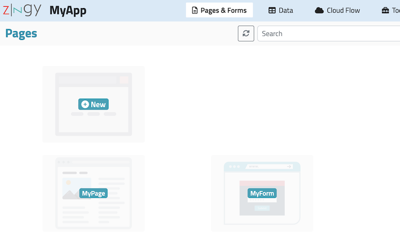
In the App Editor, go to the **`Pages & Forms`** tab and use the :heavy\_plus\_sign:**`New`** icon to add a new page to your App.&#x20;

<div align="left"><figure><img src="https://3401585094-files.gitbook.io/~/files/v0/b/gitbook-x-prod.appspot.com/o/spaces%2FmnBepgycwgisXr9ya1N4%2Fuploads%2FGVRC16X0G7jnkVDF0QKl%2Fimage.png?alt=media&amp;token=5e301bb0-e705-4f93-9793-14992ed6652f" alt="Zingy App Editor - New Page button" width="380"><figcaption><p>Zingy App Editor - New Page button</p></figcaption></figure></div>

Select **Page** as the type and provide a unique ID for your page.&#x20;

{% hint style="warning" %}
Please note that the **ID of your page cannot be changed**, but you can change the display name for the page.

The ID is used internally to refer to the page. The ID also gets used as the default name in the page's URL when you publish the page. You are allowed to change the name in the page's URL. See [Page Publishing](/app-editor/page-settings#publishing) for more information.
{% endhint %}

<div align="left"><figure><img src="https://3401585094-files.gitbook.io/~/files/v0/b/gitbook-x-prod.appspot.com/o/spaces%2FmnBepgycwgisXr9ya1N4%2Fuploads%2FoKchbTJciESjxp4sPPIn%2Fimage.png?alt=media&amp;token=ab4949ac-f2e5-485f-a875-161d4e823113" alt=""><figcaption></figcaption></figure></div>

Once the App editor creates your page, it will be shown amongst the list of pages.

<div align="left"><figure><img src="https://3401585094-files.gitbook.io/~/files/v0/b/gitbook-x-prod.appspot.com/o/spaces%2FmnBepgycwgisXr9ya1N4%2Fuploads%2FjcWp4xPrDv2uBk1jB4mt%2Fimage.png?alt=media&amp;token=d3c12b06-befa-43b4-beaa-d04ae50225f1" alt="Zingy App Editor - Page list" width="473"><figcaption><p>Zingy App Editor - Page list</p></figcaption></figure></div>

See [Adding Page Content](/app-editor/page-editor/adding-page-content)  for information about designing your page.


# Create a Structured Page

{% hint style="info" %}
For more information on Structured Pages, see:

[What is a Structured Page ? ](/app-editor/pages-and-forms/what-is-a-structured-page)
{% endhint %}

In the App Editor, go to the **`Pages & Forms`** tab and use the :heavy\_plus\_sign:**`New`** icon to add a new page to your App.&#x20;

<div align="left"><figure><img src="https://3401585094-files.gitbook.io/~/files/v0/b/gitbook-x-prod.appspot.com/o/spaces%2FmnBepgycwgisXr9ya1N4%2Fuploads%2FGVRC16X0G7jnkVDF0QKl%2Fimage.png?alt=media&amp;token=5e301bb0-e705-4f93-9793-14992ed6652f" alt="Zingy App Editor - New Page button" width="380"><figcaption><p>Zingy App Editor - New Page button</p></figcaption></figure></div>

Select **Structured Page** as the type and provide a unique ID for your page.&#x20;

{% hint style="warning" %}
Please note that the **ID of your page cannot be changed**, but you can change the display name for the page.

The ID is used internally to refer to the page. The ID also gets used as the default name in the page's URL when you publish the page. You are allowed to change the name in the page's URL. See [Page Publishing](/app-editor/page-settings#publishing) for more information.

{% endhint %}

<div align="left"><figure><img src="https://3401585094-files.gitbook.io/~/files/v0/b/gitbook-x-prod.appspot.com/o/spaces%2FmnBepgycwgisXr9ya1N4%2Fuploads%2FvmQCAJ2eWNl5DH4FRP6o%2Fimage.png?alt=media&amp;token=7dde24f9-f6f5-4d08-82fe-4cd9200da439" alt=""><figcaption></figcaption></figure></div>

Once the App editor creates your page, it will be shown amongst the list of pages.

<div align="left"><figure><img src="https://3401585094-files.gitbook.io/~/files/v0/b/gitbook-x-prod.appspot.com/o/spaces%2FmnBepgycwgisXr9ya1N4%2Fuploads%2FjcWp4xPrDv2uBk1jB4mt%2Fimage.png?alt=media&amp;token=d3c12b06-befa-43b4-beaa-d04ae50225f1" alt="Zingy App Editor - Page list" width="473"><figcaption><p>Zingy App Editor - Page list</p></figcaption></figure></div>

{% hint style="warning" %}
Structured Pages work on Standard or higher edition Apps. While you can explore this feature on any app edition, the pages will only get published in Standard or higher editions.
{% endhint %}

See [Adding Content to Structured Pages](/app-editor/page-editor/adding-content-to-structured-pages) for information about designing your structured page.


# What is a Structured Page ?

A structured page consists of 3 distinct sections (header, body and footer) containing editable page slices. The header and footer sections are limited to one page slice. The body section allows you to add one or more page slices.

The page slices can be shared across pages if required e.g. if you want all pages to have a logo and menu section at the top.

The Zingy website pages are examples that have the same header and footer:

<figure><img src="https://3401585094-files.gitbook.io/~/files/v0/b/gitbook-x-prod.appspot.com/o/spaces%2FmnBepgycwgisXr9ya1N4%2Fuploads%2FHIvKViML2QDtM3UiIfjN%2Fimage.png?alt=media&amp;token=9c8550a2-e80f-410e-8e9c-9f176dea33f1" alt=""><figcaption><p>Zingy website header layout</p></figcaption></figure>

<figure><img src="https://3401585094-files.gitbook.io/~/files/v0/b/gitbook-x-prod.appspot.com/o/spaces%2FmnBepgycwgisXr9ya1N4%2Fuploads%2FDnJAt4Bs3bzuaU9E4Fhv%2Fimage.png?alt=media&amp;token=c10c75e0-a1fd-4b2a-998d-5748e1b0b7a1" alt=""><figcaption><p>Zingy website footer</p></figcaption></figure>

See [Adding Content to Structured Pages](/app-editor/page-editor/adding-content-to-structured-pages) for more information.


# Create a Form

In the App Editor, go to the **`Pages & Forms`** tab and use the :heavy\_plus\_sign:**`New`** icon to add a new page to your App.&#x20;

<div align="left"><figure><img src="https://3401585094-files.gitbook.io/~/files/v0/b/gitbook-x-prod.appspot.com/o/spaces%2FmnBepgycwgisXr9ya1N4%2Fuploads%2FGVRC16X0G7jnkVDF0QKl%2Fimage.png?alt=media&amp;token=5e301bb0-e705-4f93-9793-14992ed6652f" alt="Zingy App Editor - New Page button" width="380"><figcaption><p>Zingy App Editor - New Page button</p></figcaption></figure></div>

Select **Form** as the type and provide a unique ID for your page.&#x20;

{% hint style="warning" %}
Please note that the **ID of your form cannot be changed**, but you can change the display name for the page.

The ID is used internally to refer to the form. The ID also gets used as the default name in the page's URL when you publish the form. You are allowed to change the name in the form's URL. See [Page Publishing](/app-editor/page-settings#publishing) for more information.
{% endhint %}

<div align="left"><figure><img src="https://3401585094-files.gitbook.io/~/files/v0/b/gitbook-x-prod.appspot.com/o/spaces%2FmnBepgycwgisXr9ya1N4%2Fuploads%2FaKKns1Dzire1Uwgqdedw%2Fimage.png?alt=media&amp;token=ddb4f387-907d-4c31-b8d3-8dbeaf46d4b6" alt=""><figcaption></figcaption></figure></div>

Once the App editor creates your form, it will be shown amongst the list of pages and forms.

<div align="left"><figure><img src="https://3401585094-files.gitbook.io/~/files/v0/b/gitbook-x-prod.appspot.com/o/spaces%2FmnBepgycwgisXr9ya1N4%2Fuploads%2FaA0lkOzvWY0BidlE0IXR%2Fimage.png?alt=media&amp;token=23a89338-4762-4065-89c0-fc7c4054e871" alt="" width="563"><figcaption></figcaption></figure></div>

See [Working with Forms](/app-editor/page-editor/working-with-forms) for information about designing to your form.


# Page Editor


# Page Editor Tour

Get to know your way around the Zingy Page Editor

{% hint style="success" %}
The Page Editor is used to edit both *Pages* and *Forms* hence the information in this section applies to both.
{% endhint %}

To launch the page editor, click on a page or form and select the **`Edit`** option.

<div align="left"><figure><img src="https://3401585094-files.gitbook.io/~/files/v0/b/gitbook-x-prod.appspot.com/o/spaces%2FmnBepgycwgisXr9ya1N4%2Fuploads%2F1AzqYRKRwoWwkJLBEPkX%2Fimage.png?alt=media&amp;token=5cdaa1ed-f463-46ed-bbe8-c717b517c1d3" alt="" width="252"><figcaption></figcaption></figure></div>

***

The page editor consists of the following sections:

## Main Toolbar

<div align="left"><figure><img src="https://3401585094-files.gitbook.io/~/files/v0/b/gitbook-x-prod.appspot.com/o/spaces%2FmnBepgycwgisXr9ya1N4%2Fuploads%2FP1VlLa0AuaGmz8sE5kcY%2Fimage.png?alt=media&amp;token=ea36f2e4-dff8-4145-b3e7-65c8be64159a" alt="Zingy Page Editor Main Toolbar"><figcaption><p>Zingy Page Editor Main Toolbar</p></figcaption></figure></div>

The main toolbar provides access to important functionalities such as:

* &#x20;<img src="https://3401585094-files.gitbook.io/~/files/v0/b/gitbook-x-prod.appspot.com/o/spaces%2FmnBepgycwgisXr9ya1N4%2Fuploads%2FUel0raxKy2r19j0V3CC3%2Fimage.png?alt=media&amp;token=ea35d33e-b159-49a3-9388-48504263e963" alt="" data-size="line"> Page Flow editor
* <img src="https://3401585094-files.gitbook.io/~/files/v0/b/gitbook-x-prod.appspot.com/o/spaces%2FmnBepgycwgisXr9ya1N4%2Fuploads%2FUgbg67yy8BTMjDWjCk0j%2Fimage.png?alt=media&amp;token=a0e929da-b104-4d39-a32d-f8adb85969e3" alt="" data-size="line">Functional preview of your page. For more information see [Page Preview](/app-editor/page-editor/page-preview).
* <img src="https://3401585094-files.gitbook.io/~/files/v0/b/gitbook-x-prod.appspot.com/o/spaces%2FmnBepgycwgisXr9ya1N4%2Fuploads%2FILPqsQWQZiRd8XtekFCj%2Fimage.png?alt=media&amp;token=77fbd490-144e-4952-ad8f-be3ff4aef16d" alt="" data-size="line">Viewing/Editing your page's settings
* <img src="https://3401585094-files.gitbook.io/~/files/v0/b/gitbook-x-prod.appspot.com/o/spaces%2FmnBepgycwgisXr9ya1N4%2Fuploads%2FLpRBHHXNPVa8yqpIlN17%2Fimage.png?alt=media&amp;token=3065a319-d394-4e64-8fe1-51a53a6dc83b" alt="" data-size="line"> Saving your page
* <img src="https://3401585094-files.gitbook.io/~/files/v0/b/gitbook-x-prod.appspot.com/o/spaces%2FmnBepgycwgisXr9ya1N4%2Fuploads%2FG6QdzOaDJ9F9vDJDOKi2%2Fimage.png?alt=media&amp;token=4cf27fff-a51d-4989-857b-86eaa4d438ee" alt="" data-size="line"> Exiting the page editor

***

## Page Element Sidebar

{% hint style="info" %}
For a [Structured Page](/app-editor/pages-and-forms/what-is-a-structured-page), no Page Element Sidebar is displayed in the page editor. Instead the Page Element Sidebar is present when you edit a page slice.
{% endhint %}

<div align="left"><figure><img src="https://3401585094-files.gitbook.io/~/files/v0/b/gitbook-x-prod.appspot.com/o/spaces%2FmnBepgycwgisXr9ya1N4%2Fuploads%2Fm4LVfMeKgs5DmvrCL03H%2Fimage.png?alt=media&amp;token=e6423778-7cae-4564-b423-b442013e589c" alt="Zingy Page Editor - Page Element Sidebar"><figcaption><p>Zingy Page Editor - Page Element Sidebar</p></figcaption></figure></div>

The page element sidebar has two primary panels:

#### <img src="https://3401585094-files.gitbook.io/~/files/v0/b/gitbook-x-prod.appspot.com/o/spaces%2FmnBepgycwgisXr9ya1N4%2Fuploads%2FqW1EdAKUAxl0sOXRTdB5%2Fimage.png?alt=media&amp;token=611c309e-81f6-42d8-be67-ec17de2e0ebb" alt="" data-size="line">Page Element Library

<div align="left"><figure><img src="https://3401585094-files.gitbook.io/~/files/v0/b/gitbook-x-prod.appspot.com/o/spaces%2FmnBepgycwgisXr9ya1N4%2Fuploads%2F8ZXdO3aXMhYD7HR6gRcr%2Fimage.png?alt=media&amp;token=25a25618-d497-45e0-a75a-0513d942883d" alt="Page Element Library" width="143"><figcaption><p>Page Element Sidebar - Page Element Library</p></figcaption></figure></div>

The page element library provides quick access to various page elements that can be added to your page. The library is organized into categories that can be expanded or collapsed for ease of use.

#### <img src="https://3401585094-files.gitbook.io/~/files/v0/b/gitbook-x-prod.appspot.com/o/spaces%2FmnBepgycwgisXr9ya1N4%2Fuploads%2F5HHHlxGIGYaY0n672pWP%2Fimage.png?alt=media&amp;token=967acef6-2f07-477f-aca5-c34668b78fe8" alt="" data-size="line">Page Tree View

<div align="left"><figure><img src="https://3401585094-files.gitbook.io/~/files/v0/b/gitbook-x-prod.appspot.com/o/spaces%2FmnBepgycwgisXr9ya1N4%2Fuploads%2FaKBSRtVpZ29DFDRtBal6%2Fimage.png?alt=media&amp;token=b7fc22f4-03ee-4773-b3b8-80baca039d61" alt="Page Structure View" width="143"><figcaption><p>Page Element Sidebar - Page TreeView</p></figcaption></figure></div>

The page tree view shows your page in a hierarchical structure.&#x20;

For more information please see: [Page Tree View](/app-editor/page-editor/working-with-page-elements#page-tree-view) **.**

***

## <img src="https://3401585094-files.gitbook.io/~/files/v0/b/gitbook-x-prod.appspot.com/o/spaces%2FmnBepgycwgisXr9ya1N4%2Fuploads%2FtrUDZlmu3Ll14sOy2oOr%2Fimage.png?alt=media&amp;token=4e36401a-5c29-4e49-8dc9-ff7e206d1e51" alt="" data-size="line">:magic\_wand:AI Wiz

**`AI Wiz`** allows you to generate and add custom page elements by simply typing what you want in plain English. The generated elements are added to your Page Element library under the AI Wiz category.

For more information please see: [Using AI Wiz in the Page Editor](/app-editor/page-editor/using-ai-wiz-in-the-page-editor).

## Page Content Area

<div align="left"><figure><img src="https://3401585094-files.gitbook.io/~/files/v0/b/gitbook-x-prod.appspot.com/o/spaces%2FmnBepgycwgisXr9ya1N4%2Fuploads%2FGX9967XWUtM5x2btdTaf%2Fimage.png?alt=media&amp;token=769343a7-dbae-4840-8bb4-5638829ec9dd" alt="Zingy Page Editor - Page Content Area"><figcaption><p>Zingy Page Editor - Page Content Area</p></figcaption></figure></div>

The page content area displays your page's content and allows you to edit or modify the page elements.

For a structured page, the page content area allows you to add, reorder or delete page slices for the header, body and footer sections.

<figure><img src="https://3401585094-files.gitbook.io/~/files/v0/b/gitbook-x-prod.appspot.com/o/spaces%2FmnBepgycwgisXr9ya1N4%2Fuploads%2F4dtyb59aejq1RP3oFoQn%2Fimage.png?alt=media&amp;token=b1fead58-86f1-41d1-aa85-30751fd923ca" alt=""><figcaption><p>Zingy Page Editor - Page Content Area for a structured page</p></figcaption></figure>

For more information please see:&#x20;

* [Adding Page Content](/app-editor/page-editor/adding-page-content)&#x20;
* [Adding Content to Structured Pages](/app-editor/page-editor/adding-content-to-structured-pages)

***

## Page Content Toolbar

{% hint style="info" %}
For a Structured Page, the Page Content Toolbar is present when you edit a layout on the page.
{% endhint %}

<figure><img src="https://3401585094-files.gitbook.io/~/files/v0/b/gitbook-x-prod.appspot.com/o/spaces%2FmnBepgycwgisXr9ya1N4%2Fuploads%2FKQiKy6ewYnw9FNM6Rafo%2Fimage.png?alt=media&amp;token=812b838d-fb16-4c23-b501-a76e4930b134" alt="Page Content Toolbar"><figcaption><p>Zingy Page Editor - Page Content Toolbar</p></figcaption></figure>

The page content toolbar allows you to:

* <img src="https://3401585094-files.gitbook.io/~/files/v0/b/gitbook-x-prod.appspot.com/o/spaces%2FmnBepgycwgisXr9ya1N4%2Fuploads%2F5DGricR2qroxQEwkJrSn%2Fimage.png?alt=media&amp;token=383c9ece-b947-46b4-8f52-871409171b64" alt="" data-size="line"> : View your page design in desktop, tablet and mobile screen sizes. See [Responsive Design](/app-editor/page-editor/responsive-design) for more information.
* <img src="https://3401585094-files.gitbook.io/~/files/v0/b/gitbook-x-prod.appspot.com/o/spaces%2FmnBepgycwgisXr9ya1N4%2Fuploads%2F01r46w5hq0uGCnecEsfA%2Fimage.png?alt=media&amp;token=482bdcec-0e23-4d98-8805-0a9366bcec80" alt="" data-size="line">: Show/Hide the dotted borders around elements
* <img src="https://3401585094-files.gitbook.io/~/files/v0/b/gitbook-x-prod.appspot.com/o/spaces%2FmnBepgycwgisXr9ya1N4%2Fuploads%2Fr2ivI81RXazWE0kBUWy7%2Fimage.png?alt=media&amp;token=cb2e05f7-dd81-4704-a85e-5c9178b1ddbd" alt="" data-size="line">: Setup data table information for *Forms* .


# Adding Page Content

{% hint style="info" %}
The information in this section refers to definitions and concepts introduced in the [Page Editor Tour](/app-editor/page-editor/page-editor-tour) section.
{% endhint %}

{% hint style="success" %}
You can use the information in this section for adding content to both *Pages* and *Forms*.
{% endhint %}

The page's content is displayed in the Page Content area of the Page Editor.&#x20;

<div align="left"><figure><img src="https://3401585094-files.gitbook.io/~/files/v0/b/gitbook-x-prod.appspot.com/o/spaces%2FmnBepgycwgisXr9ya1N4%2Fuploads%2FGX9967XWUtM5x2btdTaf%2Fimage.png?alt=media&amp;token=769343a7-dbae-4840-8bb4-5638829ec9dd" alt="Page Editor - Page Content area"><figcaption><p> v</p></figcaption></figure></div>

***

The following sections describe the various ways you can add content to a page.

### 1) Adding content from the Page Element Library

Content from the page element library can be added in following ways:

#### **a) Drag and drop element from the library**

Select the element from the sidebar and drag it into the page content area.&#x20;

In the example below, we add the 2 column layout element into the page and then add an image and a heading into the two columns.

Depending on the element, you can drag it into another element or to any part of the page.

e.g. Layout columns can only be added to Layout rows. For details on various other built-in elements, please see  [Built-in elements in Page Element Library](/app-editor/page-editor/built-in-elements) .&#x20;

{% embed url="<https://youtu.be/TAlQnNCe0lE>" %}
Video: Add content using drag and drop from library
{% endembed %}

#### **b) Select element on your page and click to add**

You can also add content to the page by pre-selecting an element in the page content area and then clicking on the desired element in the library.

In the example below we select the column on the right and then click on the 'Image' element to add it.

{% embed url="<https://youtu.be/C5WqyH2fPMc>" %}
Video: Click to add content
{% endembed %}

***

***

### 2) Importing HTML code

The Page Editor allows importing HTML code into the main body or into an existing element on the page. Please note that only certain elements allow importing HTML code inside them.

The example below shows how to import html code into the main body of your page. If your page already has existing content, the new content will be appended to the end of the page.

{% embed url="<https://youtu.be/GdufyHZYwMs>" %}
Video: Import HTML into main body
{% endembed %}

The example below imports an image via HTML code into a layout column. If the selected element already has content, the new content will be appended to the end.

{% embed url="<https://youtu.be/en1t7m2s9ns>" %}
Video: Import HTML inside another element.
{% endembed %}

When you enter your HTML code, **do not include** javascript code via the **`script`** tag, CSS files via the **`link`** tag or style definitions via the **`style`** tag.&#x20;

{% hint style="danger" %}
Disallowed tags will be removed from the HTML code.

Disallowed tags include unsafe ones like **`script`**&#x6F;&#x72;**`link`**, and tags that form the page skeleton like **`html`**, **`head, body`** or ones that usually appear within the **`head`** tag like **`title`**, **`meta`**, **`style`**, etc.

Zingy supports Bootstrap based CSS classes. For more information see: <https://getbootstrap.com/docs/4.6/getting-started/introduction/>
{% endhint %}

{% hint style="success" %}
You can add custom scripts, css files and define custom styles for your page via the Page Settings screen. If you want these to be applied to all pages of your app, you can do this via the App Settings screen.
{% endhint %}

***

### 3) Using :magic\_wand:AI Wiz

If you are looking for some ideas and inspiration, AI Wiz can help you generate layouts and content by simply typing what you want in plain English.&#x20;

For more information please see: [Using AI Wiz in the Page Editor](/app-editor/page-editor/using-ai-wiz-in-the-page-editor).

### See also

{% content-ref url="/pages/qxoE3l3g1M1NW9mpyNmo" %}
[Working with Page Elements](/app-editor/page-editor/working-with-page-elements)
{% endcontent-ref %}

{% content-ref url="/pages/PFbZwWWRuTUviYyxFQQe" %}
[Editing Text](/app-editor/page-editor/editing-text)
{% endcontent-ref %}


# Adding Content to Structured Pages

{% hint style="info" %}
The information in this section refers to definitions and concepts introduced in&#x20;

the [What is a Structured Page ?](/app-editor/pages-and-forms/what-is-a-structured-page) and [Page Editor Tour](/app-editor/page-editor/page-editor-tour) sections.
{% endhint %}

The image below shows a empty structured page with the header, body and footer sections.

<figure><img src="https://3401585094-files.gitbook.io/~/files/v0/b/gitbook-x-prod.appspot.com/o/spaces%2FmnBepgycwgisXr9ya1N4%2Fuploads%2F4dtyb59aejq1RP3oFoQn%2Fimage.png?alt=media&amp;token=b1fead58-86f1-41d1-aa85-30751fd923ca" alt=""><figcaption><p> Page Editor: Page Content Area for Structured Page</p></figcaption></figure>

***

## Adding Page Slices

To add a page slice to the header, body or footer section, click anywhere on the section and select the **`+ Add`** option from the options menu.&#x20;

For the body section, you can add more than one page slice. The header and footer section can only have one page slice.

<div align="left"><figure><img src="https://3401585094-files.gitbook.io/~/files/v0/b/gitbook-x-prod.appspot.com/o/spaces%2FmnBepgycwgisXr9ya1N4%2Fuploads%2FKxWLC2d4WsIQ9cY30Yr9%2Fimage.png?alt=media&amp;token=f6e65dc9-4a4d-4ec4-83aa-17e46c65673c" alt="" width="563"><figcaption><p>Page Editor: Adding a page slice </p></figcaption></figure></div>

The video below demonstrates a structured page with header, body and footer sections. The header consists of a menubar. The footer contains a copyright message. The body of this specific page contains an example hero image.

{% embed url="<https://youtu.be/xphv1rfmGpc>" %}
Video: Adding Page Slices to a Structured Page
{% endembed %}

After you have made a page header and footer slice, you can add them to other structured pages. Please note that: Modifying the page slice via any structured page will automatically change it in other pages. If you want a page to have an exclusive copy of an existing slice, be sure to check the *Make a Copy* switch when adding the slice.

The video below adds the same menubar and footer copyright message to a new structured page.

{% embed url="<https://youtu.be/d2Wr2bwCKG4>" %}
Video: Share existing page slices with other Structured Pages
{% endembed %}

***

## Page Slice Options Menu

<div align="left"><figure><img src="https://3401585094-files.gitbook.io/~/files/v0/b/gitbook-x-prod.appspot.com/o/spaces%2FmnBepgycwgisXr9ya1N4%2Fuploads%2Fw4rLLkHLsLtaTLFJUBBF%2Fimage.png?alt=media&amp;token=e21d8ce4-98de-4ad0-9571-fdd32b653f4a" alt="" width="280"><figcaption><p>Page Editor: Page Slice options menu</p></figcaption></figure></div>

In the page editor, clicking on any page slice of a structured page will present a menu with the following options:

* **`Edit`**

  The edit option takes you into the page editor where you can design and edit the page slice.
* **`Add`**

  For the body section, the Add option will allow you to either add an exiting page slice or create a new one. The page slice is then inserted immediately after the selected page slice. For header and footer sections, the add option will only show if no slice has been added to those sections.&#x20;
* **`Remove`**

  This option removes the slice from the page. The slice itself is retained in your slice library.

***

## Reordering Page Slices in the body section

You can change the order of the slices added to the body section. Simply click on the slice and drag it to the desired position. See the example video below.

{% embed url="<https://youtu.be/9Sa3e0tmbGE>" %}
Video: Reordering slices
{% endembed %}

***

## Page Slices Library

All the page slices that you create can be managed via the page slices library.

In the App Editor, use the Toolbox menu and select Page Slices to access the page slices library.

<figure><img src="https://3401585094-files.gitbook.io/~/files/v0/b/gitbook-x-prod.appspot.com/o/spaces%2FmnBepgycwgisXr9ya1N4%2Fuploads%2FY0tF79lLeXXhnwSTWfTJ%2Fimage.png?alt=media&amp;token=b0f8068e-4608-42a8-a0bf-c26c5463e89a" alt=""><figcaption><p>App Editor: Page Slices Library</p></figcaption></figure>


# Working with Page Elements

{% hint style="info" %}
The information in this section refers to definitions and concepts introduced in the [Adding Page Content](/app-editor/page-editor/adding-page-content) section .
{% endhint %}

## Element Toolbar

In the page content area, the currently selected element is shown with a border along with the Element Toolbar: <img src="https://3401585094-files.gitbook.io/~/files/v0/b/gitbook-x-prod.appspot.com/o/spaces%2FmnBepgycwgisXr9ya1N4%2Fuploads%2FfVLvIUWNX0Wc0R3zVK7n%2Fimage.png?alt=media&amp;token=f98f5f6a-c8a3-4f0c-886e-ffaae28da819" alt="" data-size="line">

<div align="left" data-full-width="false"><figure><img src="https://3401585094-files.gitbook.io/~/files/v0/b/gitbook-x-prod.appspot.com/o/spaces%2FmnBepgycwgisXr9ya1N4%2Fuploads%2FceFzXW1jHWc85O4dMr1u%2Fimage.png?alt=media&amp;token=3864cadf-7740-47e8-81e6-9b4f1f97fb89" alt=""><figcaption><p>Selected Page Element</p></figcaption></figure></div>

The available buttons in the element toolbar are described below:

#### <img src="https://3401585094-files.gitbook.io/~/files/v0/b/gitbook-x-prod.appspot.com/o/spaces%2FmnBepgycwgisXr9ya1N4%2Fuploads%2FEf0SkYHrOhhsc8o9GQ63%2Fimage.png?alt=media&amp;token=874793c4-d0ae-421e-8f66-517c4b058df3" alt="" data-size="line"> Select parent of the current element

The Select Parent button in the element toolbar allows you to select the parent of the current element. i.e. the selection now moves to the parent element.

In the example below, the currently selected element is a Layout Column (*named Column26*). The selection is then moved to its parent (a Layout Row *named Row8*).

{% embed url="<https://youtu.be/txSSAhQBPKg>" %}
Video: Move selection to parent element
{% endembed %}

#### <img src="https://3401585094-files.gitbook.io/~/files/v0/b/gitbook-x-prod.appspot.com/o/spaces%2FmnBepgycwgisXr9ya1N4%2Fuploads%2FLlGPS7Up2Hw28aB0KFl7%2Fimage.png?alt=media&amp;token=597272a9-6f88-4380-9d2a-e74f2f0160f9" alt="" data-size="line"> Move the selected element to another part of the page

The Move Element button in the element toolbar allows you to drag and drop the element to another part of the page. Please note that logical rules apply: e.g. a Layout Column can only be moved into a Layout Row.

In the example below, the currently selected element (an image), is moved from the left column to the right column.

{% embed url="<https://youtu.be/JUmCMMCzlMU>" %}
Video: Move element
{% endembed %}

Elements can also be [moved using the page tree view](#moving-elements).&#x20;

#### <img src="https://3401585094-files.gitbook.io/~/files/v0/b/gitbook-x-prod.appspot.com/o/spaces%2FmnBepgycwgisXr9ya1N4%2Fuploads%2FS5ZPeWtFNRbDIsg6XCJO%2Fimage.png?alt=media&amp;token=a9107295-2df6-4ba6-955b-6c561d58fcab" alt="" data-size="line"> Clone the selected element

The Clone button in the element toolbar creates an identical copy of the selected element (including contained elements) and adds it immediately after the selected element. This can also be achieved by using standard clipboard copy/paste commands.

In the example below, the Layout Column on the left (named *Column17*) containing the text "*Some text in Column1"* is cloned and added immediately after the selected column. The existing column on the right now becomes the third column of the parent Layout Row.

The page editor automatically assigns a new ID to cloned elements.

{% embed url="<https://youtu.be/yk7kXql7DIg>" %}
Video: Clone element
{% endembed %}

#### <img src="https://3401585094-files.gitbook.io/~/files/v0/b/gitbook-x-prod.appspot.com/o/spaces%2FmnBepgycwgisXr9ya1N4%2Fuploads%2FXqFCm3ynEo8MplIHmw5O%2Fimage.png?alt=media&amp;token=e6bc0519-64de-42c5-8f5d-7101c77c7a66" alt="" data-size="line"> Delete the selected element&#x20;

The Delete button in the element toolbar deletes the selected element (including contained elements).

In the example below, the Layout Column (named Column30) is deleted. The parent Layout Row now contains two columns.

{% embed url="<https://youtu.be/PoCp_QcR0xg>" %}

#### <img src="https://3401585094-files.gitbook.io/~/files/v0/b/gitbook-x-prod.appspot.com/o/spaces%2FmnBepgycwgisXr9ya1N4%2Fuploads%2FjQBABH6QWjFL0B5GyL9f%2Fimage.png?alt=media&amp;token=88e73df1-68f9-4e16-b2d3-ed3e2227ba9a" alt="" data-size="line"> Text Alignment

The Text Alignment button in the element toolbar is available for elements that contain [editable text](/app-editor/page-editor/editing-text) e.g. the **`Text`**, **`Inline Text`**, **`Link`**, **`Heading`**, etc.

Clicking on the option will bring up a menu with alignment choices.

{% embed url="<https://youtu.be/E-c3lfBQISc>" %}
Video: Text alignment options
{% endembed %}

#### <img src="https://3401585094-files.gitbook.io/~/files/v0/b/gitbook-x-prod.appspot.com/o/spaces%2FmnBepgycwgisXr9ya1N4%2Fuploads%2FBXsyEufUI91jIxmCCdHj%2Fimage.png?alt=media&amp;token=7605ae1d-0d7d-4bc7-9b2f-3abac992fc0c" alt="" data-size="line"> Options

The action taken by the Options button in the element toolbar depends on the selected element. In most cases it will open the settings screen for the selected element.

In some cases, a menu is presented with options specific to the element along with the option to open the settings screen.

See [Page Element Settings](/app-editor/page-editor/page-element-settings) for more information.

***

## Page Tree View

The page tree view is located in the page element sidebar.

It makes it easier to understand the general anatomy/organization of the page. It also makes it easy to select elements occupying a very small area on the screen.

<div align="left"><figure><img src="https://3401585094-files.gitbook.io/~/files/v0/b/gitbook-x-prod.appspot.com/o/spaces%2FmnBepgycwgisXr9ya1N4%2Fuploads%2FaKBSRtVpZ29DFDRtBal6%2Fimage.png?alt=media&amp;token=b7fc22f4-03ee-4773-b3b8-80baca039d61" alt="Page Structure View"><figcaption><p>Page Tree View</p></figcaption></figure></div>

#### Element Selection

Selecting an element in the page content area will highlight the element in the page tree view and vice-versa.

To view an element in the page tree view, select it in the page content area. The page tree view will automatically expand the hierarchy of elements leading to the selected node.

The example video shows various elements being selected in the page content area with the corresponding element being highlighted in the page tree view.

{% embed url="<https://youtu.be/TwRgE2OFfdc>" %}
Video: Show element in Page Tree View
{% endembed %}

You can also click on an element in the page tree view and select it in the page content area. See the example video below.

{% embed url="<https://youtu.be/H2TDSgjD8cQ>" %}
Video: Click element in Page Tree View to select in Page Content Area
{% endembed %}

#### Moving elements

You can also move elements to another part of the page using the page tree view.

In the example video a button is moved to another part of the page. The second part of the video also shows a layout column being moved after another layout column within the same layout row.&#x20;

{% embed url="<https://youtu.be/5YZNaJoNfFM>" %}
Video: Move elements using Page Tree View
{% endembed %}


# Page Element Settings

The page element settings screen is invoked via the [Options button](/app-editor/page-editor/working-with-page-elements#options) in the [Element Toolbar](/app-editor/page-editor/working-with-page-elements#element-toolbar).

The element settings screen allows you to change settings and the design of a page element.

For all elements, the element settings screen consists of three tabs:&#x20;

**`Options`**, **`Design`** and **`Advanced`**

<div align="left"><figure><img src="https://3401585094-files.gitbook.io/~/files/v0/b/gitbook-x-prod.appspot.com/o/spaces%2FmnBepgycwgisXr9ya1N4%2Fuploads%2F8iJnOZBtfXv2jy3amHvi%2Fimage.png?alt=media&amp;token=33caa7b5-29c2-453e-932e-3f6226dafbfd" alt="Element Settings tabs" width="563"><figcaption><p>Element settings tabs</p></figcaption></figure></div>

***

### Options Tab

The options tab generally consists of settings specific to the selected element.

However, there are two common settings that appear for all elements:&#x20;

**`Name`** and **`Custom CSS Classes`**.

<div align="left"><figure><img src="https://3401585094-files.gitbook.io/~/files/v0/b/gitbook-x-prod.appspot.com/o/spaces%2FmnBepgycwgisXr9ya1N4%2Fuploads%2F8dvj4N2PKjq8qMr8P5cw%2Fimage.png?alt=media&amp;token=ef372072-b316-4ee7-9976-694f332fb5fb" alt="Options tab - common settings" width="563"><figcaption><p>Options tab - common settings</p></figcaption></figure></div>

#### Name

The Name setting allows you to provide a friendlier name to an element. By default the page editor assigns a sequential name for the element.

#### Custom CSS Classes

The Custom CSS Classes setting allows you to add one or more CSS classes to the page element. The classes can be from:

* The standard [Bootstrap](https://getbootstrap.com/docs/4.6/getting-started/introduction/) based CSS classes that Zingy supports.
* Custom CSS files or styles that you can define in the Page Settings or App Settings.

{% hint style="info" %}
For quickly adjusting margin and padding settings using CSS classes, see [here](/app-editor/page-editor/padding-and-margin#adjustments-using-css).
{% endhint %}

#### Element specific settings

The example below shows the element settings specific to the **`Text`** element.

The common settings Name and Custom CSS Classes are present along with settings specific to the **`Text`** element.

<div align="left"><figure><img src="https://3401585094-files.gitbook.io/~/files/v0/b/gitbook-x-prod.appspot.com/o/spaces%2FmnBepgycwgisXr9ya1N4%2Fuploads%2FH1UhYFG9IanR69gCS9wR%2Fimage.png?alt=media&amp;token=ec3b20ae-9fe4-4e76-b961-47f127108183" alt="Text element specific settings in Options tab" width="563"><figcaption><p>Text element specific settings in Options tab</p></figcaption></figure></div>

Please refer to the element specific information sections for more information.

***

### Design Tab

{% hint style="warning" %}
Most page elements provide quick access to styling and design controls in the [Options tab](#options-tab). You only need use the design tab if you are looking for something beyond what is offered.

Additionally the [Custom CSS Classes](#custom-css-classes) setting in the options tab also allows for style and design customization, using either standard [Bootstrap](https://getbootstrap.com/docs/4.6/getting-started/introduction/) based CSS classes that Zingy supports, or your own (if you provide your own CSS files or CSS style definitions).
{% endhint %}

<div align="left"><figure><img src="https://3401585094-files.gitbook.io/~/files/v0/b/gitbook-x-prod.appspot.com/o/spaces%2FmnBepgycwgisXr9ya1N4%2Fuploads%2F1s9eknUra8kz2sNiWLyf%2Fimage.png?alt=media&amp;token=5ce8ddb1-a2eb-4ed3-8ba8-7362f5217373" alt="Design Tab" width="563"><figcaption><p>Design Tab</p></figcaption></figure></div>

The design tab allows you to customize how the element gets rendered on your page.&#x20;

These settings are organized into various categories like Font, Spacing, Border Radius, etc.

The responsive design implementation allows you to control the look & feel for various screen sizes. For more information see [here](/app-editor/page-editor/responsive-design#page-element-settings-design-tab).

***

### Advanced Tab

{% hint style="danger" %}
The settings in this tab require knowledge of HTML and CSS and hence we do not normally recommend modifying any settings here.
{% endhint %}

The advanced tab provides HTML specific information about the selected element. This information can be used in scenarios like using custom javascript code in [Page Flow](/app-editor/page-flow).

The Element ID shown in this tab is the [HTML ID](https://developer.mozilla.org/en-US/docs/Web/HTML/Global_attributes/id) for the element.

<div align="left"><figure><img src="https://3401585094-files.gitbook.io/~/files/v0/b/gitbook-x-prod.appspot.com/o/spaces%2FmnBepgycwgisXr9ya1N4%2Fuploads%2F73xZ8YBTZgu6WblYK3oe%2Fimage.png?alt=media&amp;token=c2db9b48-cf96-4d84-950d-182ee359d199" alt="" width="563"><figcaption><p>Advanced Tab</p></figcaption></figure></div>


# Responsive Design

Responsive design is an approach that makes your Zingy app adapt and respond to different devices and screen sizes. The goal is to provide an optimal user experience regardless of whether the user is accessing the Zingy app on a desktop computer, laptop, tablet, or smartphone.

The page editor allows you design your pages responsively in the following ways:

## Page Element Settings: Design Tab

The [Design Tab](/app-editor/page-editor/page-element-settings#design-tab) in the [Page Elements Settings](/app-editor/page-editor/page-element-settings) screen contains 4 sub-tabs:

* <img src="https://3401585094-files.gitbook.io/~/files/v0/b/gitbook-x-prod.appspot.com/o/spaces%2FmnBepgycwgisXr9ya1N4%2Fuploads%2FycMfjWUSZt0TvaRApbHs%2Fimage.png?alt=media&amp;token=4657713e-8019-4b4d-ab6b-90e468897ea1" alt="" data-size="line"> Main design settings for the element

  Use the settings in the main sub-tab for changing the overall look of the element across all screen sizes i.e. these design settings become the default for this element, unless the same setting is modified in the Desktop/Tablet/Mobile sub-tabs. **If you only want a design setting to be effective for a specific screen size then leave that setting unchanged in the Main tab.**
* <img src="https://3401585094-files.gitbook.io/~/files/v0/b/gitbook-x-prod.appspot.com/o/spaces%2FmnBepgycwgisXr9ya1N4%2Fuploads%2FGp3Q9c5uMhouGIpNi2c1%2Fimage.png?alt=media&amp;token=3b995a72-d158-43ab-8dd0-378b04ab2552" alt="" data-size="line">: Desktop/Laptop view design settings for the element

  Use the settings in the desktop sub-tab for changing the look of the element when viewed on a larger screen like a desktop or laptop computer. If a setting here is left unchanged, it will take the setting from the main sub-tab (if present).
* <img src="https://3401585094-files.gitbook.io/~/files/v0/b/gitbook-x-prod.appspot.com/o/spaces%2FmnBepgycwgisXr9ya1N4%2Fuploads%2F4s1CwG4r0xbJdS66BFsW%2Fimage.png?alt=media&amp;token=33d4def2-3534-4c45-8fd3-c0b8c8d5f969" alt="" data-size="line">: iPad/Tablet view design settings for the element
  Use the settings in the tablet sub-tab for changing the look of the element when viewed on an iPad or other tablet like devices. If a setting here is left unchanged, it will take the setting from the main sub-tab (if present).
* <img src="https://3401585094-files.gitbook.io/~/files/v0/b/gitbook-x-prod.appspot.com/o/spaces%2FmnBepgycwgisXr9ya1N4%2Fuploads%2FZmfJtwZXW0K9MhsTZfhs%2Fimage.png?alt=media&amp;token=ddecdc52-5058-46ac-8f30-d975da4f5c51" alt="" data-size="line">Mobile phone view design settings for the element
  Use the settings in the mobile sub-tab for changing the look of the element when viewed on a mobile phone or similar smaller screen device. If a setting here is left unchanged, it will take the setting from the main sub-tab (if present).

{% hint style="info" %}
The setting from the main sub-tab (if present) will be inherited unless overridden.
{% endhint %}

{% hint style="warning" %}
NOTE: Unlike the options tab described below, the smaller screen size setting does not get inherited by the larger screen sizes.&#x20;

**Each screen size needs to be set separately or it inherits the main sub-tab setting.**
{% endhint %}

***

## Page Element Settings: Options Tab

Many built-in elements allow changing certain design settings via the [Options Tab](/app-editor/page-editor/page-element-settings#options-tab) in the [Page Elements Settings](/app-editor/page-editor/page-element-settings) screen. Some examples of such elements include [Flexible Area](/app-editor/page-editor/built-in-elements/flexible-area), [Layout Row](/app-editor/page-editor/built-in-elements/layout-row), and others.

These settings are organized similar to the [design tab of the page element settings](#page-element-settings-design-tab) described above allowing a Main, Desktop, Tablet and Mobile version for that setting.

{% hint style="info" %}
The main version of the setting (if present) will be inherited for all screen sizes unless overridden.&#x20;
{% endhint %}

{% hint style="warning" %}
NOTE: **If not overridden for a specific screen size**, a smaller screen size setting (if present)  **will be inherited**. e.g. If you choose a specific value for Mobile, then this value will apply to Tablet and Desktop.&#x20;

**This behavior is different from the design tab described above.**
{% endhint %}

***

## Page Content Toolbar

The [page content toolbar](/app-editor/page-editor/page-editor-tour#page-content-toolbar) in the [page editor](/app-editor/page-editor/page-editor-tour) offers buttons <img src="https://3401585094-files.gitbook.io/~/files/v0/b/gitbook-x-prod.appspot.com/o/spaces%2FmnBepgycwgisXr9ya1N4%2Fuploads%2F5DGricR2qroxQEwkJrSn%2Fimage.png?alt=media&amp;token=383c9ece-b947-46b4-8f52-871409171b64" alt="" data-size="line"> to switch between desktop, tablet and mobile views while designing your page.

{% hint style="info" %}
For information about creating visually appealing and well-structured layouts also  read [Padding and Margin](/app-editor/page-editor/padding-and-margin) .
{% endhint %}


# Padding and Margin

Padding and margin are essential concepts in page design that contribute to the overall layout and spacing of elements.

Padding refers to the space between the contents of an element and its border. It allows you to create breathing room within an element, adding space around its content. By adjusting the padding, you can control the distance between the content and the edges of the element. This helps to enhance readability, create visual separation, and maintain a harmonious balance within the design.

Margin refers to the space outside the border of an element, creating a gap between adjacent elements. It determines the distance between elements and affects the overall spacing and alignment on the page. By manipulating the margin, you can control the spacing between elements, achieving a desired visual hierarchy, and improving the overall aesthetics of the layout.

It's important to understand and use padding and margin effectively in page design to create visually appealing and well-structured layouts. Careful consideration of padding and margin ensures proper spacing, readability, and an overall pleasing user experience.

***

## Adjustments using Design Tab

The video below demonstrates both padding and margin adjustments in the Page Editor using the [Design Tab](/app-editor/page-editor/page-element-settings#design-tab). Please refer to its labelled chapters for more information on the adjustments being made.

{% embed url="<https://youtu.be/eH7L7Uo2A4Y>" %}
Video: Adjusting padding and margin
{% endembed %}

***

## Adjustments using CSS

You can also adjust the padding and margin by using the [Custom CSS Classes](/app-editor/page-editor/page-element-settings#custom-css-classes) setting.&#x20;

In addition to the option of using your own CSS files and specifying the classes, you also have the option of using pre-made padding and margin utility classes from [Bootstrap](https://getbootstrap.com/docs/4.6/utilities/spacing/) which Zingy supports. Some of these are detailed below.

{% hint style="info" %}
The size term mentioned below is a number from 0 through 5, with 5 representing the highest amount and 0 representing none.
{% endhint %}

| CSS Class Pattern                       | Description                               | Example CSS class                                 |
| --------------------------------------- | ----------------------------------------- | ------------------------------------------------- |
| <p>m-<\<size>>/</p><p>p-<\<size>></p>   | Sets the margin/padding in all directions | <p>m-0 through m-5/</p><p>p-0 through p-5</p>     |
| <p>mx-<\<size>>/</p><p>px-<\<size>></p> | Sets the left and right margins/paddings  | <p>mx-0 through mx-5/</p><p>px-0 through px-5</p> |
| <p>my-<\<size>>/</p><p>py-<\<size>></p> | Sets the top and bottom margins/paddings  | <p>my-0 through my-5/</p><p>py-0 through py-5</p> |
| <p>mt-<\<size>>/</p><p>pt-<\<size>></p> | Sets the top margin/padding               | <p>mt-0 through mt-5/</p><p>pt-0 through pt-5</p> |
| <p>mb-<\<size>>/</p><p>pb-<\<size>></p> | Sets the bottom margin/padding            | <p>mb-0 through mb-5/</p><p>pb-0 through pb-5</p> |
| <p>ml-<\<size>>/</p><p>pl-<\<size>></p> | Sets the left margin/padding              | <p>ml-0 through ml-5/</p><p>pl-0 through pl-5</p> |
| <p>mr-<\<size>>/</p><p>pr-<\<size>></p> | Sets the right margin/padding             | <p>mr-0 through mr-5/</p><p>pr-0 through pr-5</p> |

In addition to the above utility classes, [Bootstrap](https://getbootstrap.com/docs/4.6/utilities/spacing/) also offers responsive versions of the above using the symbols lg, md and sm to desktop, tablet and mobile screen sizes.

e.g. mb-lg-5 would set the bottom margin only on desktops, whereas px-md-2 would set the left and right paddings on tablets and larger screen devices. Another example is mt-sm-3 would set the top margin on mobile and larger screen devices.

Please refer to [Bootstrap](https://getbootstrap.com/docs/4.6/utilities/spacing/) documentation for more detailed information.


# Editing Text

Elements that allow text editing are found under the 'Basic' category of the Page Element Library.

<div align="left"><figure><img src="https://3401585094-files.gitbook.io/~/files/v0/b/gitbook-x-prod.appspot.com/o/spaces%2FmnBepgycwgisXr9ya1N4%2Fuploads%2FDlLIHK7aCR1KGXv0rutN%2Fimage.png?alt=media&amp;token=ce1f3b07-aeb1-4000-bc60-cc8409ffeba0" alt="" width="176"><figcaption><p>Text Editing Elements</p></figcaption></figure></div>

When you are modifying text, a Text Edit Toolbar automatically appears for the element as shown below.

<figure><img src="https://3401585094-files.gitbook.io/~/files/v0/b/gitbook-x-prod.appspot.com/o/spaces%2FmnBepgycwgisXr9ya1N4%2Fuploads%2Fdogj1uVN5cO2H7HipR4E%2Fimage.png?alt=media&amp;token=05ea1561-9ab0-4671-90d9-fb5330dff6a2" alt=""><figcaption><p>Text Edit Toolbar</p></figcaption></figure>

The text edit toolbar buttons are:

* Bold selected text
* Italicize selected text
* Underline selected text
* Strike-through selected text
* Turn selected text into a [Link](#link) element
* Start an un-ordered list i.e. with bullets
* Start an ordered list i.e. a numbered list
* Make selection into [Badged Text](/app-editor/page-editor/built-in-elements/badged-text).
* Make selection into a [Dynamic Content](/app-editor/dynamic-content) placeholde&#x72;**.** (Only applicable if the element is inside a [Data Design](/app-editor/page-editor/built-in-elements/data-design) element).

Beyond the above described information, each of these elements differ in their rendering behavior as explained below:

### Text

By default **`Text`** elements occupy the full horizontal area they are contained in.&#x20;

<div align="left"><figure><img src="https://3401585094-files.gitbook.io/~/files/v0/b/gitbook-x-prod.appspot.com/o/spaces%2FmnBepgycwgisXr9ya1N4%2Fuploads%2FRTxpTT7VD4bmRwKMeA6x%2Fimage.png?alt=media&amp;token=3d8608f8-15e5-4367-b127-6511cedec3d8" alt=""><figcaption><p>Text elements with the default Type</p></figcaption></figure></div>

{% hint style="success" %}
For writing text over multiple lines, use the **`Text`** element with the **`Type`** setting set to **`Default`**.
{% endhint %}

When  the **`Type`** setting is changed to **`Inline`**  the elements only occupy as much horizontal space as they need as shown below.

<div align="left"><figure><img src="https://3401585094-files.gitbook.io/~/files/v0/b/gitbook-x-prod.appspot.com/o/spaces%2FmnBepgycwgisXr9ya1N4%2Fuploads%2FGPpc242qXoXe77kxy0gb%2Fimage.png?alt=media&amp;token=fe80b540-d4d6-42d7-8cc8-e837f809160f" alt="" width="563"><figcaption><p>Text elements with the Inline Type.</p></figcaption></figure></div>

Note that in the above example, both the elements have been set as Inline. If only one element is set as Inline, the other element would still occupy the full horizontal space.

<div align="left"><figure><img src="https://3401585094-files.gitbook.io/~/files/v0/b/gitbook-x-prod.appspot.com/o/spaces%2FmnBepgycwgisXr9ya1N4%2Fuploads%2FukNUJqBe1KxTWiYahf3f%2Fimage.png?alt=media&amp;token=3f410759-b984-4b55-94ae-273e83b3638e" alt="" width="563"><figcaption><p>Text element Inline Type setting</p></figcaption></figure></div>

### Inline Text

The **`Inline Text`** element behaves similar to a **`Text`** element with the **`Type`** set to **`Inline`**. The main difference is that **`Inline Text`** elements always remain inline and do not have any other settings.

### Link

The **`Link`** element creates a clickable web hyperlink that can be configured to point at a specific URL.&#x20;

The **`Link`** element behaves similar to an **`Inline Text`** element or a **`Text`** element with the **`Type`** set to **Inline**.

A Link element is created automatically if you use the hyperlink option in the text edit toolbar.

For more information about Link see [**here**](/app-editor/page-editor/built-in-elements/link).

{% hint style="info" %}
**`Text`**, **`Inline Text`** and **`Link`** elements use the Body font defined at the page level (in Page Settings) or the Body font defined at the app level (in App Settings). To change the font for a specific element, use the [design tab in the element settings](/app-editor/page-editor/page-element-settings#design-tab).
{% endhint %}

### Heading

The **`Heading`** element can be configured for various sizes: Heading 1 (largest) through Heading 6 (smallest).

Unlike **`Text`**, **`Inline Text`** and **`Link`** elements, **`Heading`** elements can contain other elements and thereby have those inherit its font settings.

{% hint style="info" %}
**`Heading`** elements use the Heading font defined at the page level (in Page Settings) or the Heading font defined at the app level (in App Settings). To change the font for a specific element, use the [design tab in the element settings](/app-editor/page-editor/page-element-settings#design-tab).
{% endhint %}


# Using AI Wiz in the Page Editor

If you are looking for ideas regarding the design/layout or content of a page, AI Wiz will be your best friend!

AI Wiz uses [Generative Artificial Intelligence (AI)](https://en.wikipedia.org/wiki/Generative_artificial_intelligence) to generate content based on instructions in plain english.

Generative AI makes use of [large language models (LLMs)](https://en.wikipedia.org/wiki/Large_language_model) and [generative pre-trained transformers (GPT)](https://en.wikipedia.org/wiki/Generative_pre-trained_transformer) to output very effective content that can be used as a starting point or reference when you are designing a page for your app.

The page editor AI Wiz can be accessed from the [page element library](/app-editor/page-editor/page-editor-tour#page-element-library) under the **`AI Wiz`** category.

<div align="left"><figure><img src="https://3401585094-files.gitbook.io/~/files/v0/b/gitbook-x-prod.appspot.com/o/spaces%2FmnBepgycwgisXr9ya1N4%2Fuploads%2Faan1rRjhfOfXyfoAUAd3%2Fimage.png?alt=media&amp;token=baeef3dd-3f7b-4492-8500-e7e563a6c74b" alt="AI Wiz in Page Editor" width="209"><figcaption><p>AI Wiz in Page Editor</p></figcaption></figure></div>

Choose the 'Create' button to specify what you want in the screen that follows.

<div align="left"><figure><img src="https://3401585094-files.gitbook.io/~/files/v0/b/gitbook-x-prod.appspot.com/o/spaces%2FmnBepgycwgisXr9ya1N4%2Fuploads%2F5ybKQBX3ptBxCpRRaL5q%2Fimage.png?alt=media&amp;token=6e553069-58e9-4d7e-849f-d8ae781d6935" alt="" width="563"><figcaption></figcaption></figure></div>

A new element appears in the library under the AI Wiz category. The element is grayed out until the processing completes and is shown in green once ready.

<div align="left"><figure><img src="https://3401585094-files.gitbook.io/~/files/v0/b/gitbook-x-prod.appspot.com/o/spaces%2FmnBepgycwgisXr9ya1N4%2Fuploads%2FdyMdP8Z4hjFTmubtuuTK%2Fimage.png?alt=media&amp;token=645d35e5-7c79-46e2-8931-5f9859e65a90" alt="" width="200"><figcaption></figcaption></figure></div>

You can drag and drop the new element just like the built-in elements in the library and have these elements referenced by your Page Flow logic.

***

### AI Wiz Examples

The video below shows a simple conference welcome screen layout and content generated by AI Wiz.

{% embed url="<https://youtu.be/m_7mOKCbPYc>" %}
AI Wiz: Conference welcome screen
{% endembed %}

In this second example, we make AI Wiz generate a home screen for a student management software.

{% embed url="<https://youtu.be/b9uqA4u-As4>" %}
AI Wiz: Student management software home screen
{% endembed %}

Lastly, for a more complex example, we make AI Wiz generate the main screen for a project management software.

{% embed url="<https://youtu.be/EgX2lr8Efho>" %}
AI Wiz: Project management software main screen
{% endembed %}

In addition to generating designs and layouts, AI Wiz can also generate write-ups and textual content based on any topic.

e.g. ***short write up on penguins*** produces:

<div align="left"><figure><img src="https://3401585094-files.gitbook.io/~/files/v0/b/gitbook-x-prod.appspot.com/o/spaces%2FmnBepgycwgisXr9ya1N4%2Fuploads%2F24DQzKXoEGNrEP15TwiI%2Fimage.png?alt=media&amp;token=57c08dc9-16bb-489d-beaf-ed67d626d1c9" alt=""><figcaption></figcaption></figure></div>

{% hint style="warning" %}
Note: AI Wiz may produce slightly different content for each run for the same input.
{% endhint %}

{% hint style="danger" %}
Every account gets a limited number of free AI Wiz credits every month. You can however, purchase add-on AI Wiz credits if you need to generate content beyond the free quota.
{% endhint %}


# Built-in elements


# Link

<div align="left"><figure><img src="https://3401585094-files.gitbook.io/~/files/v0/b/gitbook-x-prod.appspot.com/o/spaces%2FmnBepgycwgisXr9ya1N4%2Fuploads%2Fd26jvWTPpLX5spKSH3dX%2Fimage.png?alt=media&amp;token=e740e545-8e29-4b2c-b101-e8389acc12f6" alt="" width="63"><figcaption><p>Link element</p></figcaption></figure></div>

Available under the 'Basic' category, the **`Link`** element is [text editable](/app-editor/page-editor/editing-text) and creates a clickable hyperlink.&#x20;

***

## Options

The [Options tab](/app-editor/page-editor/page-element-settings#options-tab) settings for this element are described below:

### `HRef`

Sets the destination URL for the hyperlink. The URL can be external to other websites or internal to other pages of your app.&#x20;

{% hint style="info" %}
Using [Page Flow](/app-editor/page-flow), you can define custom actions instead of just navigating to the URL.
{% endhint %}

### `Target`

Choose whether you want to open the URL in a new tab/page or in the same page.

### `Link Action`

This is an advanced parameter that translates to the [Bootstrap](https://getbootstrap.com/docs/4.6/getting-started/introduction/) **`data-toggle`** attribute. The [Popup Menu Style1](/app-editor/page-editor/built-in-elements/popup-menu-style1), [Popup Menu Style2](/app-editor/page-editor/built-in-elements/popup-menu-style2)  and [Menubar Popup Menu](/app-editor/page-editor/built-in-elements/menubar-popup-menu) elements use this by setting the value to ***`dropdown`***. You can also use this to control a [Collapsible Area](/app-editor/page-editor/built-in-elements/collapsible-area) element by setting the value to ***`collapse`***.

### `Action Target`

This is an advanced parameter that translates to the [Bootstrap](https://getbootstrap.com/docs/4.6/getting-started/introduction/) **`data-target`** attribute. The value is set to the Element ID of the element to be controlled. To find the Element ID see [here](/app-editor/page-editor/page-element-settings#advanced-tab).

{% hint style="info" %}
The Element ID needs to be prefixed with a # character. This is also known as ID selector syntax. For more information click [here](https://developer.mozilla.org/en-US/docs/Web/CSS/ID_selectors).
{% endhint %}

### `Popup Menu Icon`

Enable this if you want a :arrow\_down\_small:arrow to appear next to the link to indicate that it will invoke a popup menu. The [Popup Menu Style1](/app-editor/page-editor/built-in-elements/popup-menu-style1), [Popup Menu Style2](/app-editor/page-editor/built-in-elements/popup-menu-style2)  and [Menubar Popup Menu](/app-editor/page-editor/built-in-elements/menubar-popup-menu) elements turn this setting on.

### `Type`

Select *Button* to turn this link into a button.

### `Button Look`

Only applies if the **`Type`** is set to *Button*. Select from a pre-defined list of background and text colors for the button look. For any other customizations see [here](/app-editor/page-editor/page-element-settings).

### `Button Size`

Only applies if the **`Type`** is set to *Button*. Select from a pre-defined list of sizes. For any other customizations see [here](/app-editor/page-editor/page-element-settings).

### `Dynamic Content`

{% hint style="warning" %}
NOTE: This setting only appears for Link elements inside a [Data Design](/app-editor/page-editor/built-in-elements/data-design) element.&#x20;
{% endhint %}

When this setting is ON, it enables you to set the name of the placeholder field (see **`Field Name`** setting below) with which the value of the [**`HRef`**](#href) setting will be dynamically provided using [Page Flow](/app-editor/page-flow).

### `Field Name`

{% hint style="warning" %}
NOTE: This setting only appears for Link elements inside a [Data Design](/app-editor/page-editor/built-in-elements/data-design) element.&#x20;
{% endhint %}

When the Dynamic Content setting is ON, this setting contains the name of the placeholder field with which the value of the [**`HRef`**](#href) setting will be dynamically provided using [Page Flow](/app-editor/page-flow).

{% hint style="info" %}
For a general information about hyperlinks see:&#x20;

<https://developer.mozilla.org/en-US/docs/Web/HTML/Element/a>
{% endhint %}


# Image

<div align="left"><figure><img src="https://3401585094-files.gitbook.io/~/files/v0/b/gitbook-x-prod.appspot.com/o/spaces%2FmnBepgycwgisXr9ya1N4%2Fuploads%2FGNSELfTS9OaqNvKxj9du%2Fimage.png?alt=media&amp;token=92c2f850-e53e-4af0-85d4-19747d2e2495" alt="" width="67"><figcaption><p>Image element</p></figcaption></figure></div>

Available under the 'Media' category, the **`Image`** element allows you to display images.

***

## Sizing the image

By default, the image element adjusts its width based on the parent element it is contained within. The height of the image is automatically adjusted to preserve its aspect ratio.

You can change the size of the image using the following ways:

#### Border dragging

You can resize images by using the rectangular notches that appear when you select the element. The aspect ratio of the image is maintained during the resizing process.

<div align="left"><figure><img src="https://3401585094-files.gitbook.io/~/files/v0/b/gitbook-x-prod.appspot.com/o/spaces%2FmnBepgycwgisXr9ya1N4%2Fuploads%2F9BMpt0p1Pp4n3u7OPoEL%2Fimage.png?alt=media&amp;token=9ed7786d-03f5-481a-b015-edbe56822b09" alt="" width="464"><figcaption><p>Resizing Images</p></figcaption></figure></div>

#### Custom CSS Classes

Set [Custom CSS classes](/app-editor/page-editor/page-element-settings#custom-css-classes) in the Options tab in the element settings for the **`Image`** element.

#### Design Tab

Set the values for *Width*, *Maximum Width*, *Height*, *Maximum Height* in the ***Sizing*** category.

***

## Options

The [Options tab](/app-editor/page-editor/page-element-settings#options-tab) settings for this element are described below:

### `Image Location`

Specifies the URL of the image you want to display. You can set this to an external URL or the URL of an image from the app's Media Library (see **`Select from Media Library`** below).

### `Image Description`

Provide a textual description of the image. This is useful for scenarios where the browser does not display the image.&#x20;

### `Select from Media Library`

Allows you to select an image from the app's Media Library. It automatically sets the **`Image Location`** to the URL of the image selected.

### `Auto Sizing`

Ensures that the image width fits in the area of the parent element it is inside. The height of the image is adjusted to maintain its aspect ratio.

### `Dynamic Content`

{% hint style="warning" %}
NOTE: This setting only appears for Image elements inside a [Data Design](/app-editor/page-editor/built-in-elements/data-design) element.&#x20;
{% endhint %}

When this setting is ON, it enables you to set the name of the placeholder field (see **`Field Name`** setting below) with which the value of the [**`Image Location`**](#image-location) setting will be dynamically provided using [Page Flow](/app-editor/page-flow).

### `Field Name`

{% hint style="warning" %}
NOTE: This setting only appears for Image elements inside a [Data Design](/app-editor/page-editor/built-in-elements/data-design) element.&#x20;
{% endhint %}

When the Dynamic Content setting is ON, this setting contains the name of the placeholder field with which the value of the [**`Image Location`**](#image-location) setting will be dynamically provided using [Page Flow](/app-editor/page-flow).

{% hint style="info" %}
For a general information about images see:&#x20;

<https://developer.mozilla.org/en-US/docs/Web/HTML/Element/img>
{% endhint %}


# Spacer

<div align="left"><figure><img src="https://3401585094-files.gitbook.io/~/files/v0/b/gitbook-x-prod.appspot.com/o/spaces%2FmnBepgycwgisXr9ya1N4%2Fuploads%2FG2FPTMECh0kcEbmppazu%2Fimage.png?alt=media&amp;token=43918912-d811-40dd-89f9-3de6dfc1ffb5" alt="" width="68"><figcaption><p>Spacer Element</p></figcaption></figure></div>

Available under the 'Layout' category, the **`Spacer`** element allows you to add empty vertical space to your page.

***

## Spacer Width

The Spacer element always uses the full horizontal area of the parent element it is placed in.&#x20;

Example below shows Spacer0 occupying the full width of the page as it is placed inside the main page body.

<div align="left"><figure><img src="https://3401585094-files.gitbook.io/~/files/v0/b/gitbook-x-prod.appspot.com/o/spaces%2FmnBepgycwgisXr9ya1N4%2Fuploads%2FayG4rCienBJ9qNSX4dyY%2Fimage.png?alt=media&amp;token=da3602a3-4d1e-4187-bb80-065329b42a69" alt=""><figcaption><p>Example Spacer using full page width</p></figcaption></figure></div>

Example below shows Spacer1 occupying the width of the layout column it is placed in.

<figure><img src="https://3401585094-files.gitbook.io/~/files/v0/b/gitbook-x-prod.appspot.com/o/spaces%2FmnBepgycwgisXr9ya1N4%2Fuploads%2F9eBp5JYCZLL3RkyWo72B%2Fimage.png?alt=media&amp;token=7db429e1-45e3-439f-94da-2f5366ab4c7c" alt=""><figcaption><p>Example Spacer using width of a layout column</p></figcaption></figure>

***

## Vertical Sizing

<div align="left"><figure><img src="https://3401585094-files.gitbook.io/~/files/v0/b/gitbook-x-prod.appspot.com/o/spaces%2FmnBepgycwgisXr9ya1N4%2Fuploads%2FCfBu6yLsb2Ht5gxmV7RP%2Fimage.png?alt=media&amp;token=ea7a3f8b-4324-47ea-895d-d3358c574d0f" alt="" width="471"><figcaption><p>Resizing Spacer</p></figcaption></figure></div>

You can resize by using the rectangular notches that appear when you select the element.


# Flexible Area

<div align="left"><figure><img src="https://3401585094-files.gitbook.io/~/files/v0/b/gitbook-x-prod.appspot.com/o/spaces%2FmnBepgycwgisXr9ya1N4%2Fuploads%2Ffqd07W1s2WPxOhbEXlFp%2Fimage.png?alt=media&amp;token=46048a74-b7cb-42aa-9fdf-03361a082556" alt="" width="70"><figcaption><p>Flexible Area Element</p></figcaption></figure></div>

The **`Flexible Area`** element is available under the 'Layout' category.

In general, elements on a web page can be divided into two categories based on how they occupy horizontal space:

1. Elements that only allow other elements to be positioned above or below them on the page.
2. Elements that allow other elements to be positioned to their left or right, as well as above or below them.

The Flexible Area element enables you to arrange elements side by side, even if they would not typically allow such positioning. This element provides the flexibility to create layouts where elements can coexist horizontally, hence the name **`Flexible Area`**.

The example below shows Image, [Text](/app-editor/page-editor/editing-text) and [Button](/app-editor/page-editor/built-in-elements/button) elements placed on the page. Since the [Text](/app-editor/page-editor/editing-text) element in default mode occupies the entire horizontal area, the Image and Button elements are rendered above and below that by the browser.

<div align="left"><figure><img src="https://3401585094-files.gitbook.io/~/files/v0/b/gitbook-x-prod.appspot.com/o/spaces%2FmnBepgycwgisXr9ya1N4%2Fuploads%2FbhSo7qQwMAvMG1UtEQWF%2Fimage.png?alt=media&amp;token=2a8be66b-1cf0-46f3-8e69-d3ae6cd71a2f" alt=""><figcaption></figcaption></figure></div>

The same elements when placed inside a Flexible Area element get rendered as shown below.

<figure><img src="https://3401585094-files.gitbook.io/~/files/v0/b/gitbook-x-prod.appspot.com/o/spaces%2FmnBepgycwgisXr9ya1N4%2Fuploads%2FUkFN60gAl0soFeT8ZtiE%2Fimage.png?alt=media&amp;token=5d00943d-665b-4749-999d-349800671d35" alt=""><figcaption></figcaption></figure>

Within the flexible area element, you have the freedom to effortlessly drag and drop various elements such as [Image](/app-editor/page-editor/built-in-elements/image), [Alert](/app-editor/page-editor/built-in-elements/alert), [Badged Text](/app-editor/page-editor/built-in-elements/badged-text), [Link](/app-editor/page-editor/built-in-elements/link), [Text](/app-editor/page-editor/editing-text#text), [Heading](/app-editor/page-editor/editing-text#heading), [Flexible Area](/app-editor/page-editor/built-in-elements/flexible-area), [Button](/app-editor/page-editor/built-in-elements/button), etc. However, it's important to note that certain elements may have specific restrictions. For instance, a [Layout Column](/app-editor/page-editor/built-in-elements/layout-column) can only be added to a [Layout Row](/app-editor/page-editor/built-in-elements/layout-row), adhering to its designated usage.

***

## Options

The [Options tab](/app-editor/page-editor/page-element-settings#options-tab) settings for this element are described below:

### `Inline`

When set to *Yes*, allows the elements next to the Flexible Area (not inside), to be rendered to the left or right and above or below it. This setting has no bearing on how the elements placed inside the flexible area get rendered.

### `Horizontal Align`

Controls how the elements inside the Flexible Area are spaced horizontally.

This setting has [responsive design](/app-editor/page-editor/responsive-design) support for various screen sizes: Main (overall), Desktop, Tablet and Mobile. The desktop, tablet and mobile versions of this setting override the Main setting.

The possible values are:

* Default: Same as Left or Right depending on the [locale](https://developer.mozilla.org/en-US/docs/Glossary/Locale) of the user.
* Left: Aligns the elements inside the Flexible Area towards the left.
* Center: Aligns the elements inside the Flexible Area towards the center.
* Right: Aligns the elements inside the Flexible Area towards the right.
* Space Around: Equally distribute the available space before and after each element.
* Space Between: Distribute the available space between the elements.

### `Vertical Align`

Controls how the elements inside the Flexible Area are spaced vertically.

This setting has [responsive design](/app-editor/page-editor/responsive-design) support for various screen sizes: Main (overall), Desktop, Tablet and Mobile. The desktop, tablet and mobile versions of this setting override the Main setting.

The possible values are:

* Default: Same as Stretch on most browsers.
* Top: Align the top of the elements together at the top of the Flexible Area.
* Center: Align the center of the elements together at the center of the Flexible Area.
* Bottom: Align the bottom of the elements together at the bottom of the Flexible Area.
* Stretch: Equalizes the height of all the elements.
* Baseline: Elements are aligned such that their baselines align.


# Layout Container

<div align="left"><figure><img src="https://3401585094-files.gitbook.io/~/files/v0/b/gitbook-x-prod.appspot.com/o/spaces%2FmnBepgycwgisXr9ya1N4%2Fuploads%2FmrAwTW9m33uq3lPQGjsg%2Fimage.png?alt=media&amp;token=187c763c-224e-4f71-a699-0fd99c1b7fad" alt="" width="73"><figcaption><p>Layout Container</p></figcaption></figure></div>

The **`Layout Container`** element plays an important role when it comes to designing your page. Many other built-in elements make use of the layout container and related elements like [Layout Row](/app-editor/page-editor/built-in-elements/layout-row) and [Layout Column](/app-editor/page-editor/built-in-elements/layout-column) inside them.

The layout container contains one or more layout row elements, with each row containing one or more layout column elements.

The example below shows a layout container (Container27) with two layout rows (Row26 and Row28).  The Row26 layout row has three layout columns and the Row28 layout row has two. (See the page tree view image for spotting these elements).

<div><figure><img src="https://3401585094-files.gitbook.io/~/files/v0/b/gitbook-x-prod.appspot.com/o/spaces%2FmnBepgycwgisXr9ya1N4%2Fuploads%2FiWGzEOH6YzDDw8uQ7SJo%2Fimage.png?alt=media&amp;token=40454cf9-3718-4e57-9b1c-f3369603a117" alt=""><figcaption><p>Layout Container with two rows</p></figcaption></figure> <figure><img src="https://3401585094-files.gitbook.io/~/files/v0/b/gitbook-x-prod.appspot.com/o/spaces%2FmnBepgycwgisXr9ya1N4%2Fuploads%2FPY5dhmYrENiABQThuqtM%2Fimage.png?alt=media&amp;token=3eeec685-5ae0-4b1d-ac51-35d55b523f0a" alt="" width="286"><figcaption><p>Layout container seen in page tree view</p></figcaption></figure></div>

{% hint style="info" %}
The only element that can be added to a layout container is a [Layout Row](/app-editor/page-editor/built-in-elements/layout-row).
{% endhint %}

***

## Options

The [Options tab](/app-editor/page-editor/page-element-settings#options-tab) settings for this element are described below:

### `Width`

Controls the width of the element based on the following values:

* Fixed

  Sets the width based on that of the element the container is placed in.

  * Width < 576px : 100% width of the element the layout container is placed in.
  * Width < 768px: 540px
  * Width < 992px: 720px
  * Width < 1200px: 940px
  * Width >= 1200px: 1140px

* Full Width

  Always occupies 100% width of the element the layout container is placed in.


# Layout Row

<div align="left"><figure><img src="https://3401585094-files.gitbook.io/~/files/v0/b/gitbook-x-prod.appspot.com/o/spaces%2FmnBepgycwgisXr9ya1N4%2Fuploads%2FI5wpS9GnJhpjnSIjjGto%2Fimage.png?alt=media&amp;token=ef31089d-1180-47bc-83cd-81a80b84f1f9" alt="" width="65"><figcaption><p>Layout Row</p></figcaption></figure></div>

The **`Layout Row`** element is used to create horizontal groups of [Layout Column](/app-editor/page-editor/built-in-elements/layout-column) elements inside a [Layout Container](/app-editor/page-editor/built-in-elements/layout-container).&#x20;

{% hint style="info" %}
The only element that can be added to a layout row is a [Layout Column](/app-editor/page-editor/built-in-elements/layout-column).
{% endhint %}

The column grouping inside a row can be controlled in two ways or modes:

* Default mode: Specify the width on each layout column

  In this mode the number of columns shown in a horizontal group is determined by the layout column's *Column Width* setting.  See [Layout Column](/app-editor/page-editor/built-in-elements/layout-column) for more details.

* The *Column Layout Format* setting

  In this mode, you can set the desired number of rendered columns in a horizontal group at the layout row.  See below for more details.

{% hint style="info" %}
**NOTE:** Each Layout Row will begin a **new** horizontal group of columns.
{% endhint %}

***

## Options

The [Options tab](/app-editor/page-editor/page-element-settings#options-tab) settings for this element are described below:

### `Horizontal Align`

Controls how the layout columns are spaced horizontally.&#x20;

{% hint style="warning" %}
This setting is only effective if all the columns together do not occupy the full horizontal width. e.g. a layout row with two columns each set for 25% width. In this case this setting can be used to control how the remaining 50% width is used.
{% endhint %}

This setting has [responsive design](/app-editor/page-editor/responsive-design) support for various screen sizes: Main (overall), Desktop, Tablet and Mobile. The desktop, tablet and mobile versions of this setting override the Main setting.

The possible values are:

* Default: Same as Left or Right depending on the [locale](https://developer.mozilla.org/en-US/docs/Glossary/Locale) of the user.
* Left: Aligns the layout columns inside the layout row towards the left.
* Center: Aligns the layout columns inside the layout row towards the center.
* Right: Aligns the layout columns inside the layout row towards the right.
* Space Around: Equally distribute the available space before and after each column.
* Space Between: Distribute the available space between the columns.

### `Vertical Align`

Controls how the columns are spaced vertically.

This setting has [responsive design](/app-editor/page-editor/responsive-design) support for various screen sizes: Main (overall), Desktop, Tablet and Mobile. The desktop, tablet and mobile versions of this setting override the Main setting.&#x20;

The possible values are:

* Default: Equalizes the height of all the columns.
* Top: Align the top of the columns together at the top of the row.
* Center: Align the center of the columns together at the center of the row.
* Bottom: Align the bottom of the column together at the bottom of the row.

{% hint style="info" %}
You can override this setting for a specific [Layout Column](/app-editor/page-editor/built-in-elements/layout-column) using its [Vertical Align](/app-editor/page-editor/built-in-elements/layout-column#vertical-align) setting.
{% endhint %}

### `Column Layout Format`

Allows you to specify the column grouping at the row itself. Works best when used in conjunction with the value of *Default*  for the [*Column Width*](/app-editor/page-editor/built-in-elements/layout-column#column-width) setting of the l[ayout columns](/app-editor/page-editor/built-in-elements/layout-column).

This setting has [responsive design](/app-editor/page-editor/responsive-design) support for various screen sizes: Main (overall), Desktop, Tablet and Mobile. The desktop, tablet and mobile versions of this setting override the Main setting.&#x20;

{% hint style="warning" %}
For this setting, the *Default* value is considered an override for the Desktop, Tablet and Mobile screen sizes. Hence you need to set this explicitly for all screen sizes.
{% endhint %}

The possible values are either Default or the number of columns with a maximum of 12. Setting the value to Default will make the browser render the [columns](/app-editor/page-editor/built-in-elements/layout-column) based on their individual [*Column Width*](/app-editor/page-editor/built-in-elements/layout-column#column-width) setting.

### `Gutters`

Controls the gutters or padding between the columns.

The possible values are:

* Default: a 15px padding is added on the left and right of columns.

  The example below shows a row with two columns each having an image. The padding between the columns is seen for both.

<figure><img src="https://3401585094-files.gitbook.io/~/files/v0/b/gitbook-x-prod.appspot.com/o/spaces%2FmnBepgycwgisXr9ya1N4%2Fuploads%2FyKwaSKNZB0RoWLRBz4hv%2Fimage.png?alt=media&amp;token=0d4b9368-f8de-4ebf-84f2-da3d479ae476" alt=""><figcaption></figcaption></figure>

* None: The columns are rendered without any padding.

  The example below shows the same row as above, but this time with the setting value as None. No padding is visible between the columns.

<figure><img src="https://3401585094-files.gitbook.io/~/files/v0/b/gitbook-x-prod.appspot.com/o/spaces%2FmnBepgycwgisXr9ya1N4%2Fuploads%2FWmnFbATgCHEmsKsRvQJQ%2Fimage.png?alt=media&amp;token=f03a38a7-3a1c-49b3-9353-85adb2dc6f34" alt=""><figcaption></figcaption></figure>

{% hint style="info" %}
You can further customize via [Custom CSS Classes](/app-editor/page-editor/page-element-settings#custom-css-classes) or the [Design Tab](/app-editor/page-editor/page-element-settings#design-tab).
{% endhint %}


# Layout Column

<div align="left"><figure><img src="https://3401585094-files.gitbook.io/~/files/v0/b/gitbook-x-prod.appspot.com/o/spaces%2FmnBepgycwgisXr9ya1N4%2Fuploads%2F3hWt8fmcNlB57RuhQpwZ%2Fimage.png?alt=media&amp;token=5257168c-1fae-47bd-8533-bd4f6da8b0ec" alt="" width="71"><figcaption><p>Layout Column</p></figcaption></figure></div>

The **`Layout Column`** element is used to divide the horizontal space within a row and create responsive grid layouts.

{% hint style="info" %}
The layout columns can only be added inside [Layout Row](/app-editor/page-editor/built-in-elements/layout-row) elements.
{% endhint %}

Within the layout column element, you have the freedom to effortlessly drag and drop various elements such as [Image](/app-editor/page-editor/built-in-elements/image), [Alert](/app-editor/page-editor/built-in-elements/alert), [Badged Text](/app-editor/page-editor/built-in-elements/badged-text), [Link](/app-editor/page-editor/built-in-elements/link), [Text](/app-editor/page-editor/editing-text#text), [Heading](/app-editor/page-editor/editing-text#heading), [Flexible Area](/app-editor/page-editor/built-in-elements/flexible-area), [Button](/app-editor/page-editor/built-in-elements/button), etc. However, it's important to note that certain elements may have specific restrictions. For instance, a [Table Column Cell](/app-editor/page-editor/built-in-elements/table-column-cell) can only be added to a [Table Row](/app-editor/page-editor/built-in-elements/table-row), adhering to its designated usage.

***

## Options

The [Options tab](/app-editor/page-editor/page-element-settings#options-tab) settings for this element are described below:

### `Column Width`

Sets the width of the layout column.&#x20;

This setting has [responsive design](/app-editor/page-editor/responsive-design) support for various screen sizes: Main (overall), Desktop, Tablet and Mobile. The desktop, tablet and mobile versions of this setting override the Main setting.

The possible values are:

* Inherit: As the name suggests, when this option is used the column width is inherited from either the setting for a smaller screen size (if valid) or the main setting.&#x20;
* Default: Automatically set the column width equally based on the number of columns. e.g. if there are 4 columns, each column occupies 25% of the width.
* Auto: Automatically set the column width based on the natural width of the content inside.
* Percentage Value: Set the column width based on a percentage of the container width.&#x20;

### `Horizontal Align`

Controls how the content inside the layout column is aligned horizontally.

This setting has [responsive design](/app-editor/page-editor/responsive-design) support for various screen sizes: Main (overall), Desktop, Tablet and Mobile. The desktop, tablet and mobile versions of this setting override the Main setting.

The possible values are:

* Default: Inherit from parent element.
* Left: Aligns the content towards the left.
* Center: Aligns the content towards the center.
* Right: Aligns the contents towards the right.

### `Vertical Align`

Controls how the column is spaced vertically within the layout row. This setting will override the enclosing [Layout Row's Vertical Align setting](/app-editor/page-editor/built-in-elements/layout-row#vertical-align) for this specific column.

The possible values are:

* Default: Follow the Vertical Align setting of the enclosing layout row.
* Top: Align the top of the column at the top of the enclosing layout row.
* Center: Align the center of the column at the center of the enclosing layout row.
* Bottom: Align the bottom of the column at the bottom of the enclosing layout row.


# 1 Column

<div align="left"><figure><img src="https://3401585094-files.gitbook.io/~/files/v0/b/gitbook-x-prod.appspot.com/o/spaces%2FmnBepgycwgisXr9ya1N4%2Fuploads%2FKXvu1y5a8O0D4jwHDlVV%2Fimage.png?alt=media&amp;token=cb261e3e-bf52-4c46-80f0-9a7093d12e1b" alt="" width="66"><figcaption><p>1 Column Element</p></figcaption></figure></div>

The **`1 Column`** element provides a quick way to add a full width single column layout to your page.

This is a composite element made up of the following elements:

* 1 [Layout Container](/app-editor/page-editor/built-in-elements/layout-container)&#x20;
* 1 [Layout Row](/app-editor/page-editor/built-in-elements/layout-row) inside the layout container.
* 1 [Layout Column](/app-editor/page-editor/built-in-elements/layout-column) inside the layout row.
* 1 example Text element&#x20;

The following element options options are preset:

* Layout Container set for full-width
* Layout Row set to center align horizontally and vertically.
* Layout Column set to use 100% width at the main setting and overridden to *Default* for the desktop screen size.
* Layout Column has a margin at the bottom using the [Custom CSS Classes](/app-editor/page-editor/page-element-settings#custom-css-classes) setting. For more information on adjusting the spacing see [Padding and Margin](/app-editor/page-editor/padding-and-margin).

Feel free to change the preset options and delete the example Text element.

You may also add additional columns to the layout row by:

* Using the [Add Column](/app-editor/page-editor/built-in-elements/add-column) Element.
* [Cloning](/app-editor/page-editor/working-with-page-elements#clone-the-selected-element) the existing layout column.

Additional rows can also be added by [cloning](/app-editor/page-editor/working-with-page-elements#clone-the-selected-element) the existing layout row.


# 2 Columns

<div align="left"><figure><img src="https://3401585094-files.gitbook.io/~/files/v0/b/gitbook-x-prod.appspot.com/o/spaces%2FmnBepgycwgisXr9ya1N4%2Fuploads%2FYiehHbioswB2k8tTmioZ%2Fimage.png?alt=media&amp;token=38b2e9aa-27c9-4823-bd26-bbd61a77410a" alt="" width="66"><figcaption><p>2 Columns Element</p></figcaption></figure></div>

The **`2 Columns`** element provides a quick way to add a full width two column layout to your page.

{% hint style="info" %}
NOTE: The 2 Columns element has options preset to show the two columns for desktop screen sizes and a single column for all other screens.
{% endhint %}

This is a composite element made up of the following elements:

* 1 [Layout Container](/app-editor/page-editor/built-in-elements/layout-container)&#x20;
* 1 [Layout Row](/app-editor/page-editor/built-in-elements/layout-row) inside the layout container.
* 2 [Layout Column](/app-editor/page-editor/built-in-elements/layout-column) elements inside the layout row.
* Example Text elements inside the layout columns.

The following element options options are preset:

* Layout Container set for full-width
* Layout Row set to center align horizontally and vertically.
* Layout Columns are set to use 100% width at the main setting and overridden to *Default* for the desktop screen size. So this will show a two column view for desktop and single column view for all other screen sizes.
* Layout Columns have a margin at the bottom by using the [Custom CSS Classes](/app-editor/page-editor/page-element-settings#custom-css-classes) setting. For more information on adjusting the spacing see [Padding and Margin](/app-editor/page-editor/padding-and-margin).

Feel free to change the preset options and delete the example Text elements.

You may also add additional columns to the layout row by:

* Using the [Add Column](/app-editor/page-editor/built-in-elements/add-column) Element.
* [Cloning](/app-editor/page-editor/working-with-page-elements#clone-the-selected-element) one of the existing layout columns.

Additional rows can also be added by [cloning](/app-editor/page-editor/working-with-page-elements#clone-the-selected-element) the existing layout row.


# 3 Columns

<div align="left"><figure><img src="https://3401585094-files.gitbook.io/~/files/v0/b/gitbook-x-prod.appspot.com/o/spaces%2FmnBepgycwgisXr9ya1N4%2Fuploads%2F4C5OrXSF9xiDTm0XV4WF%2Fimage.png?alt=media&amp;token=50f88506-6f81-4af3-8e6e-54c0c8f3e23a" alt="" width="66"><figcaption><p>3 Columns Element</p></figcaption></figure></div>

The **`3 Columns`** element provides a quick way to add a full width three column layout to your page.

{% hint style="info" %}
NOTE: The 3 Columns element has options preset to show the three columns for desktop screen sizes and a single column for all other screens.
{% endhint %}

This is a composite element made up of the following elements:

* 1 [Layout Container](/app-editor/page-editor/built-in-elements/layout-container)&#x20;
* 1 [Layout Row](/app-editor/page-editor/built-in-elements/layout-row) inside the layout container.
* 3 [Layout Column](/app-editor/page-editor/built-in-elements/layout-column) elements inside the layout row.
* Example Text elements inside the layout columns

The following element options options are preset:

* Layout Container set for full-width
* Layout Row set to center align horizontally and vertically.
* Layout Columns are set to use 100% width at the main setting and overridden to *Default* for the desktop screen size. So this will show a three column view for desktop and single column view for all other screen sizes.
* Layout Columns have a margin at the bottom by using the [Custom CSS Classes](/app-editor/page-editor/page-element-settings#custom-css-classes) setting. For more information on adjusting the spacing see [Padding and Margin](/app-editor/page-editor/padding-and-margin).

Feel free to change the preset options and delete the example Text elements.

You may also add additional columns to the layout row by:

* Using the [Add Column](/app-editor/page-editor/built-in-elements/add-column) Element.
* [Cloning](/app-editor/page-editor/working-with-page-elements#clone-the-selected-element) one of the existing layout columns.

Additional rows can also be added by [cloning](/app-editor/page-editor/working-with-page-elements#clone-the-selected-element) the existing layout row.


# Add Column

<div align="left"><figure><img src="https://3401585094-files.gitbook.io/~/files/v0/b/gitbook-x-prod.appspot.com/o/spaces%2FmnBepgycwgisXr9ya1N4%2Fuploads%2F8rIHwpkzY6lNzBMxo2TH%2Fimage.png?alt=media&amp;token=2dc93a5c-1b81-4c6f-b187-21eb22c89831" alt="" width="66"><figcaption><p>Add Column Element</p></figcaption></figure></div>

Use the Add Column element to quickly add a [Layout Column](/app-editor/page-editor/built-in-elements/layout-column) element to a [Layout Row](/app-editor/page-editor/built-in-elements/layout-row).

The Layout Column is already preset with:

* 100% width at the main setting and overridden to *Default* for the desktop screen size.
* Margin at the bottom by using the [Custom CSS Classes](/app-editor/page-editor/page-element-settings#custom-css-classes) setting. For more information on adjusting the spacing see [Padding and Margin](/app-editor/page-editor/padding-and-margin).


# Table

<div align="left"><figure><img src="https://3401585094-files.gitbook.io/~/files/v0/b/gitbook-x-prod.appspot.com/o/spaces%2FmnBepgycwgisXr9ya1N4%2Fuploads%2Fkq5FcdRkvRYG5ZTwN4ZH%2Fimage.png?alt=media&amp;token=26aaf4ee-43bc-44d4-8dcc-e64bcd23e3a7" alt="" width="69"><figcaption><p>Table Element</p></figcaption></figure></div>

The **`Table`** element is used to display tabular data and forms part of the two composite elements in the Page Element Library: [Table (3 cols)](/app-editor/page-editor/built-in-elements/table-3-cols) and [Table (4 cols)](/app-editor/page-editor/built-in-elements/table-4-cols).

The table element consists of a table head section and a table body section.&#x20;

The table head section usually contains a single [Table Row](/app-editor/page-editor/built-in-elements/table-row) element with one or more [Table Heading Cell](/app-editor/page-editor/built-in-elements/table-heading-cell) elements. The number heading cells matches the number of columns you need.

{% hint style="success" %}
NOTE: The table head section can contain more than one table row element.
{% endhint %}

The table body section usually contains one or more [Table Row](/app-editor/page-editor/built-in-elements/table-row) elements, each of which contain [Table Column Cell](/app-editor/page-editor/built-in-elements/table-column-cell) elements.

***

## Options

The [Options tab](/app-editor/page-editor/page-element-settings#options-tab) settings for this element are described below:

### `Borders`

Controls the type of borders shown for the table. The possible values are:

* Default

  Separates each row of the table with a horizontal line.
* Disabled

  Displays the table without any borders
* Enabled

  Displays the table with borders

### `Compact Spacing`

When ON, reduces the padding inside each heading and column cell to give the table a compact look.

### `Striped Rows`

Render alternate rows using a gray background to give the table a striped look.

{% hint style="info" %}
You can further customize your table via [Custom CSS Classes](/app-editor/page-editor/page-element-settings#custom-css-classes) or the [Design Tab](/app-editor/page-editor/page-element-settings#design-tab).
{% endhint %}


# Table Row

<div align="left"><figure><img src="https://3401585094-files.gitbook.io/~/files/v0/b/gitbook-x-prod.appspot.com/o/spaces%2FmnBepgycwgisXr9ya1N4%2Fuploads%2FM4pH5MNSSYokh0F812wk%2Fimage.png?alt=media&amp;token=354aad06-1b8a-456a-9a88-793e80802629" alt="" width="76"><figcaption><p>Table Row Element</p></figcaption></figure></div>

The **`Table Row`** element represents a row of information inside a [Table](/app-editor/page-editor/built-in-elements/table) element. A table row contains one or more columns in the form of [Table Heading Cell](/app-editor/page-editor/built-in-elements/table-heading-cell) or [Table Column Cell](/app-editor/page-editor/built-in-elements/table-column-cell) elements.

{% hint style="info" %}
A **`Table Row`** can only be added to the table head or table body sections. Additionally the only elements that can be added to the table row are [Table Heading Cell](/app-editor/page-editor/built-in-elements/table-heading-cell) or [Table Column Cell](/app-editor/page-editor/built-in-elements/table-column-cell) .
{% endhint %}

***

## Options

The [Options tab](/app-editor/page-editor/page-element-settings#options-tab) settings for this element are described below:

### `Hover`

Controls what happens when the mouse hovers over any part of the row.

The possible values are:

* Disabled

  This is the default setting with no changes.
* Enabled

  The entire row is given a gray background.
* Clickable

  The row is rendered using a gray background and the mouse cursor is changed to a pointer.

### `Look`

Provides a list of pre-defined background colors to use for the row.&#x20;

You can also customize the background color or any other design attribute via [Custom CSS Classes](/app-editor/page-editor/page-element-settings#custom-css-classes) or the [Design Tab](/app-editor/page-editor/page-element-settings#design-tab).


# Table Column Cell

<div align="left"><figure><img src="https://3401585094-files.gitbook.io/~/files/v0/b/gitbook-x-prod.appspot.com/o/spaces%2FmnBepgycwgisXr9ya1N4%2Fuploads%2FBWi2VXDXxQ2tbUNiJAAO%2Fimage.png?alt=media&amp;token=f13c9d00-eae7-431c-85d7-f6dba0d2d8c3" alt="" width="73"><figcaption><p>Table Column Cell </p></figcaption></figure></div>

Use the **`Table Column Cell`** to add columns to a table.

{% hint style="info" %}
The **`Table Column Cell`** can only be added to a [Table Row](/app-editor/page-editor/built-in-elements/table-row) element.&#x20;
{% endhint %}

The **`Table Column Cell`** is usually added to rows inside the table's body section, but it can also be added to rows inside the table head section if required.

Within the table column cell element, you have the freedom to effortlessly drag and drop various elements such as [Image](/app-editor/page-editor/built-in-elements/image), [Alert](/app-editor/page-editor/built-in-elements/alert), [Badged Text](/app-editor/page-editor/built-in-elements/badged-text), [Link](/app-editor/page-editor/built-in-elements/link), [Text](/app-editor/page-editor/editing-text#text), [Heading](/app-editor/page-editor/editing-text#heading), [Flexible Area](/app-editor/page-editor/built-in-elements/flexible-area), [Button](/app-editor/page-editor/built-in-elements/button), etc. However, it's important to note that certain elements may have specific restrictions. For instance, a [Layout Column](/app-editor/page-editor/built-in-elements/layout-column) can only be added to a [Layout Row](/app-editor/page-editor/built-in-elements/layout-row), adhering to its designated usage.

***

## Setting Table Column Cell Width

You can set the width of the table column cell in the following ways:

* [Custom CSS Classes](/app-editor/page-editor/page-element-settings#custom-css-classes)
* Via the [Design Tab](/app-editor/page-editor/page-element-settings#design-tab) by setting the Width available in the Sizing category.

***

## Options

The [Options tab](/app-editor/page-editor/page-element-settings#options-tab) settings for this element are described below:

### `Hover`

Controls what happens when the mouse hovers over any part of the column.

The possible values are:

* Disabled

  This is the default setting with no changes.
* Enabled

  The entire row is given a gray background.
* Clickable

  The column is rendered using a gray background and the mouse cursor is changed to a pointer.

### `Look`

Provides a list of pre-defined background colors to use for the column.&#x20;

You can also customize the background color or any other design attribute via [Custom CSS Classes](/app-editor/page-editor/page-element-settings#custom-css-classes) or the [Design Tab](/app-editor/page-editor/page-element-settings#design-tab).

### `Column Span`

A numeric value (greater than 1) indicating the number of columns the cell extends. If not set, it is assumed to be 1. See [here](https://en.wikipedia.org/wiki/Table_cell) for more information.

### `Row Span`

A numeric value (greater than 1) indicating the number of rows the cell extends. If not set, it is assumed to be 1. If set to 0, it extends the column across all the rows of the section.

{% hint style="info" %}
When the Row Span is set to 0, the column will be extended across all the rows in the section where the column is. e.g. if the column were inside a row of the head section, then this column will extend to all rows in the head section.
{% endhint %}

See [here](https://en.wikipedia.org/wiki/Table_cell) for more information.


# Table Heading Cell

<div align="left"><figure><img src="https://3401585094-files.gitbook.io/~/files/v0/b/gitbook-x-prod.appspot.com/o/spaces%2FmnBepgycwgisXr9ya1N4%2Fuploads%2FbZmt32vlgIwehuh2FKlh%2Fimage.png?alt=media&amp;token=0e8c5266-b3d2-4a62-a78d-b71a947d1437" alt="" width="72"><figcaption><p>Table Heading Cell</p></figcaption></figure></div>

Use the **`Table Heading Cell`** to add heading columns to a table.

{% hint style="info" %}
The **`Table Heading Cell`** can only be added to a [Table Row](/app-editor/page-editor/built-in-elements/table-row) element.&#x20;
{% endhint %}

The **`Table Heading Cell`** is usually added to rows inside the table's head section, but it can also be added to rows inside the table body section if required.

Within the table heading cell element, you have the freedom to effortlessly drag and drop various elements such as [Image](/app-editor/page-editor/built-in-elements/image), [Alert](/app-editor/page-editor/built-in-elements/alert), [Badged Text](/app-editor/page-editor/built-in-elements/badged-text), [Link](/app-editor/page-editor/built-in-elements/link), [Text](/app-editor/page-editor/editing-text#text), [Heading](/app-editor/page-editor/editing-text#heading), [Flexible Area](/app-editor/page-editor/built-in-elements/flexible-area), [Button](/app-editor/page-editor/built-in-elements/button), etc. However, it's important to note that certain elements may have specific restrictions. For instance, a [Layout Column](/app-editor/page-editor/built-in-elements/layout-column) can only be added to a [Layout Row](/app-editor/page-editor/built-in-elements/layout-row), adhering to its designated usage.

***

## Setting Heading Cell Width

You can set the width of the table heading cell in the following ways:

* [Custom CSS Classes](/app-editor/page-editor/page-element-settings#custom-css-classes)
* Via the [Design Tab](/app-editor/page-editor/page-element-settings#design-tab) by setting the Width available in the Sizing category.

***

## Options

The [Options tab](/app-editor/page-editor/page-element-settings#options-tab) settings for this element are described below:

### `Hover`

Controls what happens when the mouse hovers over any part of the column.

The possible values are:

* Disabled

  This is the default setting with no changes.
* Enabled

  The entire row is given a gray background.
* Clickable

  The column is rendered using a gray background and the mouse cursor is changed to a pointer.

### `Look`

Provides a list of pre-defined background colors to use for the column.&#x20;

You can also customize the background color or any other design attribute via [Custom CSS Classes](/app-editor/page-editor/page-element-settings#custom-css-classes) or the [Design Tab](/app-editor/page-editor/page-element-settings#design-tab).

### `Column Span`

A numeric value (greater than 1) indicating the number of columns the cell extends. If not set, it is assumed to be 1. See [here](https://en.wikipedia.org/wiki/Table_cell) for more information.

### `Row Span`

A numeric value (greater than 1) indicating the number of rows the cell extends. If not set, it is assumed to be 1. If set to 0, it extends the column across all the rows of the section.

{% hint style="info" %}
When the Row Span is set to 0, the column will be extended across all the rows in the section where the column is. e.g. if the column were inside a row of the head section, then this column will extend to all rows in the head section.
{% endhint %}

See [here](https://en.wikipedia.org/wiki/Table_cell) for more information.

### `Scope`

Allows you to specify whether this cell relates to a row or column. Please note that this has no visual effect, but can be used by screen readers.

The possible values are:

* Default

  Automatically determined by the browser
* Row

  Specifies that this cell is a header for a row.
* Column

  Specifies that this cell is a header for a column.


# Table (3 cols)

<div align="left"><figure><img src="https://3401585094-files.gitbook.io/~/files/v0/b/gitbook-x-prod.appspot.com/o/spaces%2FmnBepgycwgisXr9ya1N4%2Fuploads%2Fkq5FcdRkvRYG5ZTwN4ZH%2Fimage.png?alt=media&amp;token=26aaf4ee-43bc-44d4-8dcc-e64bcd23e3a7" alt="" width="69"><figcaption><p>Table (3 cols) Element</p></figcaption></figure></div>

The **`Table (3 cols)`** element provides a quick way to add a table with 3 columns with some sample information.

This is a composite element made up of the following elements:

* 1 [Table](/app-editor/page-editor/built-in-elements/table)
* 1 [Table Row](/app-editor/page-editor/built-in-elements/table-row) in the head section with 3 [Table Heading Cell](/app-editor/page-editor/built-in-elements/table-heading-cell) elements.
* 2 [Table Row](/app-editor/page-editor/built-in-elements/table-row) elements in the body section each with 3 [Table Column Cell](/app-editor/page-editor/built-in-elements/table-column-cell) elements .
* Text elements inside each of the [Table Heading Cell](/app-editor/page-editor/built-in-elements/table-heading-cell) and [Table Column Cell](/app-editor/page-editor/built-in-elements/table-column-cell) elements.

Feel free to delete sample Text elements.

You may also add:

* Column cells using the [Table Column Cell](/app-editor/page-editor/built-in-elements/table-column-cell) element or by [cloning](/app-editor/page-editor/working-with-page-elements#clone-the-selected-element) existing column cells.
* Heading cells using the [Table Heading Cell](/app-editor/page-editor/built-in-elements/table-heading-cell) element or by [cloning](/app-editor/page-editor/working-with-page-elements#clone-the-selected-element) existing heading cells.
* Rows using [Table Row](/app-editor/page-editor/built-in-elements/table-row) element or by [cloning](/app-editor/page-editor/working-with-page-elements#clone-the-selected-element) existing rows.


# Table (4 cols)

<div align="left"><figure><img src="https://3401585094-files.gitbook.io/~/files/v0/b/gitbook-x-prod.appspot.com/o/spaces%2FmnBepgycwgisXr9ya1N4%2Fuploads%2Fkq5FcdRkvRYG5ZTwN4ZH%2Fimage.png?alt=media&amp;token=26aaf4ee-43bc-44d4-8dcc-e64bcd23e3a7" alt="" width="69"><figcaption><p>Table (4 cols) Element</p></figcaption></figure></div>

The **`Table (4 cols)`** element provides a quick way to add a table with 4 columns with some sample information.

This is a composite element made up of the following elements:

* 1 [Table](/app-editor/page-editor/built-in-elements/table)
* 1 [Table Row](/app-editor/page-editor/built-in-elements/table-row) in the head section with 4 [Table Heading Cell](/app-editor/page-editor/built-in-elements/table-heading-cell) elements.
* 2 [Table Row](/app-editor/page-editor/built-in-elements/table-row) elements in the body section each with 4 [Table Column Cell](/app-editor/page-editor/built-in-elements/table-column-cell) elements .
* Text elements inside each of the [Table Heading Cell](/app-editor/page-editor/built-in-elements/table-heading-cell) and [Table Column Cell](/app-editor/page-editor/built-in-elements/table-column-cell) elements.

Feel free to delete sample Text elements.

You may also add:

* Column cells using the [Table Column Cell](/app-editor/page-editor/built-in-elements/table-column-cell) element or by [cloning](/app-editor/page-editor/working-with-page-elements#clone-the-selected-element) existing column cells.
* Heading cells using the [Table Heading Cell](/app-editor/page-editor/built-in-elements/table-heading-cell) element or by [cloning](/app-editor/page-editor/working-with-page-elements#clone-the-selected-element) existing heading cells.
* Rows using [Table Row](/app-editor/page-editor/built-in-elements/table-row) element or by [cloning](/app-editor/page-editor/working-with-page-elements#clone-the-selected-element) existing rows.


# Input

<div align="left"><figure><img src="https://3401585094-files.gitbook.io/~/files/v0/b/gitbook-x-prod.appspot.com/o/spaces%2FmnBepgycwgisXr9ya1N4%2Fuploads%2FToVwjzorXvvyAjmTFu9H%2Fimage.png?alt=media&amp;token=3db7cb06-6967-49ab-88c4-213525e4a6eb" alt="" width="69"><figcaption><p>Input Element</p></figcaption></figure></div>

Use the **`Input`** element to interact with users and accept data.&#x20;

This element is also part of the [Checkbox](/app-editor/page-editor/built-in-elements/checkbox) and [Toggle Switch](/app-editor/page-editor/built-in-elements/toggle-switch) composite elements, where the Type is set to *Checkbox* (see below).

{% hint style="success" %}
If you are designing a Form, you can use the automatically created Data Field Input elements to accept data from the user. See [Working with Forms](/app-editor/page-editor/working-with-forms) for more information. The **`Input`** element is a part of the Data Field Input composite elements.
{% endhint %}

***

## Options

The [Options tab](/app-editor/page-editor/page-element-settings#options-tab) settings for this element are described below:

### `Type`

Controls the type and design of the element.

The possible values are:

* Text:&#x20;

  Accepts any general input.
* Date

  Accepts a date in the format set in the user's locale. e.g. MM/DD/YYYY/etc.  Most modern browsers will show a date picker to allow the user to conveniently pick a date.
* Date/Time

  Accepts a date and time in the format set in the user's locale e.g. MM/DD/YYYY/etc. Most modern browsers will show a date and time picker.
* Time

  Accepts the time in the format set in the user's locale. Most modern browsers will show a time picker.
* Week

  Allows the user to select a week. For more information see [here](https://developer.mozilla.org/en-US/docs/Web/HTML/Element/input/week). Safari and Firefox browsers do not support this currently.
* Month

  Allows the user to select a month. For more information see [here](https://developer.mozilla.org/en-US/docs/Web/HTML/Element/input/month). Safari and Firefox browsers do not support this currently.
* URL

  Accepts a URL.
* Number

  Accepts a numeric value. You can use this in conjunction with *Numeric/Range Min* and *Numeric/Range Max* settings.
* Phone

  Accepts a phone number.
* Email

  Accepts an email address.
* Password

  Accepts a password.
* Color Picker

  Shows a color picker.
* Range

  Use this in conjunction *Numeric/Range Min* and *Numeric/Range Max* settings to show a slider.
* Checkbox

  Shows a checkbox. This is used internally by the [Checkbox](/app-editor/page-editor/built-in-elements/checkbox) and [Toggle Switch](/app-editor/page-editor/built-in-elements/toggle-switch) composite elements.

### `Title`

Enter the text you want displayed in the tooltip shown by the browser when a user hovers over the element.

### `Place Holder`

Enter the text you want displayed inside the element as a hint to the user. The place holder appears only when the element is empty and automatically disappears when the user types inside the element.

### `Initial Value`

If you want the element to already have an entered value, you set it here.

### `Autocomplete`

Allows you to provide a hint to the browser's autocomplete functionality.

Possible values are:

* Default

  Use the browser's default behavior for the current user.
* off

  Suggest the browser to not use autocomplete for this element.
* on

  Suggest the browser to use autocomplete for this element.

### `Numeric/Range Min`

For elements with the Type setting of Numeric or Range, you can specify the minimum allowed value.

### `Numeric/Range Max`

For elements with the Type setting of Numeric or Range, you can specify the maximum allowed value.

### `Form Field Name`

If you are implementing a completely custom HTML form on your page, use this to set the value of the name attribute for this element.

### `Mandatory`

Set this to *yes* If you want to make sure a valid data is entered for this element. This is used in [forms](/app-editor/page-editor/working-with-forms) and can also be used if you are implementing a completely custom HTML form on your page.

### `Form Control`

This is used in [forms](/app-editor/page-editor/working-with-forms) and adds a consistent design/style to your input element. Additionally this also enables [feedback control for the element](/app-editor/page-flow/toolbox-blocks/set-input-feedback) so that you can communicate whether the value is valid or invalid. Use this in conjunction with the *Form Control Size* setting.

### `Form Control Size`

Use this in conjunction with the *Form Control* setting. Control the size of the input element.


# Checkbox

<div align="left"><figure><img src="https://3401585094-files.gitbook.io/~/files/v0/b/gitbook-x-prod.appspot.com/o/spaces%2FmnBepgycwgisXr9ya1N4%2Fuploads%2FU705DCWmECIIPcztkRk9%2Fimage.png?alt=media&amp;token=e0f259e1-7000-4a30-a83e-1bb6e8888279" alt="" width="66"><figcaption><p>Checkbox Element</p></figcaption></figure></div>

The **`Checkbox`** element is a composite element consisting of an [Input](/app-editor/page-editor/built-in-elements/input) element and a [Label](/app-editor/page-editor/built-in-elements/label) element.

The included [Label](/app-editor/page-editor/built-in-elements/label) element is preconfigured with its [Associated Input ID](/app-editor/page-editor/built-in-elements/label#associated-input-id) set to the [Element ID](/app-editor/page-editor/page-element-settings#advanced-tab) of the included [Input](/app-editor/page-editor/built-in-elements/input) element.

{% hint style="warning" %}
[Checkbox](/app-editor/page-editor/built-in-elements/checkbox) and [Toggle Switch](/app-editor/page-editor/built-in-elements/toggle-switch) elements, used inside a Data Design element, need to be initialized using the [Initialize Toggle Switch in Data Design](/app-editor/page-flow/toolbox-blocks/initialize-toggle-switch-in-data-design) block, after they are added to the page or form.
{% endhint %}

***

## Options

The [Options tab](/app-editor/page-editor/page-element-settings#options-tab) settings for this element are described below:

{% hint style="danger" %}
We do not recommend changing any setting other than the one's mentioned below.
{% endhint %}

### `Title`

Enter the text you want displayed in the tooltip shown by the browser when a user hovers over the element.

### `Form Field Name`

If you are implementing a completely custom HTML form on your page, use this to set the value of the name attribute for this element.

### `Mandatory`

Set this to *yes* If you want to make sure a valid data is entered for this element. This is used in [forms](/app-editor/page-editor/working-with-forms) and can also be used if you are implementing a completely custom HTML form on your page.


# Toggle Switch

<div align="left"><figure><img src="https://3401585094-files.gitbook.io/~/files/v0/b/gitbook-x-prod.appspot.com/o/spaces%2FmnBepgycwgisXr9ya1N4%2Fuploads%2F0lUbzVKZDMOvncGlPPli%2Fimage.png?alt=media&amp;token=6341a63c-943e-4021-b0d2-0438f82eb75d" alt="" width="68"><figcaption><p>Toggle Switch Element</p></figcaption></figure></div>

The **`Toggle Switch`** element is a composite element consisting of an [Input](/app-editor/page-editor/built-in-elements/input) element and a [Label](/app-editor/page-editor/built-in-elements/label) element. It is similar to the  [Checkbox](/app-editor/page-editor/built-in-elements/checkbox) element, but renders the element as a switch that can be turned on or off.

The included [Label](/app-editor/page-editor/built-in-elements/label) element is preconfigured with its [Associated Input ID](/app-editor/page-editor/built-in-elements/label#associated-input-id) set to the [Element ID](/app-editor/page-editor/page-element-settings#advanced-tab) of the included [Input](/app-editor/page-editor/built-in-elements/input) element.

For customization options please see the [Checkbox](/app-editor/page-editor/built-in-elements/checkbox) element.

{% hint style="warning" %}
[Checkbox](/app-editor/page-editor/built-in-elements/checkbox) and [Toggle Switch](/app-editor/page-editor/built-in-elements/toggle-switch) elements, used inside a Data Design element, need to be initialized using the [Initialize Toggle Switch in Data Design](/app-editor/page-flow/toolbox-blocks/initialize-toggle-switch-in-data-design) block, after they are added to the page or form.
{% endhint %}


# Dropdown

<div align="left"><figure><img src="https://3401585094-files.gitbook.io/~/files/v0/b/gitbook-x-prod.appspot.com/o/spaces%2FmnBepgycwgisXr9ya1N4%2Fuploads%2FmlOGTEBy1L5xvGWLMStn%2Fimage.png?alt=media&amp;token=bbf569a7-8e89-4c14-aed8-c47cf60e50e5" alt="" width="68"><figcaption><p>Dropdown Element</p></figcaption></figure></div>

The **`Dropdown`** element allows the user to make a selection from a list of options.&#x20;

In Forms, the **`Dropdown`** automatically gets used for the Data Field elements where the **`Type`** is *Text* and **`Sub-Type`** is *List of Values*. Click [here](/app-editor/page-editor/working-with-forms#automatic-data-field-input-elements) for more information.

The list of dropdown options is configurable via the settings for the element, which are described in detail below.&#x20;

***

## Options

The [Options tab](/app-editor/page-editor/page-element-settings#options-tab) settings for this element are described below:

### `Dropdown Options`

Allows you to add, edit and remove options from the dropdown. You can also reorder the options based on how you would like it to be presented to the user.

Each selectable option consists of a Display Text and a Value. The Value can be blank or empty, but the Display Text is mandatory. The Display Text is shown in the list of options, with the Value being used when this specific option is selected.

If this element is marked as mandatory, selecting an option with an empty value will mark selection as invalid.

### `Title`

Enter the text you want displayed in the tooltip shown by the browser when a user hovers over the element.

### `Searchable`

Select yes if you want this element to allow the user to select an option quickly using text search. This is useful if you plan on having a long list of selectable options.

### `Form Field Name`

If you are implementing a completely custom HTML form on your page, use this to set the value of the name attribute for this element.

### `Mandatory`

Set this to *yes* If you want to make sure a valid selection is made. This is used in [forms](/app-editor/page-editor/working-with-forms) and can also be used if you are implementing a completely custom HTML form on your page.

### `Form Control`

This is used in [forms](/app-editor/page-editor/working-with-forms) and adds a consistent design/style to the element. Additionally this also enables [feedback control for the element](/app-editor/page-flow/toolbox-blocks/set-input-feedback) so that you can communicate whether the value is valid or invalid. Use this in conjunction with the *Form Control Size* setting.

### `Form Control Size`

Use this in conjunction with the *Form Control* setting. Control the size of the element.


# Multi-line

<div align="left"><figure><img src="https://3401585094-files.gitbook.io/~/files/v0/b/gitbook-x-prod.appspot.com/o/spaces%2FmnBepgycwgisXr9ya1N4%2Fuploads%2FmbTbLIGsGwKDzZC4ziqw%2Fimage.png?alt=media&amp;token=cfc57047-7ad2-4f42-a014-b64ed2b90cd5" alt="" width="66"><figcaption><p>Multi-line Element</p></figcaption></figure></div>

Use the **`Multi-line`** element to interact with users and accept text that can span multiple lines.

***

## Options

The [Options tab](/app-editor/page-editor/page-element-settings#options-tab) settings for this element are described below:

### `Lines (rows)`

This controls the initial height of the element. The user is allowed to extend the element if required. Enter the number of lines of text you want the element to have initially.

### `Character Width (cols)`

This controls the initial with of the element. The user is allowed to extend the element if required. Enter the number of characters on a line. Please note that this does not apply if you select [Form Control](#form-control) as *yes*.

### `Rich Text`

Select yes, if you want to allow the user to format the text they type inside the element. When enabled, the element is shown with a editing toolbar that allows the commonly found formatting functionalities like bold, underline, etc.

When you select Rich Text, the height of the element is based on the Lines (rows) setting above.

### `Title`

Enter the text you want displayed in the tooltip shown by the browser when a user hovers over the element.

### `Place Holder`

Enter the text you want displayed inside the element as a hint to the user. The place holder appears only when the element is empty and automatically disappears when the user types inside the element.

### `Autocomplete`

Allows you to provide a hint to the browser's autocomplete functionality.

Possible values are:

* Default

  Use the browser's default behavior for the current user.
* off

  Suggest the browser to not use autocomplete for this element.
* on

  Suggest the browser to use autocomplete for this element.

### `Form Field Name`

If you are implementing a completely custom HTML form on your page, use this to set the value of the name attribute for this element.

### `Mandatory`

Set this to *yes* If you want to make sure a valid data is entered for this element. This is used in [forms](/app-editor/page-editor/working-with-forms) and can also be used if you are implementing a completely custom HTML form on your page.

### `Form Control`

This is used in [forms](/app-editor/page-editor/working-with-forms) and adds a consistent design/style to your input element. Additionally this also enables [feedback control for the element](/app-editor/page-flow/toolbox-blocks/set-input-feedback) so that you can communicate whether the value is valid or invalid. Use this in conjunction with the *Form Control Size* setting.

### `Form Control Size`

Use this in conjunction with the *Form Control* setting. Control the size of the input element.


# Label

<div align="left"><figure><img src="https://3401585094-files.gitbook.io/~/files/v0/b/gitbook-x-prod.appspot.com/o/spaces%2FmnBepgycwgisXr9ya1N4%2Fuploads%2Fx17wJlurXlAR48v8O1bz%2Fimage.png?alt=media&amp;token=916de653-1da3-4df0-b656-7ea0b638eb9d" alt="" width="66"><figcaption><p>Label Element</p></figcaption></figure></div>

The **`Label`** element is used as a label or title for the interactive elements like [Input](/app-editor/page-editor/built-in-elements/input), [Dropdown](/app-editor/page-editor/built-in-elements/dropdown), [Multi-line](/app-editor/page-editor/built-in-elements/multi-line), etc and it is part of composite interactive elements like [Checkbox](/app-editor/page-editor/built-in-elements/checkbox) and [Toggle Switch](/app-editor/page-editor/built-in-elements/toggle-switch). Additionally the Label element is also part of Data Field composite elements which are used in [Forms](/app-editor/page-editor/working-with-forms).

It behaves similar to [Inline Text](/app-editor/page-editor/editing-text#inline-text) element, and allows you to edit text. See [Editing Text](/app-editor/page-editor/editing-text) for more information.

***

## Options

The [Options tab](/app-editor/page-editor/page-element-settings#options-tab) settings for this element are described below:

### `Associated Input ID`

{% hint style="success" %}
The Associated Input ID is preset in several composite elements like [Checkbox](/app-editor/page-editor/built-in-elements/checkbox) and [Toggle Switch](/app-editor/page-editor/built-in-elements/toggle-switch), and Data Field composite elements used in [Forms](/app-editor/page-editor/working-with-forms).
{% endhint %}

This setting associates this label element with its associated input element like [Input](/app-editor/page-editor/built-in-elements/input), [Dropdown](/app-editor/page-editor/built-in-elements/dropdown), [Multi-line](/app-editor/page-editor/built-in-elements/multi-line), [Checkbox](/app-editor/page-editor/built-in-elements/checkbox), [Toggle Switch](/app-editor/page-editor/built-in-elements/toggle-switch), etc. You provide the [Element ID](/app-editor/page-editor/page-element-settings#advanced-tab) of the associated element here.


# Button

<div align="left"><figure><img src="https://3401585094-files.gitbook.io/~/files/v0/b/gitbook-x-prod.appspot.com/o/spaces%2FmnBepgycwgisXr9ya1N4%2Fuploads%2Fl7BSTQ8oh57SUhZy9N62%2Fimage.png?alt=media&amp;token=e3c03777-2964-4677-b316-73e06612b1ec" alt="" width="66"><figcaption><p>Button Element</p></figcaption></figure></div>

Use the **`Button`** element when you need the user to trigger an action on your page.&#x20;

This action can encompass a variety of tasks such as form submission or data processing.&#x20;

With [Page Flow](/app-editor/page-flow), you can define the desired actions. If you're working with forms, there is already a pre-configured Submit button element available to conveniently submit your form. Additionally a pre-configured Reset button is also available to clear the contents of all the field inputs.

***

## Options

The [Options tab](/app-editor/page-editor/page-element-settings#options-tab) settings for this element are described below:

### `Button Content`

Specify what you want the button to say using this setting. You can enter some simple HTML code here. We also support [Font Awesome 6](https://fontawesome.com/v6/search?o=r\&m=free) icons.

### `Button Look`

Select from a pre-defined list of background and text colors for the button look. For any other customizations see [here](/app-editor/page-editor/page-element-settings).

### `Button Size`

Select from a pre-defined list of sizes. For any other customizations see [here](/app-editor/page-editor/page-element-settings).

### `Button Action`

This is an advanced parameter that translates to the [Bootstrap](https://getbootstrap.com/docs/4.6/getting-started/introduction/) **`data-toggle`** attribute. The [Popup Menu Style1](/app-editor/page-editor/built-in-elements/popup-menu-style1), [Popup Menu Style2](/app-editor/page-editor/built-in-elements/popup-menu-style2)  and [Menubar Popup Menu](/app-editor/page-editor/built-in-elements/menubar-popup-menu) elements use this by setting the value to ***`dropdown`***. You can also use this to control a [Collapsible Area](/app-editor/page-editor/built-in-elements/collapsible-area) element by setting the value to ***`collapse`***.

### `Action Target`

This is an advanced parameter that translates to the [Bootstrap](https://getbootstrap.com/docs/4.6/getting-started/introduction/) **`data-target`** attribute. The value is set to the Element ID of the element to be controlled. To find the Element ID see [here](/app-editor/page-editor/page-element-settings#advanced-tab).

{% hint style="info" %}
The Element ID needs to be prefixed with a # character. This is also known as ID selector syntax. For more information click [here](https://developer.mozilla.org/en-US/docs/Web/CSS/ID_selectors).
{% endhint %}

### `Popup Menu Icon`

Enable this if you want a :arrow\_down\_small:arrow to appear next to the content to indicate that it will invoke a popup menu. The [Popup Menu Style1](/app-editor/page-editor/built-in-elements/popup-menu-style1), [Popup Menu Style2](/app-editor/page-editor/built-in-elements/popup-menu-style2)  and [Menubar Popup Menu](/app-editor/page-editor/built-in-elements/menubar-popup-menu) elements turn this setting on.


# Button Group

<div align="left"><figure><img src="https://3401585094-files.gitbook.io/~/files/v0/b/gitbook-x-prod.appspot.com/o/spaces%2FmnBepgycwgisXr9ya1N4%2Fuploads%2FynfgZ0w6p4z92VYlFlh3%2Fimage.png?alt=media&amp;token=8519487a-b71d-4e1e-9167-b0603f64ccc1" alt="" width="68"><figcaption><p>Button Group Element</p></figcaption></figure></div>

The **`Button Group`** element allows you to group multiple buttons together. It provides a way to visually organize related buttons and size them as a cohesive unit.

The image below shows examples of button groups:

* Button group with 4 buttons and the *Size* option set to small.
* Button group with 3 buttons and the *Size* option set to large.&#x20;
* Button group with the *Type* option set to vertical.

<figure><img src="https://3401585094-files.gitbook.io/~/files/v0/b/gitbook-x-prod.appspot.com/o/spaces%2FmnBepgycwgisXr9ya1N4%2Fuploads%2Fw4W9jNFT6XzgQbPNBqgD%2Fimage.png?alt=media&amp;token=a8f1bbbf-bb1a-4f53-b4a9-d1d4efff056b" alt=""><figcaption><p>Examples of Button Group elements</p></figcaption></figure>

***

## Options

The [Options tab](/app-editor/page-editor/page-element-settings#options-tab) settings for this element are described below:

### `Size`

Set the size of the buttons to override the [Size setting](/app-editor/page-editor/built-in-elements/button#button-size) of individual buttons. If the value of this setting is Default, the button group is rendered based on the largest sized button in the group.

### `Type`

By default, a button group is rendered in horizontal orientation. You can also have the button vertically oriented by choosing the Vertical setting.

### `Popup Menu Direction`

When used in the composite [Popup Menu1](/app-editor/page-editor/built-in-elements/popup-menu-style1) and [Popup Menu2](/app-editor/page-editor/built-in-elements/popup-menu-style2) elements, you can specify the location where the menu opens when clicked.


# Input Group

<div align="left"><figure><img src="https://3401585094-files.gitbook.io/~/files/v0/b/gitbook-x-prod.appspot.com/o/spaces%2FmnBepgycwgisXr9ya1N4%2Fuploads%2FD1xcDLfSjtOc1GFT5i4r%2Fimage.png?alt=media&amp;token=17771659-afe6-47c8-88ed-9b21b96b8dd7" alt="" width="71"><figcaption><p>Input Group Element</p></figcaption></figure></div>

The **`Input Group`** is a composite element consisting of:

* **`IG Left Block`** containing a **`IG Label`** element that can be edited.
* A sample [Input](/app-editor/page-editor/built-in-elements/input) element.
* **`IG Right Block`** containing a **`IG Label`** element that can be edited.

The input group element is fully customizable. Here are some examples:

* You can replace the IG Label blocks with one or more [Input](/app-editor/page-editor/built-in-elements/input), [Multi-line](/app-editor/page-editor/built-in-elements/multi-line), [Dropdown](/app-editor/page-editor/built-in-elements/dropdown), [Checkbox](/app-editor/page-editor/built-in-elements/checkbox), [Toggle Switch](/app-editor/page-editor/built-in-elements/toggle-switch), [Button](/app-editor/page-editor/built-in-elements/button) elements.
* You can choose to delete the IG Left Block or the IG Right Block
* You can replace the sample [Input](/app-editor/page-editor/built-in-elements/input) element with one or more [Multi-line](/app-editor/page-editor/built-in-elements/multi-line), [Dropdown](/app-editor/page-editor/built-in-elements/dropdown), [Checkbox](/app-editor/page-editor/built-in-elements/checkbox), [Toggle Switch](/app-editor/page-editor/built-in-elements/toggle-switch), [Button](/app-editor/page-editor/built-in-elements/button) elements or add additional [Input](/app-editor/page-editor/built-in-elements/input) elements.

The image below shows example of various ways you could use the Input Group element (from top to bottom, left to right):

* Input group with IG Label elements in IG Left Block and IG Right Block elements, and a standard [Input](/app-editor/page-editor/built-in-elements/input) element inside it.
* Input group with IG Label elements in IG Left Block and IG Right Block elements, with a [Dropdown](/app-editor/page-editor/built-in-elements/dropdown) element inside it.
* Input group with IG Label elements in IG Left Block and IG Right Block elements, with a [Input](/app-editor/page-editor/built-in-elements/input) and [Button](/app-editor/page-editor/built-in-elements/button) elements inside it.
* Input group with IG Label element in IG Left Block, a [Button](/app-editor/page-editor/built-in-elements/button) inside the IG Right Block element and [Dropdown](/app-editor/page-editor/built-in-elements/dropdown) element inside it.
* Input group with IG Label elements in IG Left Block and IG Right Block elements, with a [Multi-line](/app-editor/page-editor/built-in-elements/multi-line) element inside it.

<figure><img src="https://3401585094-files.gitbook.io/~/files/v0/b/gitbook-x-prod.appspot.com/o/spaces%2FmnBepgycwgisXr9ya1N4%2Fuploads%2FPFmPOiF4NV3KiCSBBTHE%2Fimage.png?alt=media&amp;token=ae36f2ec-038f-4f93-b496-7214a5dfe96d" alt=""><figcaption><p>Example of the various ways you can customize the Input Group</p></figcaption></figure>

The input group elements can be added to the [Button Toolbar](/app-editor/page-editor/built-in-elements/button-toolbar) element along with button group elements to create a cohesive multi-functional toolbar for your app.

The Input Group element normally occupies the full width of the parent element it is placed in. You can customize this behavior by:

* Specify the built-in CSS class **`w-auto`** in the [Custom CSS Classes setting](/app-editor/page-editor/page-element-settings#custom-css-classes).
* Use your own CSS class that sets the element's width in the [Custom CSS Classes setting](/app-editor/page-editor/page-element-settings#custom-css-classes).
* Use [Design Tab](/app-editor/page-editor/page-element-settings#design-tab) and specify a width.

{% hint style="info" %}
To add text to the Input Group, use the IG Label element.
{% endhint %}


# Button Toolbar

<div align="left"><figure><img src="https://3401585094-files.gitbook.io/~/files/v0/b/gitbook-x-prod.appspot.com/o/spaces%2FmnBepgycwgisXr9ya1N4%2Fuploads%2FIgVL0xcigPAOaFsWNopA%2Fimage.png?alt=media&amp;token=267a99f5-f007-4d4d-8c2e-08d6af4cdb69" alt="" width="71"><figcaption><p>Button Toolbar Element</p></figcaption></figure></div>

The **`Button Toolbar`** element allows you to group multiple [Button Group](/app-editor/page-editor/built-in-elements/button-group) and [Input Group](/app-editor/page-editor/built-in-elements/input-group) elements horizontally. There can be more than one button group and/or input groups and the button groups can have any number of buttons.

The example image below shows a button toolbar with:

* [Input Group](/app-editor/page-editor/built-in-elements/input-group) with [Input](/app-editor/page-editor/built-in-elements/input) element.
* [Button Group](/app-editor/page-editor/built-in-elements/button-group) with three [Button](/app-editor/page-editor/built-in-elements/button) elements.
* [Input Group](/app-editor/page-editor/built-in-elements/input-group) with [Dropdown](/app-editor/page-editor/built-in-elements/dropdown) element.

<figure><img src="https://3401585094-files.gitbook.io/~/files/v0/b/gitbook-x-prod.appspot.com/o/spaces%2FmnBepgycwgisXr9ya1N4%2Fuploads%2FVCXcJgwt48tH9Fx614rn%2Fimage.png?alt=media&amp;token=1b6246f3-d739-437c-b506-72bfe949a8db" alt=""><figcaption><p>A Button Toolbar with Input groups and Button Group</p></figcaption></figure>

It makes it easy to create visually appealing and functional toolbars for your Zingy app.

To control the horizontal alignment use the Button Toolbar element inside a [Flexible Area](/app-editor/page-editor/built-in-elements/flexible-area) and use the [Horizontal Align](/app-editor/page-editor/built-in-elements/flexible-area#horizontal-align) setting.&#x20;


# Menubar Holder

The purpose of the **`Menubar Holder`** element is to serve as a container for either a [Menubar](/app-editor/page-editor/built-in-elements/menubar) element or a [Menubar Collapsible](/app-editor/page-editor/built-in-elements/menubar-collapsible) element that contains the Menubar element within it.&#x20;

It's important to note that the **`Menubar Holder`** element cannot be directly found in the [Page Element Library](/app-editor/page-editor/page-editor-tour#page-element-library) for drag and drop functionality. Instead, you can utilize the pre-designed responsive solutions offered by the [Menubar Style1](/app-editor/page-editor/built-in-elements/menubar-style1) and [Menubar Style2](/app-editor/page-editor/built-in-elements/menubar-style2) elements, which already include the Menubar Holder functionality. By using these elements, you can easily incorporate the Menubar Holder and its associated components into your web page.

The Menubar Holder element allows you to control:

* The text color (light or dark) of the [Menubar Item](/app-editor/page-editor/built-in-elements/menubar-item) elements inside the Menubar (see the Options section below).
* The background color by using the [Custom CSS Classes](/app-editor/page-editor/page-element-settings#custom-css-classes) setting or the [Design Tab](/app-editor/page-editor/page-element-settings#design-tab).
* The screen-sizes for which the menu will be shown by specifying one of the following classes in the [Custom CSS Classes](/app-editor/page-editor/page-element-settings#custom-css-classes) setting:
  * *`navbar-expand-lg`*

    The menu is shown horizontally expanded for screen widths 992px or greater.
  * *`navbar-expand-md`*

    The menu is shown horizontally expanded for screen widths 768px or greater.
  * *`navbar-expand-sm`*

    The menu is shown horizontally expanded for screen widths 576px or greater.

***

## Options

The [Options tab](/app-editor/page-editor/page-element-settings#options-tab) settings for this element are described below:

### `Background Style`

This setting allows you to specify the general color scheme you intend to use for your menubar.

* Default

  Does not change the text color attributes of the contained menu items.
* Light

  Renders the contained menu items in a dark text color.  The menu items marked with the [Activated Look](/app-editor/page-editor/built-in-elements/menubar-item#activated-look) setting are shown in a more distinctly dark text color.
* Dark

  Renders the contained menu items in a light text color. The menu items marked with the [Activated Look](/app-editor/page-editor/built-in-elements/menubar-item#activated-look) setting are shown in a more distinctly light text color.

{% hint style="info" %}
NOTE: You would still need to set the actual back-ground color of the menu bar using one of the following:

* Use your own CSS class in the [Custom CSS Classes](/app-editor/page-editor/page-element-settings#custom-css-classes) setting for this element.
* Choose the background color in the [Design Tab](/app-editor/page-editor/page-element-settings#design-tab) for this element.
  {% endhint %}


# Menubar Collapsible

The **`Menubar Collapsible`** element offers the ability to hide the menubar based on specific screen sizes and allows you to control its visibility using a button or other custom methods.&#x20;

Please note that you won't find the **`Menubar Collapsible`** element directly available in the [Page Element Library](/app-editor/page-editor/page-editor-tour#page-element-library) for drag-and-drop functionality. Instead, you can utilize the pre-designed responsive solutions provided by the [Menubar Style1](/app-editor/page-editor/built-in-elements/menubar-style1) and [Menubar Style2](/app-editor/page-editor/built-in-elements/menubar-style2) elements, which contain the Menubar Collapsible element.

To incorporate the Menubar Collapsible element, you need to place the [Menubar](/app-editor/page-editor/built-in-elements/menubar) within this element and then insert this element into the [Menubar Holder](/app-editor/page-editor/built-in-elements/menubar-holder) element. Fortunately, the [Menubar Style1](/app-editor/page-editor/built-in-elements/menubar-style1) and [Menubar Style2](/app-editor/page-editor/built-in-elements/menubar-style2) elements already handle this arrangement for you.

For determining the screen sizes where the menubar should be displayed, please refer to the documentation of the [Menubar Holder](/app-editor/page-editor/built-in-elements/menubar-holder) element. It provides instructions on specifying the desired screen sizes for menubar visibility.


# Menubar

The **`Menubar`** element serves the purpose of constructing a primary menu for your application by incorporating one or more [Menu Item](/app-editor/page-editor/built-in-elements/menu-item), [Menubar Popup Menu](/app-editor/page-editor/built-in-elements/menubar-popup-menu), or [Menubar Login Info](/app-editor/page-editor/built-in-elements/menubar-login-info) elements.&#x20;

It's important to note that the **`Menubar`** element cannot be directly accessed in the [Page Element Library](/app-editor/page-editor/page-editor-tour#page-element-library) for drag-and-drop functionality. Instead, you can utilize the pre-built responsive solutions offered by the [Menubar Style1](/app-editor/page-editor/built-in-elements/menubar-style1) and [Menubar Style2](/app-editor/page-editor/built-in-elements/menubar-style2) elements, which already include the Menubar functionality. By utilizing these elements, you can easily incorporate the Menubar and its associated elements into your web page.

***

## Options

The [Options tab](/app-editor/page-editor/page-element-settings#options-tab) settings for this element are described below:

### `Horizontal Align`

Controls how the elements inside the contents of the Menubar are spaced horizontally.

This setting has [responsive design](/app-editor/page-editor/responsive-design) support for various screen sizes: Main (overall), Desktop, Tablet and Mobile. The desktop, tablet and mobile versions of this setting override the Main setting.

The possible values are:

* Default: Same as Left or Right depending on the [locale](https://developer.mozilla.org/en-US/docs/Glossary/Locale) of the user.
* Left: Aligns the contents towards the left.
* Center: Aligns the contents towards the center.
* Right: Aligns the contents towards the right.
* Space Around: Equally distribute the available space before and after each element inside the Menubar.
* Space Between: Distribute the available space between the elements inside the Menubar.

### `Scrollable Content`

Enable this if the content inside your Menubar exceeds the dimensions of the page and you require the ability to scroll.


# Menubar Item

The **`Menubar Item`** element is used to represent a menu entry within a [Menubar](/app-editor/page-editor/built-in-elements/menubar) component.&#x20;

Typically, it includes the editable [Menubar Item Link](/app-editor/page-editor/built-in-elements/menubar-item-link) element, but you have the flexibility to add various other elements to it. For example, you can include elements such as [Input](/app-editor/page-editor/built-in-elements/input), [Dropdown](/app-editor/page-editor/built-in-elements/dropdown), [Button](/app-editor/page-editor/built-in-elements/button), or [Image](/app-editor/page-editor/built-in-elements/image) within the Menubar Item element. This allows you to customize the content of each menu item according to your specific needs.

It's important to note that the **`Menubar Item`** element cannot be directly accessed in the [Page Element Library](/app-editor/page-editor/page-editor-tour#page-element-library) for drag-and-drop functionality. Instead, you can utilize the following pre-built elements:

* [Menu Item](/app-editor/page-editor/built-in-elements/menu-item): This has a [Menubar Item Link](/app-editor/page-editor/built-in-elements/menubar-item-link) element, which can be edited and configured.
* [Menubar Popup Menu](/app-editor/page-editor/built-in-elements/menubar-popup-menu): This adds a sub-menu to the menubar which can be customized.
* [Menubar Login Info](/app-editor/page-editor/built-in-elements/menubar-popup-menu): This adds a widget that shows information about the current logged-in user to your app.

{% hint style="info" %}
To add a **`Menubar Item`** element containing custom content, you can utilize the [Menu Item](/app-editor/page-editor/built-in-elements/menu-item) element by removing the default [Menubar Item Link](/app-editor/page-editor/built-in-elements/menubar-item-link) and replacing it with other desired elements. This allows you to incorporate custom content within the Menubar Item according to your specific requirements.
{% endhint %}

***

## Options

The [Options tab](/app-editor/page-editor/page-element-settings#options-tab) settings for this element are described below:

### `Activated Look`

This setting works in conjunction with the [Background Style](/app-editor/page-editor/built-in-elements/menubar-holder#background-style) setting of the [Menubar Holder](/app-editor/page-editor/built-in-elements/menubar-holder) element:

* Default: This setting will have no effect.
* Light: Renders the element in a more distinctly dark text color.
* Dark: Renders the element in a more distinctly light text color.

### `Contains Popup Menu`

This setting is used to indicate that the element contains a popup menu or a sub-menu. This setting is automatically turned ON for the [Menubar Popup Menu](/app-editor/page-editor/built-in-elements/menubar-popup-menu) element.

### `Popup Menu Direction`

Control the direction in which the popup-menu or sub-menu will open when the element is clicked. This setting is only used if the element contains a popup-menu or a sub-menu and has the [Contains Popup Menu](#contains-popup-menu) option turned on.


# Menubar Item Link

The **`Menubar Item Link`** element is similar to the [Link](/app-editor/page-editor/built-in-elements/link) element, but is used inside [Menubar Item](/app-editor/page-editor/built-in-elements/menubar-item) elements.

It's important to note that the **`Menubar Item Link`** element cannot be directly accessed in the [Page Element Library](/app-editor/page-editor/page-editor-tour#page-element-library) for drag-and-drop functionality. Instead, you can utilize the following pre-built elements:

* [Menu Item](/app-editor/page-editor/built-in-elements/menu-item): This has a [Menubar Item Link](/app-editor/page-editor/built-in-elements/menubar-item-link) element, which can be edited and configured.
* [Menubar Popup Menu](/app-editor/page-editor/built-in-elements/menubar-popup-menu): This adds a sub-menu to the menubar which can be customized.
* [Menubar Login Info](/app-editor/page-editor/built-in-elements/menubar-popup-menu): This adds a widget that shows information about the current logged-in user to your app.

***

## Options

The [Options tab](/app-editor/page-editor/page-element-settings#options-tab) settings for this element are described below:

### `HRef`

Sets the destination URL. The URL can be external to other websites or internal to other pages of your app.&#x20;

{% hint style="info" %}
Using [Page Flow](/app-editor/page-flow), you can define custom actions instead of navigating to the URL.
{% endhint %}

### `Target`

Choose whether you want to open the URL in a new tab/page or in the same page.

### `Link Action`

This is an advanced parameter that translates to the [Bootstrap](https://getbootstrap.com/docs/4.6/getting-started/introduction/) **`data-toggle`** attribute. The [Popup Menu Style1](/app-editor/page-editor/built-in-elements/popup-menu-style1), [Popup Menu Style2](/app-editor/page-editor/built-in-elements/popup-menu-style2)  and [Menubar Popup Menu](/app-editor/page-editor/built-in-elements/menubar-popup-menu) elements use this by setting the value to ***`dropdown`***. You can also use this to control a [Collapsible Area](/app-editor/page-editor/built-in-elements/collapsible-area) element by setting the value to ***`collapse`***.

### `Action Target`

This is an advanced parameter that translates to the [Bootstrap](https://getbootstrap.com/docs/4.6/getting-started/introduction/) **`data-target`** attribute. The value is set to the Element ID of the element to be controlled. To find the Element ID see [**here**](/app-editor/page-editor/page-element-settings#advanced-tab).

{% hint style="info" %}
The Element ID needs to be prefixed with a # character. This is also known as ID selector syntax. For more information click [here](https://developer.mozilla.org/en-US/docs/Web/CSS/ID_selectors).
{% endhint %}

### `Popup Menu Icon`

Enable this if you want a :arrow\_down\_small:arrow to appear next to the link to indicate that it will invoke a popup menu. The [Popup Menu Style1](/app-editor/page-editor/built-in-elements/popup-menu-style1), [Popup Menu Style2](/app-editor/page-editor/built-in-elements/popup-menu-style2)  and [Menubar Popup Menu](/app-editor/page-editor/built-in-elements/menubar-popup-menu) elements turn this setting on.


# Menubar Style1

<div align="left"><figure><img src="https://3401585094-files.gitbook.io/~/files/v0/b/gitbook-x-prod.appspot.com/o/spaces%2FmnBepgycwgisXr9ya1N4%2Fuploads%2FOTBH81JSSeDH1AJ2Wigj%2Fimage.png?alt=media&amp;token=9d08ac73-c00d-4687-8d3a-4fb5504b8412" alt="" width="69"><figcaption><p>Menubar Style1</p></figcaption></figure></div>

The **`Menubar Style1`** is a pre-designed element that offers a complete and customizable top-level menu structure for your application.&#x20;

<figure><img src="https://3401585094-files.gitbook.io/~/files/v0/b/gitbook-x-prod.appspot.com/o/spaces%2FmnBepgycwgisXr9ya1N4%2Fuploads%2FI2DbyW3rjdY6whpaehjl%2Fimage.png?alt=media&amp;token=1e71dc5b-de9d-4d23-a8af-f328efbd96d8" alt=""><figcaption><p>Menubar Style1</p></figcaption></figure>

This composite element is composed of the following elements arranged in a single row:

* A left-aligned placeholder text to be replaced with a logo [Image](/app-editor/page-editor/built-in-elements/image) element or anything else depending on your needs.
* A responsive menu consisting of:
  * [Menubar Holder](/app-editor/page-editor/built-in-elements/menubar-holder)
  * [Menubar Collapsible](/app-editor/page-editor/built-in-elements/menubar-collapsible)
  * [Menubar](/app-editor/page-editor/built-in-elements/menubar) with two example [Menubar Item](/app-editor/page-editor/built-in-elements/menubar-item) elements consisting of [Menubar Item Link](/app-editor/page-editor/built-in-elements/menubar-item-link) elements.
  * A [Button](/app-editor/page-editor/built-in-elements/button) element with a [Hamburger icon](https://en.wikipedia.org/wiki/Hamburger_button) . This button is responsible for controlling the  Menubar Collapsible element and displaying the Menubar. It automatically appears on smaller screen sizes.

{% hint style="success" %}
Note: The [Button](/app-editor/page-editor/built-in-elements/button) element with a [Hamburger icon](https://en.wikipedia.org/wiki/Hamburger_button) becomes visible in the [Page Content Area](/app-editor/page-editor/page-editor-tour#page-content-area) when you switch to Tablet or Mobile view using the buttons in the [Page Content Toolbar](/app-editor/page-editor/page-editor-tour#page-content-toolbar).&#x20;
{% endhint %}

Using the Menubar Style1 element, you can easily implement a fully functional and adaptable top-level menu for your app, and it can be further customized to suit your specific requirements.

{% hint style="info" %}
You can add more entries to the [Menubar](/app-editor/page-editor/built-in-elements/menubar) by:

* Dropping [Menu Item](/app-editor/page-editor/built-in-elements/menu-item) elements&#x20;
* [Cloning](/app-editor/page-editor/working-with-page-elements#clone-the-selected-element) the existing [Menubar Item](/app-editor/page-editor/built-in-elements/menubar-item) elements.
  {% endhint %}


# Menubar Style2

<div align="left"><figure><img src="https://3401585094-files.gitbook.io/~/files/v0/b/gitbook-x-prod.appspot.com/o/spaces%2FmnBepgycwgisXr9ya1N4%2Fuploads%2F3R33i7BE34orJ0qOV6F1%2Fimage.png?alt=media&amp;token=5406b804-bafa-41c1-a95c-66359b5d1542" alt="" width="69"><figcaption><p>Menubar Style2</p></figcaption></figure></div>

The **`Menubar Style2`** is a pre-designed element that offers a complete and customizable top-level menu structure for your application.&#x20;

<figure><img src="https://3401585094-files.gitbook.io/~/files/v0/b/gitbook-x-prod.appspot.com/o/spaces%2FmnBepgycwgisXr9ya1N4%2Fuploads%2FuI261SFzOJiFC8xOmFuM%2Fimage.png?alt=media&amp;token=73b254ac-057e-49a6-b96e-8717ab6d731e" alt=""><figcaption><p>Menubar Style2</p></figcaption></figure>

This composite element is composed of the following elements arranged in two rows:

* The first row with a center-aligned placeholder text that can be replaced with logo [Image](/app-editor/page-editor/built-in-elements/image) element or anything else depending on your needs.
* A second row with a responsive menu consisting of:
  * [Menubar Holder](/app-editor/page-editor/built-in-elements/menubar-holder)
  * [Menubar Collapsible](/app-editor/page-editor/built-in-elements/menubar-collapsible)
  * [Menubar](/app-editor/page-editor/built-in-elements/menubar) with two example [Menubar Item](/app-editor/page-editor/built-in-elements/menubar-item) elements consisting of [Menubar Item Link](/app-editor/page-editor/built-in-elements/menubar-item-link) elements.
  * A [Button](/app-editor/page-editor/built-in-elements/button) element with a [Hamburger icon](https://en.wikipedia.org/wiki/Hamburger_button) . This button is responsible for controlling the  Menubar Collapsible element and displaying the Menubar. It automatically appears on smaller screen sizes.

{% hint style="success" %}
Note: The [Button](/app-editor/page-editor/built-in-elements/button) element with a [Hamburger icon](https://en.wikipedia.org/wiki/Hamburger_button) becomes visible in the [Page Content Area](/app-editor/page-editor/page-editor-tour#page-content-area) when you switch to Tablet or Mobile view using the buttons in the [Page Content Toolbar](/app-editor/page-editor/page-editor-tour#page-content-toolbar).&#x20;
{% endhint %}

Using the Menubar Style2 element, you can easily implement a fully functional and adaptable top-level menu for your app, and it can be further customized to suit your specific requirements.

{% hint style="info" %}
You can add more entries to the [Menubar](/app-editor/page-editor/built-in-elements/menubar) by:

* Dropping [Menu Item](/app-editor/page-editor/built-in-elements/menu-item) elements&#x20;
* [Cloning](/app-editor/page-editor/working-with-page-elements#clone-the-selected-element) the existing [Menubar Item](/app-editor/page-editor/built-in-elements/menubar-item) elements.
  {% endhint %}


# Menu Item

<div align="left"><figure><img src="https://3401585094-files.gitbook.io/~/files/v0/b/gitbook-x-prod.appspot.com/o/spaces%2FmnBepgycwgisXr9ya1N4%2Fuploads%2FTCnayUflY0QofyLSEFp7%2Fimage.png?alt=media&amp;token=ebd83f0f-1b62-471d-b8f0-453a3ae943dd" alt="" width="69"><figcaption><p>Menu Item</p></figcaption></figure></div>

Use the **`Menu Item`** element to add a menu entry to your app's [Menubar](/app-editor/page-editor/built-in-elements/menubar).

<figure><img src="https://3401585094-files.gitbook.io/~/files/v0/b/gitbook-x-prod.appspot.com/o/spaces%2FmnBepgycwgisXr9ya1N4%2Fuploads%2FzFVZrXTIeQT4wIIKDYfB%2Fimage.png?alt=media&amp;token=21c7e1f3-110c-453a-9711-fd789416fc5a" alt=""><figcaption><p>Example showing three menu items</p></figcaption></figure>

This composite element consists of a [Menubar Item Link](/app-editor/page-editor/built-in-elements/menubar-item-link) inside the [Menubar Item](/app-editor/page-editor/built-in-elements/menubar-item) .

You can customize this element by editing the text and the destination URL.


# Popup Menu

The **`Popup Menu`** element provides a user-friendly way to display a list of options or actions that can be accessed by clicking a trigger element. The trigger element is usually a [Button](/app-editor/page-editor/built-in-elements/button) element or a [Link](/app-editor/page-editor/built-in-elements/link) element.

The list of options is created by adding [Popup Menu Item](/app-editor/page-editor/built-in-elements/popup-menu-item) elements to the popup menu element. You can also add the [Popup Menu Separator](/app-editor/page-editor/built-in-elements/popup-menu-separator) item to group sets of cohesive options.

It's important to note that the **`Popup Menu`** element cannot be directly found in the [Page Element Library](/app-editor/page-editor/page-editor-tour#page-element-library) for drag and drop functionality. Instead, you can utilize the following composite elements which include it:

* [Popup Menu Style1](/app-editor/page-editor/built-in-elements/popup-menu-style1)
* [Popup Menu Style2](/app-editor/page-editor/built-in-elements/popup-menu-style2)
* [Menubar Popup Menu](/app-editor/page-editor/built-in-elements/menubar-popup-menu)

{% hint style="success" %}
NOTE: For dynamically presenting a popup-menu you can use the [Show Menu](/app-editor/page-flow/toolbox-blocks/show-menu) block in [Page Flow](/app-editor/page-flow).
{% endhint %}


# Popup Menu Item

<div align="left"><figure><img src="https://3401585094-files.gitbook.io/~/files/v0/b/gitbook-x-prod.appspot.com/o/spaces%2FmnBepgycwgisXr9ya1N4%2Fuploads%2FWYHjYwTIvgJqvYxDXuF6%2Fimage.png?alt=media&amp;token=06ac4ff2-ebb6-478c-b480-2f2a095bed0c" alt="" width="69"><figcaption><p>Popup Menu Item</p></figcaption></figure></div>

The **`Popup Menu Item`** element is similar to the [Menubar Item Link](/app-editor/page-editor/built-in-elements/menubar-item-link) element, but is used inside [Popup Menu](/app-editor/page-editor/built-in-elements/popup-menu) elements.

<div align="left"><figure><img src="https://3401585094-files.gitbook.io/~/files/v0/b/gitbook-x-prod.appspot.com/o/spaces%2FmnBepgycwgisXr9ya1N4%2Fuploads%2FltZkeMnaBfiOGATk23l9%2Fimage.png?alt=media&amp;token=9d042fa7-8dcb-4871-b371-1ff984dc121b" alt="" width="366"><figcaption><p>Image highlighting popup menu items</p></figcaption></figure></div>

***

## Options

For settings that are part of the [Options tab](/app-editor/page-editor/page-element-settings#options-tab) for this element settings please refer to the options for the [Menubar Item Link](/app-editor/page-editor/built-in-elements/menubar-item-link) element.


# Menubar Popup Menu

<div align="left"><figure><img src="https://3401585094-files.gitbook.io/~/files/v0/b/gitbook-x-prod.appspot.com/o/spaces%2FmnBepgycwgisXr9ya1N4%2Fuploads%2FoNHOysUYwHRDOBmhHY4e%2Fimage.png?alt=media&amp;token=592974eb-a116-49a9-a276-98a1c2b38997" alt="" width="69"><figcaption><p>Menubar Popup Menu</p></figcaption></figure></div>

Use the **`Menubar Popup Menu`** element to add a sub-menu to your [Menubar](/app-editor/page-editor/built-in-elements/menubar).

<figure><img src="https://3401585094-files.gitbook.io/~/files/v0/b/gitbook-x-prod.appspot.com/o/spaces%2FmnBepgycwgisXr9ya1N4%2Fuploads%2FDBuGJbemp1GNLBXGlyni%2Fimage.png?alt=media&amp;token=c455ced0-6c49-4b05-855f-70516fcb22d6" alt=""><figcaption><p>A Menubar Style1 with a menu bar popup menu.</p></figcaption></figure>

The Menubar Popup Menu is composed of a Menubar Item element with:

* [Menubar Item Link](/app-editor/page-editor/built-in-elements/menubar-item-link) element configured to trigger the visibility of the popup menu.
* [Popup Menu](/app-editor/page-editor/built-in-elements/popup-menu) element with some sample [Popup Menu Item](/app-editor/page-editor/built-in-elements/popup-menu-item) and [Popup Menu Separator](/app-editor/page-editor/built-in-elements/popup-menu-separator) elements.

You can customize the element by editing the text, the destination URLs, adding more [Popup Menu Item](/app-editor/page-editor/built-in-elements/popup-menu-item) elements. &#x20;


# Popup Menu Style1

<div align="left"><figure><img src="https://3401585094-files.gitbook.io/~/files/v0/b/gitbook-x-prod.appspot.com/o/spaces%2FmnBepgycwgisXr9ya1N4%2Fuploads%2Fqc14xiOfGdAUPBONXHpZ%2Fimage.png?alt=media&amp;token=4cd44e6c-0274-49c6-80d6-41011b20dc89" alt="" width="65"><figcaption><p>Popup Menu Style1</p></figcaption></figure></div>

The **`Popup Menu Style1`** is a pre-designed composite element that combines a [Popup Menu](/app-editor/page-editor/built-in-elements/popup-menu) with sample entries along with a [Link](/app-editor/page-editor/built-in-elements/link) element that triggers the visibility of the menu.

You can customize it by changing the link element's text and the entries in the popup menu. This element is similar in many ways to the [Popup Menu Style2](/app-editor/page-editor/built-in-elements/popup-menu-style2) element which uses a [Button](/app-editor/page-editor/built-in-elements/button) element as a trigger.

<div align="left"><figure><img src="https://3401585094-files.gitbook.io/~/files/v0/b/gitbook-x-prod.appspot.com/o/spaces%2FmnBepgycwgisXr9ya1N4%2Fuploads%2FxPOtJjpAguHlVsxMD4RZ%2Fimage.png?alt=media&amp;token=c86c6bda-3d05-4093-89d1-a5c82cfcb800" alt="" width="320"><figcaption><p>Popup Menu Style1</p></figcaption></figure></div>


# Popup Menu Style2

<div align="left"><figure><img src="https://3401585094-files.gitbook.io/~/files/v0/b/gitbook-x-prod.appspot.com/o/spaces%2FmnBepgycwgisXr9ya1N4%2Fuploads%2Fur3OXB90yREEM4W07Jlx%2Fimage.png?alt=media&amp;token=44b9e5ab-9f43-4a2a-b35c-bbcd14f3d801" alt="" width="65"><figcaption><p>Popup Menu Style2</p></figcaption></figure></div>

The **`Popup Menu Style2`** is a pre-designed composite element that combines a [Popup Menu](/app-editor/page-editor/built-in-elements/popup-menu) with sample entries along with a [Button](/app-editor/page-editor/built-in-elements/button) element that triggers the visibility of the menu.

You can customize it by changing the button element's design/text and the entries in the popup menu. This element is similar in many ways to the [Popup Menu Style1](/app-editor/page-editor/built-in-elements/popup-menu-style1) element which uses a [Button](/app-editor/page-editor/built-in-elements/link) element as a trigger.

<div align="left"><figure><img src="https://3401585094-files.gitbook.io/~/files/v0/b/gitbook-x-prod.appspot.com/o/spaces%2FmnBepgycwgisXr9ya1N4%2Fuploads%2F9SftkPaOG4PoenGvtvYy%2Fimage.png?alt=media&amp;token=08437517-20e0-4c68-ac23-ed16d8a68850" alt="" width="366"><figcaption><p>Popup Menu Style2</p></figcaption></figure></div>


# Popup Menu Separator

<div align="left"><figure><img src="https://3401585094-files.gitbook.io/~/files/v0/b/gitbook-x-prod.appspot.com/o/spaces%2FmnBepgycwgisXr9ya1N4%2Fuploads%2FOf6pOHIBC1T1Wd1LczQ5%2Fimage.png?alt=media&amp;token=58b66b19-cbdd-4ffa-b160-7054c4ebd69f" alt="" width="69"><figcaption><p>Popup Menu Separator</p></figcaption></figure></div>

This **`Popup Menu Separator`** helps organize and visually distinguish different sections or groups of [Popup Menu Item](/app-editor/page-editor/built-in-elements/popup-menu-item) elements within a [Popup Menu](/app-editor/page-editor/built-in-elements/popup-menu).


# Card

The **`Card`** is a versatile and flexible element. It is used to create visually appealing and structured sections to display various types of content, such as text, images, and buttons.

A **`Card`** typically encompasses a box-shaped section and offers options for incorporating Card Header, Card Body, and Card Footer elements which are described below.

You can add elements directly to the card or inside the contained header, body and footer elements.&#x20;

You can place the card anywhere on your page. If you need to show a group of related cards together on a page, please see [Card Group](/app-editor/page-editor/built-in-elements/card-group).

***

### Card Header

The **`Card Header`** element enhances the appearance of a card by providing a padded section with a light gray background. It features a border at the bottom to visually distinguish it from other sections within the card.&#x20;

Typically, the card header is positioned near the top of the card, but it can be placed anywhere within the card structure.&#x20;

To customize the card header, you have the flexibility to modify its background color or any other aspect by either adding [Custom CSS Classes](/app-editor/page-editor/page-element-settings#custom-css-classes) or utilizing the [Design Tab](/app-editor/page-editor/page-element-settings#design-tab), which offers additional styling options.

***

### Card Body

The **`Card Body`** element adds a padded section to the card and is designed to contain the main content of the card.

It ensures that the main content of the card is appropriately separated and visually distinguished from other card sections, such as the card header and card footer.

To customize the card body, you have the flexibility to modify its background color or any other aspect by either adding [Custom CSS Classes](/app-editor/page-editor/page-element-settings#custom-css-classes) or utilizing the [Design Tab](/app-editor/page-editor/page-element-settings#design-tab), which offers additional styling options.

***

### Card Footer

The **`Card Footer`** element serves the purpose of creating a dedicated section at the bottom of a card, allowing you to incorporate supplementary content or actions that are directly associated with the card. It enhances the visual structure by adding a padded section with a light gray background and a top border, effectively separating it from other card sections.

To customize the appearance of the card footer, you have the flexibility to modify various aspects, including its background color and other properties.&#x20;

This can be achieved by either adding [Custom CSS Classes](/app-editor/page-editor/page-element-settings#custom-css-classes) or utilizing the [Design Tab](/app-editor/page-editor/page-element-settings#design-tab), which provides additional styling options and control over the card footer's visual presentation.

{% hint style="info" %}
The **`Card`**, **`Card Header`**, **`Card Body`** and **`Card Footer`** elements cannot be directly accessed in the [Page Element Library](/app-editor/page-editor/page-editor-tour#page-element-library) for drag-and-drop functionality. Instead, you can utilize the pre-built responsive solutions offered by [Card Style1](/app-editor/page-editor/built-in-elements/card-style1), [Card Style2](/app-editor/page-editor/built-in-elements/card-style2) and [Card Style3](/app-editor/page-editor/built-in-elements/card-style3) elements.&#x20;
{% endhint %}

{% hint style="success" %}
Within the card, card header, card body and card footer elements, you have the freedom to effortlessly drag and drop various elements such as [Image](/app-editor/page-editor/built-in-elements/image), [Alert](/app-editor/page-editor/built-in-elements/alert), [Badged Text](/app-editor/page-editor/built-in-elements/badged-text), [Link](/app-editor/page-editor/built-in-elements/link), [Text](/app-editor/page-editor/editing-text#text), [Heading](/app-editor/page-editor/editing-text#heading), [Flexible Area](/app-editor/page-editor/built-in-elements/flexible-area), [Button](/app-editor/page-editor/built-in-elements/button), etc. However, it's important to note that certain elements may have specific restrictions. For instance, a [Layout Column](/app-editor/page-editor/built-in-elements/layout-column) can only be added to a [Layout Row](/app-editor/page-editor/built-in-elements/layout-row), adhering to its designated usage.
{% endhint %}


# Card Group

<div align="left"><figure><img src="https://3401585094-files.gitbook.io/~/files/v0/b/gitbook-x-prod.appspot.com/o/spaces%2FmnBepgycwgisXr9ya1N4%2Fuploads%2FwpX6Db6oqr8wTooafBFc%2Fimage.png?alt=media&amp;token=74523d11-433e-4354-94e1-b93057655398" alt="" width="67"><figcaption><p>Card Group</p></figcaption></figure></div>

The **`Card Group`** is a pre-built responsive element that is designed to show a group of related [Card](/app-editor/page-editor/built-in-elements/card) elements.

The element is composed of 1 [Layout Container](/app-editor/page-editor/built-in-elements/layout-container) element with:

* 1 [Layout Row](/app-editor/page-editor/built-in-elements/layout-row) configured to show a 3 column layout for larger screens and a single column layout for smaller screens (via its [Column Layout Format](/app-editor/page-editor/built-in-elements/layout-row#column-layout-format) setting).
* 3 [Layout Column](/app-editor/page-editor/built-in-elements/layout-column) elements inside the Layout Row.

To add cards into the group, simple drag and drop the [Card Style1](/app-editor/page-editor/built-in-elements/card-style1), [Card Style2](/app-editor/page-editor/built-in-elements/card-style2) and [Card Style2](/app-editor/page-editor/built-in-elements/card-style3) elements into the Layout Column elements.&#x20;

<figure><img src="https://3401585094-files.gitbook.io/~/files/v0/b/gitbook-x-prod.appspot.com/o/spaces%2FmnBepgycwgisXr9ya1N4%2Fuploads%2F4DS1WzguvnmeDmFXLXDU%2Fimage.png?alt=media&amp;token=71fb6de6-81bb-4709-b7c8-5f1a4a96c75e" alt=""><figcaption><p>Example Card Group with <a href="/app-editor/page-editor/built-in-elements/card-style1">Card Style1</a>, <a href="/app-editor/page-editor/built-in-elements/card-style2">Card Style2</a> and <a href="/app-editor/page-editor/built-in-elements/card-style3">Card Style3</a> elements.</p></figcaption></figure>

If you need more cards:

* [Clone](/app-editor/page-editor/working-with-page-elements#clone-the-selected-element) one of the Layout Columns
* Add the additional card into the cloned column

You can customize the card group's layout by modifying the [Column Layout Format](/app-editor/page-editor/built-in-elements/layout-row#column-layout-format) setting for the layout row.


# Card Style1

<div align="left"><figure><img src="https://3401585094-files.gitbook.io/~/files/v0/b/gitbook-x-prod.appspot.com/o/spaces%2FmnBepgycwgisXr9ya1N4%2Fuploads%2FOprGwoYoPkdrH2TNvrAK%2Fimage.png?alt=media&amp;token=600d1313-2775-48d0-8d6f-75e832655b88" alt="" width="67"><figcaption><p>Card Style1</p></figcaption></figure></div>

The **`Card Style1`** element provides a pre-designed [Card](/app-editor/page-editor/built-in-elements/card) element with:

* A sample [Image](/app-editor/page-editor/built-in-elements/image) element that you can replace.
* [Card Body](/app-editor/page-editor/built-in-elements/card#card-body) with sample heading and text that can be edited.

<div align="left"><figure><img src="https://3401585094-files.gitbook.io/~/files/v0/b/gitbook-x-prod.appspot.com/o/spaces%2FmnBepgycwgisXr9ya1N4%2Fuploads%2FVkGbGDonbf3RtlUQNF3H%2Fimage.png?alt=media&amp;token=929f57ff-f2b5-4740-9c0e-64dbfff1c65a" alt="" width="325"><figcaption><p>Example Card Style1</p></figcaption></figure></div>


# Card Style2

<div align="left"><figure><img src="https://3401585094-files.gitbook.io/~/files/v0/b/gitbook-x-prod.appspot.com/o/spaces%2FmnBepgycwgisXr9ya1N4%2Fuploads%2FnorIJqu9OO9kXbtVYlbI%2Fimage.png?alt=media&amp;token=ec67ebee-a5b3-4a5d-9e7e-f4499037f0c6" alt="" width="67"><figcaption><p>Card Style2</p></figcaption></figure></div>

The **`Card Style2`** element provides a pre-designed [Card](/app-editor/page-editor/built-in-elements/card) element that contains a [Card Body](/app-editor/page-editor/built-in-elements/card#card-body) with sample heading and text that can be edited.

<div align="left"><figure><img src="https://3401585094-files.gitbook.io/~/files/v0/b/gitbook-x-prod.appspot.com/o/spaces%2FmnBepgycwgisXr9ya1N4%2Fuploads%2Fc8kn4JngzYeDCkGtDoDZ%2Fimage.png?alt=media&amp;token=01b07358-fc96-4f29-9cee-9282c33f4ef2" alt="" width="330"><figcaption><p>Example Card Style2</p></figcaption></figure></div>


# Card Style3

<div align="left"><figure><img src="https://3401585094-files.gitbook.io/~/files/v0/b/gitbook-x-prod.appspot.com/o/spaces%2FmnBepgycwgisXr9ya1N4%2Fuploads%2FUCDUofA4cHgDPpb2ywPX%2Fimage.png?alt=media&amp;token=8bd690ef-4efd-47b3-a421-aa395f1f4f17" alt="" width="67"><figcaption><p>Card Style3</p></figcaption></figure></div>

The **`Card Style3`** element provides a pre-designed [Card](/app-editor/page-editor/built-in-elements/card) element with:

* [Card Header](/app-editor/page-editor/built-in-elements/card#card-header) containing sample text.
* [Card Body](/app-editor/page-editor/built-in-elements/card#card-body) with sample heading and text.
* [Card Footer](/app-editor/page-editor/built-in-elements/card#card-footer) with sample text.

<div align="left"><figure><img src="https://3401585094-files.gitbook.io/~/files/v0/b/gitbook-x-prod.appspot.com/o/spaces%2FmnBepgycwgisXr9ya1N4%2Fuploads%2FrDaZzDFiZpUCSh7kqlLv%2Fimage.png?alt=media&amp;token=ed8bd71d-bef0-47ef-9108-4862e4c6c7e6" alt="" width="330"><figcaption><p>Example Card Style3</p></figcaption></figure></div>


# Alert

<div align="left"><figure><img src="https://3401585094-files.gitbook.io/~/files/v0/b/gitbook-x-prod.appspot.com/o/spaces%2FmnBepgycwgisXr9ya1N4%2Fuploads%2FVtGCe10CRXN8D8dU6jc1%2Fimage.png?alt=media&amp;token=5688682a-0437-4d54-8f75-569a5b36acab" alt="" width="63"><figcaption><p>Alert Element</p></figcaption></figure></div>

The **`Alert`** element as the name implies, provides a user-friendly way to provide feedback to the user or to grab the user's attention and display a message.

It is closely related to the **`Alert Dismissible`** element that offers the ability to dismiss or remove the message.

You can [edit the text](/app-editor/page-editor/editing-text) inside the Alert element just like other text editable elements and use the standard formatting tools in addition to created [Badged Text](/app-editor/page-editor/built-in-elements/badged-text).&#x20;

The Alert element inherits the font properties from the parent element chain or uses the Body font defined at the app level (in App Settings). You can customize this by using the [Custom CSS Classes](/app-editor/page-editor/page-element-settings#custom-css-classes) setting or by using the [Design Tab](/app-editor/page-editor/page-element-settings#design-tab).

{% hint style="info" %}

* You can use the Alert element inside a [Heading](/app-editor/page-editor/editing-text#heading) element and have it rendered in a heading style.&#x20;
* You can dynamically create an Alert element using the [Alert Text](/app-editor/page-flow/toolbox-blocks/alert-text) block in [Page Flow](/app-editor/page-flow).
  {% endhint %}

***

## Examples

The following images show examples of Alert and Alert Dismissible elements.

<figure><img src="https://3401585094-files.gitbook.io/~/files/v0/b/gitbook-x-prod.appspot.com/o/spaces%2FmnBepgycwgisXr9ya1N4%2Fuploads%2F9L22breaXl1ZBiqUBf4g%2Fimage.png?alt=media&amp;token=a407b857-a085-460d-9591-952e087ebd05" alt=""><figcaption><p>Example of Alert element using the Yellow Alert Style</p></figcaption></figure>

<figure><img src="https://3401585094-files.gitbook.io/~/files/v0/b/gitbook-x-prod.appspot.com/o/spaces%2FmnBepgycwgisXr9ya1N4%2Fuploads%2FfGJYEuC26c5wM66uMpBK%2Fimage.png?alt=media&amp;token=d42ed7f7-328b-4b4b-ae5f-f511661a7ba0" alt=""><figcaption><p>Example of Alert element using the Teal Alert Style</p></figcaption></figure>

<figure><img src="https://3401585094-files.gitbook.io/~/files/v0/b/gitbook-x-prod.appspot.com/o/spaces%2FmnBepgycwgisXr9ya1N4%2Fuploads%2F3HwmGNmmfrTp9RhJDVuV%2Fimage.png?alt=media&amp;token=5f6d3201-c8c4-43d7-9b44-2347dfa28b37" alt=""><figcaption><p>Example of Alert with formatted text and a <a href="/app-editor/page-editor/built-in-elements/badged-text">Badged Text</a> inside it.</p></figcaption></figure>

<figure><img src="https://3401585094-files.gitbook.io/~/files/v0/b/gitbook-x-prod.appspot.com/o/spaces%2FmnBepgycwgisXr9ya1N4%2Fuploads%2FLpRyo5dFBniN3CRPkGxB%2Fimage.png?alt=media&amp;token=b46a0699-10ee-4cc6-bcc8-36fe7c6a2c2d" alt=""><figcaption><p>Example of Alert inside a <a href="/app-editor/page-editor/editing-text#heading">Heading</a> element with <a href="/app-editor/page-editor/built-in-elements/badged-text">Badged Text</a>.</p></figcaption></figure>

***

## Options

The [Options tab](/app-editor/page-editor/page-element-settings#options-tab) settings for this element are described below:

### `Alert Style`

Select from a pre-defined list of background and text colors. For any other customizations see [here](/app-editor/page-editor/page-element-settings).

### `Dismissible`

Marks the element as dismissible. Used by the **`Alert Dismissible`** element.


# Badged Text

<div align="left"><figure><img src="https://3401585094-files.gitbook.io/~/files/v0/b/gitbook-x-prod.appspot.com/o/spaces%2FmnBepgycwgisXr9ya1N4%2Fuploads%2FOFRm9OUj1KzqPJYPnRol%2Fimage.png?alt=media&amp;token=4fbab8d2-5633-43ad-81cb-718bbac425c3" alt="" width="63"><figcaption><p>Badged Text</p></figcaption></figure></div>

The **`Badged Text`** element is typically used to display numerical counts, notifications, status labels, or any other short and important messages.

The badged text element provides a quick way to customize the shape, the background and text colors (see below). You can further customize it by using the [Custom CSS Classes](/app-editor/page-editor/page-element-settings#custom-css-classes) setting or by using the [Design Tab](/app-editor/page-editor/page-element-settings#design-tab).

You can add a badged text to your page in two ways:

* Drag and drop the Badge Text element from the [Page Element Library](/app-editor/page-editor/page-editor-tour#page-element-library).&#x20;
* Convert any exiting text on the page to a Badged Text element using the *<mark style="color:green;">**Bdg**</mark>* button on the [Text Edit Toolbar](/app-editor/page-editor/editing-text).

The badged text element inherits the font properties from the parent element chain or uses the Body font defined at the app level (in App Settings). You can customize this by using the [Custom CSS Classes](/app-editor/page-editor/page-element-settings#custom-css-classes) setting or by using the [Design Tab](/app-editor/page-editor/page-element-settings#design-tab).

{% hint style="info" %}

* You can have the badged text element inside an [Alert](/app-editor/page-editor/built-in-elements/alert) element and inside [Heading](/app-editor/page-editor/editing-text#heading) elements.
* You can dynamically create an Badged Text element using the [Badged Text](/app-editor/page-flow/toolbox-blocks/badged-text) block in [Page Flow](/app-editor/page-flow).
  {% endhint %}

***

## Examples

The following images show examples of Badged Text elements.

<figure><img src="https://3401585094-files.gitbook.io/~/files/v0/b/gitbook-x-prod.appspot.com/o/spaces%2FmnBepgycwgisXr9ya1N4%2Fuploads%2FYUgxiv0Sput0QtYJzTA3%2Fimage.png?alt=media&amp;token=1d878bb4-9f01-4e6d-bfc4-fe51341e6f41" alt=""><figcaption><p>Badged Text with Default shape</p></figcaption></figure>

<figure><img src="https://3401585094-files.gitbook.io/~/files/v0/b/gitbook-x-prod.appspot.com/o/spaces%2FmnBepgycwgisXr9ya1N4%2Fuploads%2FS95BCrpB98LKohuTfR70%2Fimage.png?alt=media&amp;token=08cf9006-4c90-4a80-9e95-796bbb66b8f1" alt=""><figcaption><p>Badged Text with Pill shape</p></figcaption></figure>

<figure><img src="https://3401585094-files.gitbook.io/~/files/v0/b/gitbook-x-prod.appspot.com/o/spaces%2FmnBepgycwgisXr9ya1N4%2Fuploads%2FRBiXZwyAt9gWdn7GUur6%2Fimage.png?alt=media&amp;token=b167acb2-c3cd-40d0-b22e-a8c6fa02639e" alt=""><figcaption><p>Badged Text inside <a href="/app-editor/page-editor/editing-text#heading">Heading</a> element.</p></figcaption></figure>

<figure><img src="https://3401585094-files.gitbook.io/~/files/v0/b/gitbook-x-prod.appspot.com/o/spaces%2FmnBepgycwgisXr9ya1N4%2Fuploads%2F1iSpGf0DzJJH42ZN9JUp%2Fimage.png?alt=media&amp;token=594dc571-f645-4011-85a2-514f5fca3837" alt=""><figcaption><p>Example of Badged Text inside a <a href="/app-editor/page-editor/built-in-elements/link">Link</a> element with the Button look showing numerical counts as a way to indicate status.</p></figcaption></figure>

<figure><img src="https://3401585094-files.gitbook.io/~/files/v0/b/gitbook-x-prod.appspot.com/o/spaces%2FmnBepgycwgisXr9ya1N4%2Fuploads%2F3HwmGNmmfrTp9RhJDVuV%2Fimage.png?alt=media&amp;token=5f6d3201-c8c4-43d7-9b44-2347dfa28b37" alt=""><figcaption><p>Badged Text inside an <a href="/app-editor/page-editor/built-in-elements/alert">Alert</a> element</p></figcaption></figure>

<figure><img src="https://3401585094-files.gitbook.io/~/files/v0/b/gitbook-x-prod.appspot.com/o/spaces%2FmnBepgycwgisXr9ya1N4%2Fuploads%2FLpRyo5dFBniN3CRPkGxB%2Fimage.png?alt=media&amp;token=b46a0699-10ee-4cc6-bcc8-36fe7c6a2c2d" alt=""><figcaption><p>Badged Text inside an <a href="/app-editor/page-editor/built-in-elements/alert">Alert</a> element which is inside a <a href="/app-editor/page-editor/editing-text#heading">Heading</a>.</p></figcaption></figure>

{% hint style="success" %}
You can have a badged text inside a button. Instead of a [Button](/app-editor/page-editor/built-in-elements/button) element, use a [Link](/app-editor/page-editor/built-in-elements/link) element with the [Type](/app-editor/page-editor/built-in-elements/link#type) setting set to *Button* and customize the [Button Look](/app-editor/page-editor/built-in-elements/link#button-look) and [Button Size](/app-editor/page-editor/built-in-elements/link#button-size) settings.
{% endhint %}

***

## Options

The [Options tab](/app-editor/page-editor/page-element-settings#options-tab) settings for this element are described below:

### `Badge Style`

Select from a pre-defined list of background and text colors. For any other customizations see [here](/app-editor/page-editor/page-element-settings).

### `Badge Shape`

Select between the Default (rectangular) and a Pill shape.


# Collapsible Area

<div align="left"><figure><img src="https://3401585094-files.gitbook.io/~/files/v0/b/gitbook-x-prod.appspot.com/o/spaces%2FmnBepgycwgisXr9ya1N4%2Fuploads%2FL9Xz3ddpA29QfMI1hfvq%2Fimage.png?alt=media&amp;token=a45f42d6-b2ac-40ad-9c9a-275999480257" alt="" width="70"><figcaption><p>Collapsible Area Element</p></figcaption></figure></div>

The **`Collapsible Area`** element allows you to hide and show content with a smooth transition. It is commonly used to create collapsible panels, accordions, or toggling content visibility on your app's pages. This element is particularly useful for crafting interactive user interfaces that optimize space usage by displaying or concealing content based on user interactions.

You have multiple options to trigger the expansion or collapse of the element, as outlined below:

* Using a [Link](/app-editor/page-editor/built-in-elements/link), [Button](/app-editor/page-editor/built-in-elements/button), [Menubar Item Link](/app-editor/page-editor/built-in-elements/menubar-item-link) or [Popup Menu Item](/app-editor/page-editor/built-in-elements/popup-menu-item) element:

  You need to set the [Link Action](/app-editor/page-editor/built-in-elements/link#link-action) or [Button Action](/app-editor/page-editor/built-in-elements/button#button-action) setting's value to ***`collapse`***, and specify the Element ID of the collapsible area element in the [Action Target](/app-editor/page-editor/built-in-elements/link#action-target) setting.  Please note that the Element ID needs to be prefixed with a # character.
* Using [Page Flow](/app-editor/page-flow)

  With Page Flow, you have complete flexibility to customize the behavior of the collapsible area. You are not limited to using specific elements as triggers for operating the collapsible area.

By leveraging the **`Collapsible Area`** element, you can create dynamic and user-friendly interfaces that enhance content organization and improve user experience.

Within the collapsible area element, you have the freedom to effortlessly drag and drop various elements such as [Image](/app-editor/page-editor/built-in-elements/image), [Alert](/app-editor/page-editor/built-in-elements/alert), [Badged Text](/app-editor/page-editor/built-in-elements/badged-text), [Link](/app-editor/page-editor/built-in-elements/link), [Text](/app-editor/page-editor/editing-text#text), [Heading](/app-editor/page-editor/editing-text#heading), [Flexible Area](/app-editor/page-editor/built-in-elements/flexible-area), [Button](/app-editor/page-editor/built-in-elements/button), etc. However, it's important to note that certain elements may have specific restrictions. For instance, a [Layout Column](/app-editor/page-editor/built-in-elements/layout-column) can only be added to a [Layout Row](/app-editor/page-editor/built-in-elements/layout-row), adhering to its designated usage.

***

## Options

The [Options tab](/app-editor/page-editor/page-element-settings#options-tab) settings for this element are described below:

### `Initial State`

Specify whether the element is marked as Expanded or Collapsed when your page is loaded.

###


# Data Table

<div align="left"><figure><img src="https://3401585094-files.gitbook.io/~/files/v0/b/gitbook-x-prod.appspot.com/o/spaces%2FmnBepgycwgisXr9ya1N4%2Fuploads%2FsOdC45kbpNVHsUQL1ZnY%2Fimage.png?alt=media&amp;token=50e65a9f-004b-4dbf-b2e5-ed4383e5fc25" alt="" width="68"><figcaption><p>Data Table Element</p></figcaption></figure></div>

{% hint style="info" %}
The Data Table element requires at-least one [Database Table](/app-editor/data/database-tables) in your app's data. For more information please click [here](/app-editor/data).
{% endhint %}

Use the **`Data Table`** element to quickly show the data from one of your app's [database tables](/app-editor/data/database-tables).&#x20;

The Data Table is a widget element with the following characteristics:

* It exhibits content dynamically upon page load. Within the page editor, it will showcase a placeholder that denotes the designated content area. To preview the element's appearance on your page, utilize the [Page Preview](/app-editor/page-editor/page-preview) feature.
* &#x20;It will span the entire width of its parent element horizontally.

***

## Example

The image below shows a data table element placed inside in the right layout column. For demonstration the left layout column is styled with a green dashed border, and the right layout column is styled with a red dashed border.&#x20;

In the page editor, the data table element is rendered with a place holder as shown.

<figure><img src="https://3401585094-files.gitbook.io/~/files/v0/b/gitbook-x-prod.appspot.com/o/spaces%2FmnBepgycwgisXr9ya1N4%2Fuploads%2FlZC8qyV1JvoPuM6rS9Tg%2Fimage.png?alt=media&amp;token=63407262-f41d-4ebc-b39e-09c4c52594bd" alt=""><figcaption><p>Example showing Data Table placeholder in the page editor.</p></figcaption></figure>

When the page is previewed or loaded by the user, the data table element is rendered as shown below. The specific database table selected in the example had 5 fields. Each field is displayed in a column. Each entry in the database table is shown on a row.

The data table element spans the width of the parent element horizontally as shown by the green and red dashed borders.

<figure><img src="https://3401585094-files.gitbook.io/~/files/v0/b/gitbook-x-prod.appspot.com/o/spaces%2FmnBepgycwgisXr9ya1N4%2Fuploads%2FuQfUmTYJkvPpaFctW2qr%2Fimage.png?alt=media&amp;token=80c13ddd-bd29-4cf4-b154-31d4e9c1f181" alt=""><figcaption><p>Example showing Data Table element when the page is loaded</p></figcaption></figure>

{% hint style="info" %}
By default all fields of the selected [Database Table](/app-editor/data/database-tables) are shown. Customization options are discussed below.
{% endhint %}

***

## Options

The [Options tab](/app-editor/page-editor/page-element-settings#options-tab) settings for this element are described below:

### `Table`

Select the desired [Database Table](/app-editor/data/database-tables) in your app. Without a valid database table selection,  the data table element cannot work and will display a placeholder instead.

### `Select Columns to Display`

If turned off, data table element will display all the fields in the selected database table. Each field will be displayed in its own column.

If turned on, allows you customize the data table element in the following ways:

* Select the specific fields you want to display in columns of the table.
* Set the width used by each column.
* Set the order of the columns.
* Decide whether a column is displayed on a specific screen type.

In the example below, the *First Name* field is chosen as Column 1, and is set to use 20% of the width. The *Notes* field is disabled for mobile phone screen sizes.

<figure><img src="https://3401585094-files.gitbook.io/~/files/v0/b/gitbook-x-prod.appspot.com/o/spaces%2FmnBepgycwgisXr9ya1N4%2Fuploads%2FPTY51wbeLVI6sYTAVO6H%2Fimage.png?alt=media&amp;token=1d62a108-3cd5-4bca-b944-9b96f0d7ee2f" alt=""><figcaption><p>Customizing the Data Table by selecting columns</p></figcaption></figure>

The Add Column button allows you to select [Database Table Fields](/app-editor/data/database-tables#table-fields) and choose the desired options as shown below:

<figure><img src="https://3401585094-files.gitbook.io/~/files/v0/b/gitbook-x-prod.appspot.com/o/spaces%2FmnBepgycwgisXr9ya1N4%2Fuploads%2FFmfwsUYN8uPpMtY6DyTR%2Fimage.png?alt=media&amp;token=6d15304e-c945-47cd-a634-84981054606c" alt=""><figcaption><p>Customizing the Data Table by adding columns</p></figcaption></figure>

### `Custom Query`

When this setting is OFF, the selected [Database Table](/app-editor/data/database-tables) will be read without any criteria and sorting rules. Turning this setting ON, allows you to use one of your defined queries and set the appropriate parameters via [Page Flow](/app-editor/page-flow).

{% hint style="warning" %}
NOTE: Ensure that the query you choose outputs the fields you want to display.
{% endhint %}

### `Hide Column Headings`

When turned ON, the names of the [Database Table](/app-editor/data/database-tables) fields will not be shown as the column header for the table.

### `Hide Toolbar`

By default this setting is OFF. The data table element gets rendered with a toolbar at the top as highlighted in the image below:

<figure><img src="https://3401585094-files.gitbook.io/~/files/v0/b/gitbook-x-prod.appspot.com/o/spaces%2FmnBepgycwgisXr9ya1N4%2Fuploads%2FDriJTh5IScHvaxcyZsWK%2Fimage.png?alt=media&amp;token=23d442b8-01c3-4e8e-8155-2a8e3b714031" alt=""><figcaption><p>The data element toolbar</p></figcaption></figure>

The toolbar provides the following functionality:

* Download the displayed information as a CSV file
* Search the Database Table
* Switch between pages of displayed information
* The 'Add' button to trigger the data entry screen to add new entries to the database.

If this setting is turned ON, this toolbar will not be displayed.

***

## Other ways to customize

Using [Page Flow,](/app-editor/page-flow) you can further customize the data table in the following ways:

* Use your own form instead of the default data entry screen for adding new entries and editing existing ones.
* Add your own action options in the popup menu that is displayed when an entry row is clicked.
* When the Custom Query option is turned ON, you can change the data display criteria and/or sorting order.


# Stripe Payment

<div align="left"><figure><img src="https://3401585094-files.gitbook.io/~/files/v0/b/gitbook-x-prod.appspot.com/o/spaces%2FmnBepgycwgisXr9ya1N4%2Fuploads%2F84kFylRfkLILjdBaorxO%2Fimage.png?alt=media&amp;token=b5baa1ed-c94a-496c-ac07-d33e1f3b8c01" alt="" width="62"><figcaption><p>Stripe Payment</p></figcaption></figure></div>

{% hint style="info" %}
The Stripe Payment element requires at-least one connection to an active Stripe account. For more information please click [here](/app-editor/connections/services/stripe).
{% endhint %}

The **`Stripe Payment`** element provides a turn-key solution to accept payments inside your app.&#x20;

The Stripe Payment is a widget element with the following characteristics:

* It exhibits content dynamically upon page load. Within the page editor, it will showcase a placeholder that denotes the designated content area. To preview the element's appearance on your page, utilize the [Page Preview](/app-editor/page-editor/page-preview) feature.
* It will span the entire width of their parent element horizontally.

The Stripe Payment element uses the [Test Mode keys](/app-editor/connections/services/stripe#test-mode-publishable-key) when you preview the page and uses the [Live Mode keys](/app-editor/connections/services/stripe#live-mode-publishable-key) when your page is normally loaded by your app's users.&#x20;

The information about successful payments are posted to the [Stripe service](/app-editor/connections/services/stripe) Connection Data.

***

## Example

The image below shows a stripe payment element placed inside in the right layout column. For demonstration the left layout column is styled with a green dashed border, and the right layout column is styled with a red dashed border.&#x20;

In the page editor, the stripe payment element is rendered with a place holder as shown below.

<figure><img src="https://3401585094-files.gitbook.io/~/files/v0/b/gitbook-x-prod.appspot.com/o/spaces%2FmnBepgycwgisXr9ya1N4%2Fuploads%2FH3i4KZ3UtIxZw4lLQO4M%2Fimage.png?alt=media&amp;token=8d5f4847-bc72-4253-ba2f-0aeb00905775" alt=""><figcaption><p>Example showing Stripe Payment placeholder in the page editor.</p></figcaption></figure>

When the page is previewed or loaded by the user, the stripe payment element is rendered as shown below.&#x20;

<figure><img src="https://3401585094-files.gitbook.io/~/files/v0/b/gitbook-x-prod.appspot.com/o/spaces%2FmnBepgycwgisXr9ya1N4%2Fuploads%2FAaB2s6HtXPDQ7HfPTKTL%2Fimage.png?alt=media&amp;token=5402a496-5aa6-4065-bdde-197e91f311ed" alt=""><figcaption><p>Example showing Stripe Payment element when the page is loaded</p></figcaption></figure>

***

## Options

The [Options tab](/app-editor/page-editor/page-element-settings#options-tab) settings for this element are described below:

### `Stripe Connection`

Select the Stripe service connection you want to use for the element.&#x20;

### `Sendgrid Connection for Email`

This is an optional setting. If you want the customer to receive a payment receipt email from your app, select the Sendgrid service connection here.

### `Require Shipping Address`

Turn this ON if you want the stripe payment element to ask the user for their address.

<div align="left"><figure><img src="https://3401585094-files.gitbook.io/~/files/v0/b/gitbook-x-prod.appspot.com/o/spaces%2FmnBepgycwgisXr9ya1N4%2Fuploads%2Ftkk98wsyGF8CHpSwLhqX%2Fimage.png?alt=media&amp;token=a7be0c06-c7b9-44e2-89e6-bc99002509e2" alt="" width="375"><figcaption><p>Stripe Payment: Require Address</p></figcaption></figure></div>

### `Email Payment Receipt to Customer`

Turn this ON if you want the customer to receive a payment receipt email from your app. This works in conjunction with the  [Sendgrid Connection for Email](#sendgrid-connection-for-email) setting.

### `Email Notification`

Turn this ON if you want a payment notification email to be sent to the address set in the [Notification Address](#notification-address) setting.

### `Notification Address`

Specify the email address you want the payment notification to be sent to.

### `Amount`

Provide the amount you want to charge using the payment element. If you need to calculate the amount dynamically when the user is using the app, enter 0 and use [Page Flow](/app-editor/page-flow) to set this value.


# Form

<div align="left"><figure><img src="https://3401585094-files.gitbook.io/~/files/v0/b/gitbook-x-prod.appspot.com/o/spaces%2FmnBepgycwgisXr9ya1N4%2Fuploads%2FYOIvLvOITCX0i8xK5c3H%2Fimage.png?alt=media&amp;token=1b5d7bfd-b2cc-4504-807e-ec318c4ae6c0" alt="" width="69"><figcaption><p>Form Element</p></figcaption></figure></div>

{% hint style="info" %}
To utilize the Form element, it is necessary to have an existing [form page](/app-editor/pages-and-forms/create-a-form) already created within your application.
{% endhint %}

Use the **`Form`** element to embed a form in your page.

&#x20;The Form is a widget element with the following characteristics:

* It exhibits content dynamically upon page load. Within the page editor, it will showcase a placeholder that denotes the designated content area. To preview the element's appearance on your page, utilize the [Page Preview](/app-editor/page-editor/page-preview) feature.
* It will span the entire width of their parent element horizontally.

***

## Example

The image below shows a form element placed inside in the right layout column. For demonstration the left layout column is styled with a green dashed border, and the right layout column is styled with a red dashed border.&#x20;

In the page editor, the form element is rendered with a place holder as shown below.

<figure><img src="https://3401585094-files.gitbook.io/~/files/v0/b/gitbook-x-prod.appspot.com/o/spaces%2FmnBepgycwgisXr9ya1N4%2Fuploads%2F9faagljeNzDqn1hPwbRZ%2Fimage.png?alt=media&amp;token=eead51f0-cf12-4a9f-960c-d488265dce4b" alt=""><figcaption><p>Example showing Form element placeholder in the page editor.</p></figcaption></figure>

When the page is previewed or loaded by the user, the form element is rendered with the specified form page.

<figure><img src="https://3401585094-files.gitbook.io/~/files/v0/b/gitbook-x-prod.appspot.com/o/spaces%2FmnBepgycwgisXr9ya1N4%2Fuploads%2FYSxsmIsOxoOWPyqePIis%2Fimage.png?alt=media&amp;token=007a9698-dd09-42df-9a3f-c9fd40604674" alt=""><figcaption><p>Example showing Form element when the page is loaded</p></figcaption></figure>

***

## Options

The [Options tab](/app-editor/page-editor/page-element-settings#options-tab) settings for this element are described below:

### `Form URL (AppDomain/forms/)`

Specify the name of the form page or the [Publishing URL slug](/app-editor/page-settings#page-url) of the form page.

### `Allow Multiple Uses`

When turned ON, the embedded form will reset back to its initial state after it has been successfully submitted.&#x20;

When turned OFF, the embedded form can only be used once per page load, and will display a status message after the form is submitted.


# Menubar Login Info

<div align="left"><figure><img src="https://3401585094-files.gitbook.io/~/files/v0/b/gitbook-x-prod.appspot.com/o/spaces%2FmnBepgycwgisXr9ya1N4%2Fuploads%2FGY5j6oUJfS2sOWnnYR6H%2Fimage.png?alt=media&amp;token=111bacd8-ed45-4151-a81b-9983618bded5" alt="" width="68"><figcaption><p>Menubar Login Info</p></figcaption></figure></div>

{% hint style="info" %}
The Menubar Login Info element can only be placed inside a [Menubar](/app-editor/page-editor/built-in-elements/menubar) element.
{% endhint %}

Use the **`Menubar Login Info`** element to show the current user's information and a way for the user to sign-off from your app.

<figure><img src="https://3401585094-files.gitbook.io/~/files/v0/b/gitbook-x-prod.appspot.com/o/spaces%2FmnBepgycwgisXr9ya1N4%2Fuploads%2Fo5Y99VUDQnXwBnfPVZWr%2Fimage.png?alt=media&amp;token=1faa403a-551d-48d6-bfff-a142978634dd" alt=""><figcaption><p>Menubar Style1 with a Menubar Login Info (highlighted).</p></figcaption></figure>

&#x20;The Menubar Login Info is a widget element with the following characteristics:

* It exhibits content dynamically upon page load.&#x20;
* It will show the current Zingy App Editor user within the page editor and in the the [Page Preview](/app-editor/page-editor/page-preview).


# Data Design

<div align="left"><figure><img src="https://3401585094-files.gitbook.io/~/files/v0/b/gitbook-x-prod.appspot.com/o/spaces%2FmnBepgycwgisXr9ya1N4%2Fuploads%2FoVAakAyPv6gOazny6dOs%2Fimage.png?alt=media&amp;token=16560efa-8820-4b63-93ba-7452ef78d224" alt="" width="76"><figcaption><p>Data Design</p></figcaption></figure></div>

The **`Data Design`** element is used to design a template with various elements and placeholders. This template can subsequently be populated with real data and dynamically incorporated into your page via [Page Flow](/app-editor/page-flow).&#x20;

The data design element can be positioned anywhere on the page, but it's important to note that as mere templates, they will not be rendered in the [Page Preview](/app-editor/page-editor/page-preview) or when accessed by users of your app.

Each instance of the data design element on a page, will create one design template that can be dynamically shown on your page. Additionally, you have the flexibility to replicate the template multiple times, enabling the addition of rows to a table or any other desired repetition as needed.

Within a Data Design, certain elements like [Image](/app-editor/page-editor/built-in-elements/image), [Link](/app-editor/page-editor/built-in-elements/link) and [Text](/app-editor/page-editor/editing-text), allow you to define placeholder fields, whose values can be set from real data.&#x20;

{% hint style="success" %}
Look for the **`Dynamic Content`** toggle switch and the **`Field Name`** settings in these elements for defining the placeholder field names.
{% endhint %}

For example you can add a [Link](/app-editor/page-editor/built-in-elements/link) element and set its [URL dynamically](/app-editor/page-editor/built-in-elements/link#dynamic-content). Similarly a text element's content can also be set dynamically.

To facilitate template design, certain element placement rules are relaxed. For instance, you can directly drag a [Layout Column](/app-editor/page-editor/built-in-elements/layout-column) into the data design element without the requirement of adding a [Layout Row](/app-editor/page-editor/built-in-elements/layout-row) element first.

{% hint style="success" %}
The usage of Data Design element is explained in more detail in [Dynamic Content](/app-editor/dynamic-content).
{% endhint %}


# Working with Forms

Within Zingy, a form represents a unique type of page specifically designed to engage users in data input and facilitate the editing of existing data. Its primary objective is to establish a seamless interaction between the user and the application, enabling efficient data manipulation and updates.

Normally a form is associated with a [Database Table](/app-editor/data/database-tables), but you can also create custom forms that are not attached to any specific database table. Examples for both of these cases is described below.

***

## Demonstration

{% embed url="<https://youtu.be/dmiyhGt75Oc>" %}
Video: Demonstration of forms.
{% endembed %}

The video above demonstrates a database attached form and a custom form, which are explained in more detail below.

***

## Example Form with Database Table

In this example, we will be creating a form page and associate it with a database table named **`Employees`**.

This is done with the Table setting for the form by selecting the specific database table as shown below.

<figure><img src="https://3401585094-files.gitbook.io/~/files/v0/b/gitbook-x-prod.appspot.com/o/spaces%2FmnBepgycwgisXr9ya1N4%2Fuploads%2FgMGarbSVslT1jLrXBuBw%2Fimage.png?alt=media&amp;token=b858cdfa-6f28-4c90-bced-83be9c21ba7f" alt=""><figcaption><p>Form Settings: Database Table Selection</p></figcaption></figure>

### Database table fields

The image below shows the fields for the Employees database table. Please observe each field's type and sub-type.

<figure><img src="https://3401585094-files.gitbook.io/~/files/v0/b/gitbook-x-prod.appspot.com/o/spaces%2FmnBepgycwgisXr9ya1N4%2Fuploads%2FT96p2zg9OH5rHAcQMWGW%2Fimage.png?alt=media&amp;token=a383f118-25c3-4f85-95ac-8f79f423249e" alt="" width="563"><figcaption><p>Employees database table fields</p></figcaption></figure>

### Automatic Data Field Input elements

The page editor automatically creates data field input elements for all the fields in the associated database table. The following is a summary that outlines how the page editor employs the type and sub-type information of each field to determine the specific page element to be utilized for the data field input.

| Field Type         | Field Sub-Type  | Element created                                                                                                                                                                            |
| ------------------ | --------------- | ------------------------------------------------------------------------------------------------------------------------------------------------------------------------------------------ |
| Text               | any             | [Input](/app-editor/page-editor/built-in-elements/input) element with [Type](/app-editor/page-editor/built-in-elements/input#type) set to *Text*.                                          |
| Text               | Multi-line      | [Multi-line](/app-editor/page-editor/built-in-elements/multi-line) element                                                                                                                 |
| Text               | Multi-line HTML | [Multi-line](/app-editor/page-editor/built-in-elements/multi-line) element with [Rich Text](/app-editor/page-editor/built-in-elements/multi-line#rich-text) turned on.                     |
| Text               | Email           | [Input](/app-editor/page-editor/built-in-elements/input) element with [Type](/app-editor/page-editor/built-in-elements/input#type) set to *Email*.                                         |
| Text               | Phone           | [Input](/app-editor/page-editor/built-in-elements/input) element with [Type](/app-editor/page-editor/built-in-elements/input#type) set to *Phone*.                                         |
| Text               | Password        | [Input](/app-editor/page-editor/built-in-elements/input) element with [Type](/app-editor/page-editor/built-in-elements/input#type) set to *Password*.                                      |
| Text               | List of Values  | [Dropdown](/app-editor/page-editor/built-in-elements/dropdown) element with [options list](/app-editor/page-editor/built-in-elements/dropdown#dropdown-options) set to the field's values. |
| Text               | Files           | Composite element that allows you to upload files.                                                                                                                                         |
| Numeric            | -               | [Input](/app-editor/page-editor/built-in-elements/input) element with [Type](/app-editor/page-editor/built-in-elements/input#type) set to *Number*.                                        |
| Numeric (decimals) | -               | [Input](/app-editor/page-editor/built-in-elements/input) element with [Type](/app-editor/page-editor/built-in-elements/input#type) set to *Number*.                                        |
| Date/Time          | -               | Composite element that allows you to select date and time.                                                                                                                                 |
| Yes/No             | -               | [Toggle Switch](/app-editor/page-editor/built-in-elements/toggle-switch) element                                                                                                           |
| Large Numeric      | -               | [Input](/app-editor/page-editor/built-in-elements/input) element with [Type](/app-editor/page-editor/built-in-elements/input#type) set to *Number*.                                        |

{% hint style="success" %}
The page editor will create the data field input elements in two different styles:

* Style&#x31;**:** where the field input elements are inside a [Input Group](/app-editor/page-editor/built-in-elements/input-group)&#x20;
* Style&#x32;**:** where they are directly utilized.

Feel free to choose a style that gels with your app. The general functionality of the form is not affected by the style chosen.
{% endhint %}

For more information on database table fields, please see [Database Tables](/app-editor/data/database-tables).

{% hint style="info" %}
Based on the information about the type and sub-type of the fields you will observe the following in the [demonstration video](https://youtu.be/dmiyhGt75Oc):

* The First Name, Last Name fields will use an input element with type set to Text.
* The Notes field will use a multi-line element.
* The Department field will use a dropdown element.
  {% endhint %}

***

## Example Form with Custom Data

In this example, we will generate a custom form page that is not linked to any specific database table within your application.

This is done with the Table setting for the form by selecting Custom (No Table) option as shown below.

<figure><img src="https://3401585094-files.gitbook.io/~/files/v0/b/gitbook-x-prod.appspot.com/o/spaces%2FmnBepgycwgisXr9ya1N4%2Fuploads%2Fp1jZdb427KPlozD3PgyR%2Fimage.png?alt=media&amp;token=fd1aaf19-f6cd-4cb1-b231-d87086e51ebf" alt=""><figcaption><p>Form Settings: Custom </p></figcaption></figure>

### Custom fields

The page editor is capable of automatically generating data field input elements, even when utilizing the Custom (No Table) option. For this you will be need to define fields based on your custom requirement. The definition of each field is similar to the database fields where a type and sub-type is set along with any other required attributes.

Here we will use fields similar to the Employees database table used in the first example as shown below:

<figure><img src="https://3401585094-files.gitbook.io/~/files/v0/b/gitbook-x-prod.appspot.com/o/spaces%2FmnBepgycwgisXr9ya1N4%2Fuploads%2FC3qiOeIfp71IMWa8I2JE%2Fimage.png?alt=media&amp;token=a5ac90dd-1b6e-4239-83a0-1c1410edf5b9" alt=""><figcaption><p>Form settings: Defining custom fields</p></figcaption></figure>

### Handling form submission

{% hint style="info" %}
Our discussion on [Page Flow](/app-editor/page-flow) blocks in this context is just a brief overview. For a more comprehensive understanding of Page Flow and its various blocks, we recommend referring to the dedicated [Page Flow section](/app-editor/page-flow), which delves into this topic and explores other blocks in greater detail.
{% endhint %}

When you have a form attached to a database table, the data submission is handled automatically. However, in the case of a custom form, you manage the submission manually through Page Flow.

The [Form Events](/app-editor/page-flow/toolbox-blocks/form-events) block allows you to handle various stages of a user interacting with your form. The submission for custom forms is handled via the *Submit Tasks* [flow parameter](/app-editor/page-flow/block-anatomy#flow-parameters) where you can take some custom action with the data entered by the user and the mark whether the operation was successful or a failure via the [Set Form Event Status](/app-editor/page-flow/toolbox-blocks/set-form-event-status) block. You then signal that your custom processing is complete by using the [Form Submit Complete](/app-editor/page-flow/toolbox-blocks/form-submit-complete) block.

<figure><img src="https://3401585094-files.gitbook.io/~/files/v0/b/gitbook-x-prod.appspot.com/o/spaces%2FmnBepgycwgisXr9ya1N4%2Fuploads%2Fm6qEyBfgeKLQ0hvhrb7k%2Fimage.png?alt=media&amp;token=f389d322-c4c0-4b83-8c9c-5c4a5cd175cd" alt=""><figcaption><p>Handling custom form submission.</p></figcaption></figure>

In the image above, the purple function block named ***`sendFormDataToMyCustomPlace`*** is an example placeholder function block used to indicate that you need do take some action on the data entered by the user.&#x20;

***

## Adding Custom Logic to Forms

[Page Flow](/app-editor/page-flow) allows you to add custom logic to forms (database-attached and custom forms). The following listing shows some important Page Flow blocks that are related to forms. For a complete listing of all Page Flow blocks, please see [Toolbox Blocks](/app-editor/page-flow/toolbox-blocks).

<table data-view="cards"><thead><tr><th></th><th data-hidden data-card-target data-type="content-ref"></th></tr></thead><tbody><tr><td><mark style="color:blue;">Form Events</mark></td><td><a href="/app-editor/page-flow/toolbox-blocks/form-events">Form Events</a></td></tr><tr><td><mark style="color:blue;">Form Data</mark></td><td><a href="/app-editor/page-flow/toolbox-blocks/form-data">Form Data</a></td></tr><tr><td><mark style="color:blue;">Set Form Event Status</mark></td><td><a href="/app-editor/page-flow/toolbox-blocks/set-form-event-status">Set Form Event Status</a></td></tr><tr><td><mark style="color:blue;">Set Form Event Status Message</mark></td><td><a href="/app-editor/page-flow/toolbox-blocks/set-form-event-status-message">Set Form Event Status Message</a></td></tr><tr><td><mark style="color:blue;">Form Submit Complete</mark></td><td><a href="/app-editor/page-flow/toolbox-blocks/form-submit-complete">Form Submit Complete</a></td></tr><tr><td><mark style="color:blue;">Lock/Unlock Form</mark></td><td><a href="/app-editor/page-flow/toolbox-blocks/lock-unlock-form">Lock/Unlock Form</a></td></tr><tr><td><mark style="color:blue;">Reset Form</mark></td><td><a href="/app-editor/page-flow/toolbox-blocks/reset-form">Reset Form</a></td></tr><tr><td><mark style="color:blue;">Save Form with Data</mark></td><td><a href="/app-editor/page-flow/toolbox-blocks/save-form-with-data">Save Form with Data</a></td></tr><tr><td><mark style="color:blue;">Set Field Input Value</mark></td><td><a href="/app-editor/page-flow/toolbox-blocks/set-field-input-value">Set Field Input Value</a></td></tr><tr><td><mark style="color:blue;">Get Field Input Value</mark></td><td><a href="/app-editor/page-flow/toolbox-blocks/get-field-input-value">Get Field Input Value</a></td></tr></tbody></table>

***

## Using the Form

Please refer to the section [Using Forms](/app-editor/page-editor/using-forms) for more information.


# Using Forms

The forms in your app can be presented to the user in the following ways:

## Page Flow Modal Popup

The Page Flow [Show Popup Form](/app-editor/page-flow/toolbox-blocks/show-popup-form) block allows you to present the form dynamically on any page/form based on user-interaction e.g. a button-click.

The result of the user's interaction with the form is provided back using the [Popup Form Data](/app-editor/page-flow/toolbox-blocks/popup-form-data) block for any further custom processing.

## Form Widget

You can also embed a form on any page using the [Form](/app-editor/page-editor/built-in-elements/form) Widget.


# Page Preview

The page preview feature enables you to assess a functional version of your page while designing it. Accessible through the Preview button located in the [main toolbar of the page editor](/app-editor/page-editor/page-editor-tour#main-toolbar), this allows you to test and evaluate the appearance and functionality of your page in real-time.

### Responsive Design

Page preview enables you to view your page across different screen sizes, including Desktop, Tablet, and Mobile. Located in the toolbar at the top, you can utilize the provided buttons to seamlessly switch between the various screen sizes.

<figure><img src="https://3401585094-files.gitbook.io/~/files/v0/b/gitbook-x-prod.appspot.com/o/spaces%2FmnBepgycwgisXr9ya1N4%2Fuploads%2FIHPZUwOGSLLRc03dOobP%2Fimage.png?alt=media&amp;token=74000368-4259-40da-91cc-5387effffabd" alt=""><figcaption><p>Page Preview Toolbar with screen size buttons</p></figcaption></figure>

### Features

Using the page preview feature, you can test the following:

* The functionality of various widgets such as [Data Table](/app-editor/page-editor/built-in-elements/data-table), [Stripe Payment](/app-editor/page-editor/built-in-elements/stripe-payment), [Form](/app-editor/page-editor/built-in-elements/form), etc.
* Custom Javascript and CSS files
* The effectiveness of your [Page Flow](/app-editor/page-flow) logic in guiding users through different interactions and processes.

### Limitations

The following are some of the limitations in page preview when it comes to testing your page:

* [Link](/app-editor/page-editor/built-in-elements/link) elements with their [URL](/app-editor/page-editor/built-in-elements/link#href) set to another page in your app will not work.
* Custom JavaScript within your app that necessitates access to user peripherals such as the camera or microphone will not function.


# Page Settings

{% hint style="success" %}
You can use the information in this section for both *Pages* and *Forms*.
{% endhint %}

The Page Settings screen allows configuring important settings related to a page or form in your Zingy app. You can access the page settings screen using the Settings button located in the [main toolbar of the page editor](/app-editor/page-editor/page-editor-tour#main-toolbar).

{% hint style="warning" %}
Please note that you need to [re-publish your app](/app-editor/publishing-your-app) for the settings to take effect.
{% endhint %}

The page settings are categorized into the following sections:

## Publishing

### `Active`

The Active setting permits you to switch the publishing status of the page.

When turned OFF, the page will be disabled and will not appear in the live version of your Zingy app.&#x20;

By default, this setting is set to ON.

### `Page URL`

Use the Page URL setting to change the URL [slug](https://en.wikipedia.org/wiki/Clean_URL#Slug) of the page.

e.g. if your Zingy app is using the URL *<https://example.myzingy.app>*, the default URL of a page in your app will look like:  *<https://example.myzingy.app/>**<\<PageId>>*** , where Page ID is the identifier you used when creating the page.

{% hint style="success" %}
NOTE: The default URL structure for a [form](/app-editor/pages-and-forms/create-a-form) within your app will follow this format:  <https://example.myzingy.app/forms/>**<\<PageId>>** , where Page ID is the identifier you used when creating the form.
{% endhint %}

You can change the default URL by providing your own slug in the Page URL setting.

***

## Access (Security)

### `Password Protected`

The Password Protected toggle switch indicates whether your page is secure. If your page is publicly accessible, this setting will be OFF. If your page can only be accessed by a [successfully authenticated user](/app-editor/app-users) of your Zingy app, this setting will be ON.

Please note that this setting is read-only and you need to use the Access Rules setting to modify your page's security setting.

{% hint style="info" %}
If an unauthenticated user attempts to access a page that is not publicly accessible, the app will automatically display a login screen. Upon successful authentication, the user will be redirected to the requested page.
{% endhint %}

### `Access Rules`

For a page, the Access Rules setting allows you to configure role based access.&#x20;

[User's](/app-editor/app-users) that are members of the Admin [group](/app-editor/app-user-groups) are always allowed to access any page in your Zingy app. To grant public access to a page, select "Public" from the Group dropdown menu and click the "Add" button. As a result, the Password Protected toggle switch will automatically be turned OFF, as depicted below:

<figure><img src="https://3401585094-files.gitbook.io/~/files/v0/b/gitbook-x-prod.appspot.com/o/spaces%2FmnBepgycwgisXr9ya1N4%2Fuploads%2FGh0irAutj8ygS45Jnjfl%2Fimage.png?alt=media&amp;token=e47a5ef2-a539-4524-b92a-a38d2de35ac5" alt=""><figcaption><p>Page Settings: Example of publicly accessible page.</p></figcaption></figure>

To revoke public access for a page, simply click on the 'x' icon within the Public group. This action will trigger the automatic activation of the Password Protected toggle switch.&#x20;

The same methods as described above can be utilized to establish access rules for any group within your app. As described [here](/app-editor/app-user-groups#roles), when adding a group, the minimum role level also needs to be specified. Roles below the selected level will be disallowed when trying to access the page.

***

## Page Info/SEO

### `Title`

The Title setting for a page specifies the label that is shown in a browser's title bar or a tab.&#x20;

When it comes to pages that are publicly accessible, the content within the page title plays a crucial role in search engine optimization. Optimal results are achieved with a descriptive title rather than a brief or generic one. Search engine algorithms utilize the title content as one of the factors to determine the ranking and order of pages in search results. Therefore, crafting a well-defined and informative page title can greatly impact search engine visibility and user engagement.

### `HTML Meta Desc`

For publicly accessible pages, the HTML Meta Desc setting is used to provide a concise and accurate description of the content on a webpage. This description typically appears in search engine results pages (SERPs) as a snippet below the page title, giving users an idea of what the page is about.

It is important to consider the following for this setting:

* Be Concise: Keep the description brief, usually between 50 to 160 characters, as search engines may truncate longer descriptions.
* Be Informative: Clearly summarize the main content or purpose of the webpage, providing an enticing preview to users.
* Be Unique: Craft unique descriptions for each page on your website, avoiding duplicate or repetitive content.
* Include Relevant Keywords: Incorporate relevant keywords or phrases that accurately reflect the content of the page. However, avoid keyword stuffing or excessive use of keywords, as search engines prioritize meaningful and natural language.

***

## Fonts

{% hint style="success" %}
NOTE: You can override the font of a specific element by:

* Using the [Custom CSS Classes](/app-editor/page-editor/page-element-settings#custom-css-classes) setting
* Using the [Design Tab](/app-editor/page-editor/page-element-settings#design-tab) under the Font section.
* Adding this font to the Font List in App Settings or at the page. If you want to use a font that is not supported, you can add the [font using CSS](https://developer.mozilla.org/en-US/docs/Web/CSS/CSS_fonts)
  {% endhint %}

### `Font List`

Every page and form within your Zingy app will automatically adopt the defined fonts specified in your [app's settings](/app-editor/app-settings).&#x20;

To further customize the font selection, the Font List setting allows additional fonts to be utilized on the page.&#x20;

Furthermore, this setting allows for the removal of fonts that are no longer required.

### `Heading Font`

Select the font to be used for displaying headings in your page using the Heading Font setting. By default the page will use the heading font selected in your [app's settings](/app-editor/app-settings). &#x20;

### `Body Font`

The Body Font setting allows you to select the font to be used in your page for all non-heading elements. By default the page will use the body font selected in your [app's settings](/app-editor/app-settings). &#x20;

***

## Advanced

### `HTML Head Additions`

The HTML Head Additions setting allows you to include custom Javascript (via script tag) and CSS files (via link tag).&#x20;

The contents of the HTML Head Additions setting, will be inserted into your page along with the [HTML Head Additions setting](/app-editor/app-settings#html-head-additions) defined in your [app's settings](/app-editor/app-settings).&#x20;

{% hint style="warning" %}
It is recommended that you limit the contents if this setting to script, link or meta tags.
{% endhint %}

### `Custom Style Definitions`

The HTML Head Additions setting allows you to define your own CSS classes.

The contents of the Custom Style Definitions setting will be inserted into your page along with the [Custom Style Definitions setting](/app-editor/app-settings#custom-style-definitions) defined in your [app's settings](/app-editor/app-settings).&#x20;

{% hint style="danger" %}
Please define your CSS classes directly and do not include a style tag. The style tag is automatically generated.
{% endhint %}

### `Footer Type`

The Footer Type setting is applicable only to a [Structured Page](/app-editor/pages-and-forms/what-is-a-structured-page).&#x20;

The following are possible values for this setting:

* Fixed

  The footer section will automatically be fixed to the bottom of your page.
* Standard

  The footer section will be part of the normal flow of your page and will be placed where the body section ends.


# Page Flow

Page Flow in Zingy offers a user-friendly interface where you can design the flow of your app's pages and forms. It provides a collection of pre-designed blocks that can be easily arranged and connected through a drag-and-drop interface. Each block represents a specific programming concept or logic, allowing you to build sophisticated programs by stacking and nesting these blocks together.

You can open the Page Flow editor by using the 'Page Flow' button on the [Page Editor's main toolbar](/app-editor/page-editor/page-editor-tour#main-toolbar).

***

## Page Flow Editor Tour

The page flow editor consists of the main toolbar, the toolbox and the workspace sections and they are discussed below:

### &#x20;Main Toolbar

<div align="left"><figure><img src="https://3401585094-files.gitbook.io/~/files/v0/b/gitbook-x-prod.appspot.com/o/spaces%2FmnBepgycwgisXr9ya1N4%2Fuploads%2Fp7mMsUbQ9vAcKg1XwLKL%2Fimage.png?alt=media&amp;token=d098b4aa-0382-4e1d-8106-16e98452d796" alt="" width="563"><figcaption><p>Page Flow Editor: Main Toolbar</p></figcaption></figure></div>

The page flow editor's main toolbar sits near the top and provides the following buttons:

* Save: Saves your work.
* Close: Takes you back to the page editor.

***

### Toolbox

<div align="left"><figure><img src="https://3401585094-files.gitbook.io/~/files/v0/b/gitbook-x-prod.appspot.com/o/spaces%2FmnBepgycwgisXr9ya1N4%2Fuploads%2F2dIuUPw7wc3IlBVoFb2R%2Fimage.png?alt=media&amp;token=dc57c7d4-c1aa-402e-a9ea-96912e1bd8f9" alt="" width="563"><figcaption><p>Page Flow Editor: Toolbox</p></figcaption></figure></div>

The page flow editor's toolbox serves as a palette or menu from which you can select blocks to build your page's flow. The toolbox appears as a vertical panel, providing a categorized collection of blocks that you can drag and drop onto the page flow editor's workspace.&#x20;

The blocks in the toolbox represent different programming concepts, commands, and functions that can be combined to create customized logic for your page.

***

### Workspace

<div align="left"><figure><img src="https://3401585094-files.gitbook.io/~/files/v0/b/gitbook-x-prod.appspot.com/o/spaces%2FmnBepgycwgisXr9ya1N4%2Fuploads%2FL9PAo4N9wf5fyfk7Rwel%2Fimage.png?alt=media&amp;token=1390f6cb-02e9-4247-a879-87bab740e7f0" alt="" width="563"><figcaption><p>Page Flow Editor: Workspace</p></figcaption></figure></div>

The workspace is the main area where you build and arrange your flow using blocks. It appears as a grid-like interface where you can visually assemble the blocks to create the desired logic or sequence of instructions.

To add a block to your program, you click and hold on the desired block in the toolbox, then drag it into the workspace. Once the block is in the workspace, you can release the mouse button to drop it into the desired position.

The blocks can be connected together by attaching them to one another, forming a chain of blocks that represent the desired flow. The connection points on the blocks allow you to snap them together, creating a visual representation of the logical structure.

By dragging blocks from the toolbox into the workspace and arranging them accordingly, you can construct the page's flow, define variables, implement conditional statements, perform calculations, and execute other programming tasks.

***

## See also

<table data-view="cards"><thead><tr><th></th><th data-hidden data-card-target data-type="content-ref"></th></tr></thead><tbody><tr><td><mark style="color:blue;">Understanding Page Flow blocks</mark></td><td><a href="/app-editor/page-flow/block-anatomy">Block Anatomy</a></td></tr><tr><td><mark style="color:blue;">Directory of all Page Flow blocks</mark></td><td><a href="/app-editor/page-flow/toolbox-blocks">Toolbox Blocks</a></td></tr></tbody></table>


# Block Anatomy

{% hint style="success" %}
NOTE: The information in this section applies to Page Flow and Cloud Flow blocks.
{% endhint %}

In this section, we will discuss various aspects of a Page Flow/Cloud Flow block including the types of blocks, configuration settings and block parameters.

## Types of Blocks

In the Zingy Page Flow/Cloud Flow editors, you will encounter three distinct types of blocks. &#x20;

{% hint style="info" %}
It's important to note that Zingy utilizes color-coded blocks based on their categories, and the example images below are provided solely to illustrate their shapes.
{% endhint %}

### Regular Block

Regular blocks feature notches at the top and bottom, allowing them to be stacked both above and below other regular blocks, as well as on top of terminal blocks.&#x20;

The image below provides an example of the shape of a regular block.

<div align="left"><figure><img src="https://3401585094-files.gitbook.io/~/files/v0/b/gitbook-x-prod.appspot.com/o/spaces%2FmnBepgycwgisXr9ya1N4%2Fuploads%2FfPiPkZGltug8uxbw2ev6%2Fimage.png?alt=media&amp;token=9ac461e4-0dde-4663-b4c1-88f4cc4c29d8" alt="" width="245"><figcaption><p>Regular Block shape with top and bottom notches</p></figcaption></figure></div>

***

### Terminal Block

Terminal blocks have notches only at the top and can be stacked beneath regular blocks, but they do not support stacking below them. These blocks are commonly used to implement the concluding logic of a procedure or flow.&#x20;

The image below showcases an example of the shape of a terminal block.

<div align="left"><figure><img src="https://3401585094-files.gitbook.io/~/files/v0/b/gitbook-x-prod.appspot.com/o/spaces%2FmnBepgycwgisXr9ya1N4%2Fuploads%2FtsTx1k2jhMeRMqBhomPr%2Fimage.png?alt=media&amp;token=9a85fda7-c8f3-438c-bb0e-e83bffaf2dde" alt="" width="254"><figcaption><p>Terminal block shape with only a top notch</p></figcaption></figure></div>

***

### Output Block

Output blocks do not feature top and bottom notches, but they have a distinctive notch on the left side to indicate that they output or send out a value.

These blocks are not designed to be stacked vertically. Instead, they connect to compatible [Value Parameters](#value-parameters) of other blocks.&#x20;

The image below depicts an example of the shape of an output block.

<div align="left"><figure><img src="https://3401585094-files.gitbook.io/~/files/v0/b/gitbook-x-prod.appspot.com/o/spaces%2FmnBepgycwgisXr9ya1N4%2Fuploads%2FpXLUjok84k93rY7kDrmc%2Fimage.png?alt=media&amp;token=5a3494a7-d4b2-4b3e-858f-4f080b095a66" alt="" width="251"><figcaption><p>Output block shape</p></figcaption></figure></div>

***

## Configuration Settings

The Page Flow/Cloud Flow blocks may have configuration settings allowing you to make a selection or type in directly on the block. Configuration settings within a block allow users to input specific data or make selections. They provide a way to customize the behavior of the block.

Configuration settings can be of the following types:

### Input

An Input configuration setting enables you to directly input text or numbers within the block, allowing you to specify the necessary information for its operation.&#x20;

The accompanying image showcases the [Set CSS](/app-editor/page-flow/toolbox-blocks/set-css) block, emphasizing two Input Configuration settings labeled *Add Classes* and *Remove Classes*.&#x20;

When utilizing this block, you would enter the CSS classes you wish to add or remove into their respective Input Configuration settings.

<div align="left"><figure><img src="https://3401585094-files.gitbook.io/~/files/v0/b/gitbook-x-prod.appspot.com/o/spaces%2FmnBepgycwgisXr9ya1N4%2Fuploads%2FnhyvKE4muKNg6T6MJJzT%2Fimage.png?alt=media&amp;token=1bbe5266-07bb-44f7-9792-0d651caed253" alt="" width="254"><figcaption><p>Page Flow Block highlighting Input Configuration Setting</p></figcaption></figure></div>

***

### Dropdown

In Page Flow or Cloud Flow, the Dropdown configuration setting provides a selection of predefined options for customizing the behavior of a block.

The image below highlights a dropdown configuration setting for the [Set Content (Mode 1)](/app-editor/page-flow/toolbox-blocks/set-content#mode-1) block where three options are shown: "Set Content of", "Append to" and "Prepend to".

By choosing one of these options, you determine how the block will function on the page.

<div align="left"><figure><img src="https://3401585094-files.gitbook.io/~/files/v0/b/gitbook-x-prod.appspot.com/o/spaces%2FmnBepgycwgisXr9ya1N4%2Fuploads%2FMgkysbPBS0BXXk0PWgP5%2Fimage.png?alt=media&amp;token=ae3e7f27-0211-4aea-b3c5-df333819dcf7" alt="" width="503"><figcaption><p>Page Flow Block highlighting Dropdown Configuration Setting</p></figcaption></figure></div>

***

### Selectable Input

A selectable input configuration setting functions similarly to the input configuration setting mentioned earlier, but with an added <img src="https://3401585094-files.gitbook.io/~/files/v0/b/gitbook-x-prod.appspot.com/o/spaces%2FmnBepgycwgisXr9ya1N4%2Fuploads%2F36j6QULiWbebqKOD3VSb%2Fimage.png?alt=media&amp;token=93a38155-936f-486f-9836-94fb73186529" alt="" data-size="line"> selection button. This <img src="https://3401585094-files.gitbook.io/~/files/v0/b/gitbook-x-prod.appspot.com/o/spaces%2FmnBepgycwgisXr9ya1N4%2Fuploads%2F36j6QULiWbebqKOD3VSb%2Fimage.png?alt=media&amp;token=93a38155-936f-486f-9836-94fb73186529" alt="" data-size="line"> selection button allows you to choose a specific item or element related to the block, such as page elements, database tables, etc. Once the selection is made, the input field is automatically populated with information regarding the selected item.

In the image below, a selectable input is highlighted, which triggers the selection of a page element. The associated input field in the block is automatically filled with the [Element ID](/app-editor/page-editor/page-element-settings#advanced-tab) of the chosen element. Selectable inputs are utilized in various Page Flow and Cloud Flow blocks.

<div align="left"><figure><img src="https://3401585094-files.gitbook.io/~/files/v0/b/gitbook-x-prod.appspot.com/o/spaces%2FmnBepgycwgisXr9ya1N4%2Fuploads%2FS0FNcNM4Iqvtz5ZRstiC%2Fimage.png?alt=media&amp;token=ec4d8e33-1bb1-43c4-803a-2af7ba79c43c" alt="" width="308"><figcaption><p>Page Flow Block highlighting Selectable Input Configuration Setting</p></figcaption></figure></div>

***

## Block Parameters

In addition to configuration settings, Zingy Page Flow and Cloud Flow blocks have parameters, which are categorized into the following types:

### Value Parameters

Value Parameters are used to accept dynamic values and can be connected to other [Output Blocks](#output-block). It is indicated by a slot where values from other output blocks (with compatible output) can be plugged in.&#x20;

The image below shows examples of value parameters. The example on the left highlights the value parameter slot in the [Set Content (Mode 1)](/app-editor/page-flow/toolbox-blocks/set-content#mode-1) block. In the example on the right, the [Data Delete Record with ID](/app-editor/page-flow/toolbox-blocks/data-delete-record-with-id) block is shown with four value parameter slots labelled Table, Dataset Name, Dataset Refresh and Record ID.

The value parameter slots can either be inside the block itself or on the edge of the block spanning multiple lines.

<figure><img src="https://3401585094-files.gitbook.io/~/files/v0/b/gitbook-x-prod.appspot.com/o/spaces%2FmnBepgycwgisXr9ya1N4%2Fuploads%2FBiyaobPEuGAlMy8jp5Zl%2Fimage.png?alt=media&amp;token=0821a591-b01a-44aa-81cb-ea1853ce8461" alt=""><figcaption><p>Example of Value Parameters in Zingy Page Flow and Cloud Flow blocks</p></figcaption></figure>

The key difference between [Input Configuration Settings](#input) discussed above and Value Parameters are:

* Their purpose and the type of data they handle: Input Configuration settings are used for capturing specific values directly within the block, while Value Parameters are used for accepting dynamic values or expressions from other blocks.&#x20;
* Input Configuration settings are generally used to configure the behavior a block, while Value Parameters enable data flow and connections between blocks.

The image below shows an example of the [Set Content (Mode 1)](/app-editor/page-flow/toolbox-blocks/set-content#mode-1) block's value parameter connected to a Text block. The Text block itself has a [Input Configuration setting](#input) with the content set to "Hello World!" .

When the page is loaded or previewed this would set the content of the selected element to the text "Hello World!"

<div align="left"><figure><img src="https://3401585094-files.gitbook.io/~/files/v0/b/gitbook-x-prod.appspot.com/o/spaces%2FmnBepgycwgisXr9ya1N4%2Fuploads%2F3gI4E9cgajLhOlF8t4v2%2Fimage.png?alt=media&amp;token=c21b6b59-b538-4713-80af-3a796ae48d17" alt="" width="563"><figcaption><p>Example showing Content block's Value Parameter connected to a Text block.</p></figcaption></figure></div>

Another example using the same [Set Content (Mode 1)](/app-editor/page-flow/toolbox-blocks/set-content#mode-1) block as above is shown below. This time the Set Content block is connected to the Variable Value block which has a [Dropdown configuration setting](#dropdown) and has the variable named mycontent selected.

<div align="left"><figure><img src="https://3401585094-files.gitbook.io/~/files/v0/b/gitbook-x-prod.appspot.com/o/spaces%2FmnBepgycwgisXr9ya1N4%2Fuploads%2FdJIFtb1pQFoR114XfhDr%2Fimage.png?alt=media&amp;token=4db4dc59-ee1a-45be-a2e0-945ecf1ebf10" alt="" width="563"><figcaption><p>Example showing Content block's Value Parameter connected to a Variable block.</p></figcaption></figure></div>

As a final example the [Data Delete Record with ID](/app-editor/page-flow/toolbox-blocks/data-delete-record-with-id) block is shown below with its Table, Dataset Name, Dataset Refresh and Record ID value parameters all connected to other blocks.

<div align="left"><figure><img src="https://3401585094-files.gitbook.io/~/files/v0/b/gitbook-x-prod.appspot.com/o/spaces%2FmnBepgycwgisXr9ya1N4%2Fuploads%2F6FnBsryrb0LO00tKwpSc%2Fimage.png?alt=media&amp;token=ecc91ea1-b69b-4b3e-9f3a-c133f32dd4f8" alt="" width="512"><figcaption><p>Example showing the DELETE Record block's Value Parameters connected to other blocks.</p></figcaption></figure></div>

In summary, Value Parameters allow for the flow of dynamic data between blocks. They can be attached to compatible output blocks including compatible Variable Value blocks.

***

### Value Parameter Set

Certain blocks accept a set of Value Parameters. The parameters in the set can optionally have configurable names.

The image below shows two blocks that accept a Value Parameter Set. In this case the value parameters do not have names.

<div align="left"><figure><img src="https://3401585094-files.gitbook.io/~/files/v0/b/gitbook-x-prod.appspot.com/o/spaces%2FmnBepgycwgisXr9ya1N4%2Fuploads%2F5u76Jkqw8kI10KmhuMU0%2Fimage.png?alt=media&amp;token=ce323fae-0078-413a-a644-4188cc67ba10" alt="" width="518"><figcaption><p>Example of blocks with Value Parameter Set without names</p></figcaption></figure></div>

The image below shows two blocks that accept Value Parameter Sets with configurable names.

<div align="left"><figure><img src="https://3401585094-files.gitbook.io/~/files/v0/b/gitbook-x-prod.appspot.com/o/spaces%2FmnBepgycwgisXr9ya1N4%2Fuploads%2FsJGvUwMrIxfL17HbEeDd%2Fimage.png?alt=media&amp;token=2a8efd50-fe38-4b68-931a-60a5a9627579" alt="" width="563"><figcaption><p>Examples of Blocks with configured Value Parameter Set</p></figcaption></figure></div>

The number of such parameters in the set varies based on the block's configuration settings. The image above shows the [Content from Data Design](/app-editor/page-flow/toolbox-blocks/content-from-data-design) block  with it's Value Parameter Set showing three parameters, based on the selected [Data Design](/app-editor/page-editor/built-in-elements/data-design) element.

You have the option to include or exclude parameters from this set by clicking on the "gear" icon located at the top left corner of the block. An example of this functionality is demonstrated in the image below.

<div align="left"><figure><img src="https://3401585094-files.gitbook.io/~/files/v0/b/gitbook-x-prod.appspot.com/o/spaces%2FmnBepgycwgisXr9ya1N4%2Fuploads%2Fid9aITZ2X9cyWxNSFr9D%2Fimage.png?alt=media&amp;token=d7815168-e329-47f2-a4de-831dcb03283c" alt="" width="441"><figcaption><p>Add/Removing parameters from the Value Parameter Set</p></figcaption></figure></div>

***

### Flow Parameters

Flow Parameters are used to connect regular and/or terminal blocks. It is represented by a notch or opening in a block where other blocks can be attached.&#x20;

The image below shows three examples of blocks that have Flow Parameters. From left to right, the Repeat Loop block includes a flow parameter labeled "do". The If Condition block also features a flow parameter named "do". Lastly, the [Data Lookup with ID](/app-editor/page-flow/toolbox-blocks/data-lookup-with-id) block incorporates two flow parameters: "on Success do" and "on Error do".

<figure><img src="https://3401585094-files.gitbook.io/~/files/v0/b/gitbook-x-prod.appspot.com/o/spaces%2FmnBepgycwgisXr9ya1N4%2Fuploads%2FH6w4AYS0F5ry7fwSzKvW%2Fimage.png?alt=media&amp;token=5101efa1-112f-4cb2-a4ca-82c057bdf014" alt=""><figcaption><p>Examples of Blocks with Flow Parameters</p></figcaption></figure>

Flow Parameters allow for the sequencing and nesting of blocks to create logical flows and control structures.

The image below shows the If Condition block with two flow parameters. The blocks connected to the "do" flow parameter will get executed if the condition (amount is greater than 100) is true.&#x20;

The blocks connected to the "else" flow parameter will get executed if the condition is false i.e. amount is less than or equal to 100.

<figure><img src="https://3401585094-files.gitbook.io/~/files/v0/b/gitbook-x-prod.appspot.com/o/spaces%2FmnBepgycwgisXr9ya1N4%2Fuploads%2FxEqgXInthgnhxRmY974S%2Fimage.png?alt=media&amp;token=949b0e50-2cd9-4aa9-9294-0b38fa7be6a4" alt=""><figcaption><p>Example of flow parameter with attached blocks.</p></figcaption></figure>

***

## Block Operations

Right-clicking on a block will bring up a popup menu with options as shown in the image below:

<div align="left"><figure><img src="https://3401585094-files.gitbook.io/~/files/v0/b/gitbook-x-prod.appspot.com/o/spaces%2FmnBepgycwgisXr9ya1N4%2Fuploads%2FEEYxShDmvuWX0t6azhwk%2Fimage.png?alt=media&amp;token=afb7af34-d0e6-4d00-905e-0393299fb439" alt="" width="318"><figcaption><p>Block popup-menu options</p></figcaption></figure></div>

Each of the options in the block's popup-menu is described below:

* Duplicate: Makes a copy of the block and adds it to the Page Flow/Cloud Flow workspace.
* Add Comment: Allows you to document what you are doing with the block.
* Collapse Block/Expand Block: Allows you to collapse a block to use less space in the workspace or expand a collapsed block back to its original form.
* Disable Block/Enable Block: You can disable a block, but keep it in the workspace. Once disabled this option will allow you to re-enable the block.
* Delete: Delete's the block and all attached blocks.
* Help: Takes you to the Zingy documentation for the block.


# Toolbox Blocks


# Set Content

{% hint style="info" %}
**Block Information**

Available in: Page Flow

Toolbox Category: Page Content

Block Type: [Regular](/app-editor/page-flow/block-anatomy#regular-block)
{% endhint %}

**`Set Content`** is a [regular block](/app-editor/page-flow/block-anatomy#regular-block) that allows you to set the content of any element on the page or form.&#x20;

{% hint style="success" %}
Refer to the [Set Content in Data Design](/app-editor/page-flow/toolbox-blocks/set-content-in-data-design) block for dynamically generated content.
{% endhint %}

The block comes in two modes which are discussed below.

## Mode 1 <a href="#mode-1" id="mode-1"></a>

<div align="left"><figure><img src="https://3401585094-files.gitbook.io/~/files/v0/b/gitbook-x-prod.appspot.com/o/spaces%2FmnBepgycwgisXr9ya1N4%2Fuploads%2FSiZkroymozdnJqpmi8L9%2Fimage.png?alt=media&amp;token=939db151-c253-4031-8a8f-794b7e8e209a" alt="" width="354"><figcaption><p>Set Content (Mode 1)</p></figcaption></figure></div>

The Mode 1 version of the Set Content block consists of (from left to right):

* *Behavior*: [Dropdown configuration setting](/app-editor/page-flow/block-anatomy#dropdown) that allows you to choose from three options:
  1. Set Content of: Overwrite the contents of the chosen *Element* with *Content* provided.
  2. Append to: Add the *Content* provided to the existing content of the chosen *Element*.
  3. Prepend to: Add the *Content* provided before any existing content of the chosen *Element*.&#x20;
* *Element*: [Selectable Input](/app-editor/page-flow/block-anatomy#selectable-input) to choose the element you want to change the content of.
* *Content*: [Value Parameter](/app-editor/page-flow/block-anatomy#value-parameters) that accepts a [*text*](/app-editor/page-flow/references/value-types) value containing the content you want to set.

## Mode 2 <a href="#mode-2" id="mode-2"></a>

<div align="left"><figure><img src="https://3401585094-files.gitbook.io/~/files/v0/b/gitbook-x-prod.appspot.com/o/spaces%2FmnBepgycwgisXr9ya1N4%2Fuploads%2FpoXpMteZeAd7kWVQ7L4G%2Fimage.png?alt=media&amp;token=ffff2ca1-5374-4c6f-ac61-c9f9a3ae177e" alt="" width="354"><figcaption><p>Set Content (Mode 2)</p></figcaption></figure></div>

The Mode 2 version of the Set Content block consists of (from left to right):

* *Behavior*: [Dropdown configuration setting](/app-editor/page-flow/block-anatomy#dropdown) that allows you to choose from three options:
  1. Set Content of: Overwrite the contents of the chosen *Element* with *Content* provided.
  2. Append to: Add the *Content* provided to the existing content of the chosen *Element*.
  3. Prepend to: Add the *Content* provided before any existing content of the chosen *Element*.&#x20;
* *Element*: [Value Parameter](/app-editor/page-flow/block-anatomy#value-parameters) that accepts either a [*text*](/app-editor/page-flow/references/value-types) value in the form of a [CSS Selector](https://developer.mozilla.org/en-US/docs/Learn/CSS/Building_blocks/Selectors) or an [*element*](/app-editor/page-flow/references/value-types) value. The Element block comes pre-attached for your convenience but can be removed and customized.
* *Content*: [Value Parameter](/app-editor/page-flow/block-anatomy#value-parameters) that accepts a [*text*](/app-editor/page-flow/references/value-types) value containing the content you want to set.

***

## Usage Examples

The image below shows an example of the Mode 1 version where the *Content* value parameter attached to a Text block containing "Hello World!".

<figure><img src="https://3401585094-files.gitbook.io/~/files/v0/b/gitbook-x-prod.appspot.com/o/spaces%2FmnBepgycwgisXr9ya1N4%2Fuploads%2FTjNMKnxkjhRts8Li8gBt%2Fimage.png?alt=media&amp;token=c072c973-6c0e-4d7a-a382-b5e65c761f45" alt="" width="563"><figcaption><p>Example of Set Content Mode 1</p></figcaption></figure>

In the next example we see a Mode 2 version where the *Element* value parameter is attached to an Element block.

<figure><img src="https://3401585094-files.gitbook.io/~/files/v0/b/gitbook-x-prod.appspot.com/o/spaces%2FmnBepgycwgisXr9ya1N4%2Fuploads%2FFsN15mmjJdj3BZjOUrhM%2Fimage.png?alt=media&amp;token=24ca8c62-8c3e-44b3-8f24-fc5215b0f12f" alt="" width="563"><figcaption><p>Example of Set Content Mode 2</p></figcaption></figure>

The next example also shows a Mode 2 version but this time the *Element* value parameter is attached to a Text block containing a [CSS Selector](https://developer.mozilla.org/en-US/docs/Learn/CSS/Building_blocks/Selectors) that selects the same element.

<figure><img src="https://3401585094-files.gitbook.io/~/files/v0/b/gitbook-x-prod.appspot.com/o/spaces%2FmnBepgycwgisXr9ya1N4%2Fuploads%2F8MEi3cl5HN9ZTqPLPKnZ%2Fimage.png?alt=media&amp;token=33182454-388c-46ca-bca7-96da1ee5ecc0" alt="" width="563"><figcaption><p>Example of Set Content Mode 2</p></figcaption></figure>

{% hint style="success" %}
NOTE: Using a CSS selector, you can operate on multiple elements that match the criteria specified by the selector. See the references below for more information:

* [Wikipedia article on CSS](https://en.wikipedia.org/wiki/CSS#Selector)
* [Mozilla Developer Network article on CSS selectors](https://developer.mozilla.org/en-US/docs/Learn/CSS/Building_blocks/Selectors)
  {% endhint %}

The last example shows the *Content* value parameter attached to a Variable Value block.&#x20;

<figure><img src="https://3401585094-files.gitbook.io/~/files/v0/b/gitbook-x-prod.appspot.com/o/spaces%2FmnBepgycwgisXr9ya1N4%2Fuploads%2Ft7p42prSpQShS7rZ7yZd%2Fimage.png?alt=media&amp;token=2d011981-fccc-4008-b89d-1f6e955ec68e" alt="" width="563"><figcaption><p>Example of Set Content using a Variable Value block</p></figcaption></figure>


# Get Content

{% hint style="info" %}
**Block Information**

Available in: Page Flow

Toolbox Category: Page Content

Block Type: [Output](/app-editor/page-flow/block-anatomy#output-block)

Output Type: [*text*](/app-editor/page-flow/references/value-types)
{% endhint %}

**`Get Content`** is an [output block](/app-editor/page-flow/block-anatomy#output-block) that retrieves and outputs the content of any element on the page or form. The output is of type [*text*](/app-editor/page-flow/references/value-types) and is compatible with [Value Parameters](/app-editor/page-flow/block-anatomy#value-parameters) of type [*text*](/app-editor/page-flow/references/value-types) or of type [*any*](/app-editor/page-flow/references/value-types).

{% hint style="success" %}
Refer to the [Get Content in Data Design](/app-editor/page-flow/toolbox-blocks/get-content-in-data-design) block for dynamically generated content.
{% endhint %}

The block comes in two modes which are discussed below:

## Mode 1 <a href="#mode-1" id="mode-1"></a>

<div align="left"><figure><img src="https://3401585094-files.gitbook.io/~/files/v0/b/gitbook-x-prod.appspot.com/o/spaces%2FmnBepgycwgisXr9ya1N4%2Fuploads%2FygaJgng3mIczUeKdbUwK%2Fimage.png?alt=media&amp;token=1ea93733-af4d-4ba2-b97f-f1ff8f874dac" alt="" width="251"><figcaption><p>Get Content Mode 1</p></figcaption></figure></div>

The Mode 1 version of the Get Content block consists of the *Element* [selectable input](/app-editor/page-flow/block-anatomy#selectable-input) to choose the element you want to get the content of.

## Mode 2 <a href="#mode-2" id="mode-2"></a>

<div align="left"><figure><img src="https://3401585094-files.gitbook.io/~/files/v0/b/gitbook-x-prod.appspot.com/o/spaces%2FmnBepgycwgisXr9ya1N4%2Fuploads%2FwxLcLO40tONPDIblL6Hv%2Fimage.png?alt=media&amp;token=1e29c4e6-3b68-4c13-89c0-60709244eb0c" alt="" width="251"><figcaption><p>Get Content Mode 2</p></figcaption></figure></div>

The Mode 2 version of the Get Content block consists of the *Element* [value parameter](/app-editor/page-flow/block-anatomy#value-parameters) that accepts either a [*text*](/app-editor/page-flow/references/value-types) value in the form of a [CSS Selector](https://developer.mozilla.org/en-US/docs/Learn/CSS/Building_blocks/Selectors) or an [*element*](/app-editor/page-flow/references/value-types) value[.](https://developer.mozilla.org/en-US/docs/Learn/CSS/Building_blocks/Selectors) The Element block comes pre-attached for your convenience but can be removed and customized.


# Badged Text

{% hint style="info" %}
**Block Information**

Available in: Page Flow

Toolbox Category: Page Content

Block Type: [Output](/app-editor/page-flow/block-anatomy#output-block)

Output Type: [*text*](/app-editor/page-flow/references/value-types)
{% endhint %}

The **`Badged Text`** block is an [output block](/app-editor/page-flow/block-anatomy#output-block) that dynamically creates a [Badged Text element](/app-editor/page-editor/built-in-elements/badged-text) and outputs its content (of type [*text*](/app-editor/page-flow/references/value-types)) .&#x20;

<div align="left"><figure><img src="https://3401585094-files.gitbook.io/~/files/v0/b/gitbook-x-prod.appspot.com/o/spaces%2FmnBepgycwgisXr9ya1N4%2Fuploads%2FVGZQSR7nUdXa1Ejxfe4a%2Fimage.png?alt=media&amp;token=1f0460ef-8641-4df9-9501-3eae85fd798e" alt="" width="539"><figcaption><p>Badged Text block</p></figcaption></figure></div>

It consists of the following (from left to right):

* *Badge Shape*: [Dropdown configuration setting](/app-editor/page-flow/block-anatomy#dropdown) with options for [Normal or a Pill shape](/app-editor/page-editor/built-in-elements/badged-text#badge-shape)
* *Badge Style*: [Dropdown configuration setting](/app-editor/page-flow/block-anatomy#dropdown) with pre-defined options of [background and text colors](/app-editor/page-editor/built-in-elements/badged-text#badge-style).
* *Text*: [Value Parameter](/app-editor/page-flow/block-anatomy#value-parameters) that accepts a [*text*](/app-editor/page-flow/references/value-types) value containing the content inside the badge.

{% hint style="success" %}
You can attach the block to [Set Content](/app-editor/page-flow/toolbox-blocks/set-content) or [Set Content in Data Design](/app-editor/page-flow/toolbox-blocks/set-content-in-data-design) blocks to display the content on the page or form.
{% endhint %}

***

## Usage Example

An example of the usage for the Badged Text block is shown below:

<figure><img src="https://3401585094-files.gitbook.io/~/files/v0/b/gitbook-x-prod.appspot.com/o/spaces%2FmnBepgycwgisXr9ya1N4%2Fuploads%2FsCfk1VOuLRKSTPe0Juam%2Fimage.png?alt=media&amp;token=c75da34b-1768-46e7-91fc-648f9ae7a761" alt=""><figcaption><p>Badged Text block usage example</p></figcaption></figure>

***

## See also

[Badged Text Element](/app-editor/page-editor/built-in-elements/badged-text)

[Page Flow Set Content block](/app-editor/page-flow/toolbox-blocks/set-content)


# Alert Text

{% hint style="info" %}
**Block Information**

Available in: Page Flow

Toolbox Category: Page Content

Block Type: [Output](/app-editor/page-flow/block-anatomy#output-block)

Output Type: [*text*](/app-editor/page-flow/references/value-types)
{% endhint %}

The **`Alert Text`** block is an [output block](/app-editor/page-flow/block-anatomy#output-block) that dynamically creates a [Alert element](/app-editor/page-editor/built-in-elements/alert) and outputs its content (of type [*text*](/app-editor/page-flow/references/value-types)) .&#x20;

<div align="left"><figure><img src="https://3401585094-files.gitbook.io/~/files/v0/b/gitbook-x-prod.appspot.com/o/spaces%2FmnBepgycwgisXr9ya1N4%2Fuploads%2Fox7sowbWjHg7gDQkLZEt%2Fimage.png?alt=media&amp;token=287602c3-d8f5-4f08-bdba-32c078c8d7d3" alt="" width="516"><figcaption><p>Alert Text block</p></figcaption></figure></div>

It consists of the following (from left to right):

* *Alert Type*: [Dropdown configuration setting](/app-editor/page-flow/block-anatomy#dropdown) with options for [Normal or a Dismissible alert](/app-editor/page-editor/built-in-elements/alert#dismissible).
* *Alert Style*: [Dropdown configuration setting](/app-editor/page-flow/block-anatomy#dropdown) with pre-defined options of [background and text colors](/app-editor/page-editor/built-in-elements/alert#alert-style).
* *Text*: [Value Parameter](/app-editor/page-flow/block-anatomy#value-parameters) that accepts a [*text*](/app-editor/page-flow/references/value-types) value containing the content inside the alert.

{% hint style="success" %}
You can attach the block to [Set Content](/app-editor/page-flow/toolbox-blocks/set-content) or [Set Content in Data Design](/app-editor/page-flow/toolbox-blocks/set-content-in-data-design) blocks to display the content on the page or form.
{% endhint %}

***

## Usage Example

An example of the usage for the Alert Text block is shown below:

<figure><img src="https://3401585094-files.gitbook.io/~/files/v0/b/gitbook-x-prod.appspot.com/o/spaces%2FmnBepgycwgisXr9ya1N4%2Fuploads%2F4zEJi1IPZpzuHNDjHM9k%2Fimage.png?alt=media&amp;token=b955c745-5e96-42fb-9507-c2133f5b279b" alt=""><figcaption><p>Alert Text block usage example</p></figcaption></figure>

***

## See also

[Alert Element](/app-editor/page-editor/built-in-elements/alert)

[Page Flow Set Content block](/app-editor/page-flow/toolbox-blocks/set-content)


# Status Animation

{% hint style="info" %}
**Block Information**

Available in: Page Flow

Toolbox Category: Page Content

Block Type: [Output](/app-editor/page-flow/block-anatomy#output-block)

Output Type: [*text*](/app-editor/page-flow/references/value-types)
{% endhint %}

The **`Status Animation`** block is an [output block](/app-editor/page-flow/block-anatomy#output-block) that dynamically creates a visual indicator used for providing feedback during actions that may take some time to complete, such as data loading, form submission, or application processing.&#x20;

<div align="left"><figure><img src="https://3401585094-files.gitbook.io/~/files/v0/b/gitbook-x-prod.appspot.com/o/spaces%2FmnBepgycwgisXr9ya1N4%2Fuploads%2FTFYNMvKyKsOpIjAehgcn%2Fimage.png?alt=media&amp;token=8abd2944-c815-43f0-b76b-ff813e856121" alt="" width="563"><figcaption><p>Status Animation block</p></figcaption></figure></div>

It consists of the following (from left to right):

* *Type*: [Dropdown configuration setting](/app-editor/page-flow/block-anatomy#dropdown) with options for Spinning or Pulsing.
* *Style*: [Dropdown configuration setting](/app-editor/page-flow/block-anatomy#dropdown) with pre-defined color options.
* *Size*: [Dropdown configuration setting](/app-editor/page-flow/block-anatomy#dropdown) with pre-defined size options of Normal and Small .

{% hint style="success" %}
You can attach the block to [Set Content](/app-editor/page-flow/toolbox-blocks/set-content) or [Set Content in Data Design](/app-editor/page-flow/toolbox-blocks/set-content-in-data-design) blocks to display the content on the page or form.
{% endhint %}

***

## Usage Example

An example of the usage for the Status Animation block is shown below:

The example displays a spinning status animation using the [Set Content block](/app-editor/page-flow/toolbox-blocks/set-content) and then proceeds to conduct a task (in this case a database table lookup operation). When the task completes, the spinning status animation is replaced by an [Alert](/app-editor/page-editor/built-in-elements/alert) using the [Alert Text block](/app-editor/page-flow/toolbox-blocks/alert-text).

<figure><img src="https://3401585094-files.gitbook.io/~/files/v0/b/gitbook-x-prod.appspot.com/o/spaces%2FmnBepgycwgisXr9ya1N4%2Fuploads%2Fp198SCy1T3d6Y27mH9TO%2Fimage.png?alt=media&amp;token=56c9cde0-3e55-4507-94a0-e71918aa8506" alt=""><figcaption><p>Status Animation block usage example</p></figcaption></figure>

***

## See also

[Page Flow Set Content block](/app-editor/page-flow/toolbox-blocks/set-content)

[Alert Text block](/app-editor/page-flow/toolbox-blocks/alert-text)


# Set Style

{% hint style="info" %}
**Block Information**

Available in: Page Flow

Toolbox Category: Style/CSS

Block Type: [Regular](/app-editor/page-flow/block-anatomy#regular-block)
{% endhint %}

**`Set Style`** is a [regular block](/app-editor/page-flow/block-anatomy#regular-block) that allows you to set a [CSS Property](https://developer.mozilla.org/en-US/docs/Web/CSS/Reference#index) on any element on the page or form.&#x20;

{% hint style="success" %}
Refer to the [Set Style in Data Design](/app-editor/page-flow/toolbox-blocks/set-style-in-data-design) block for dynamically generated content.
{% endhint %}

The block comes in two modes which are discussed below.

## Mode 1 <a href="#mode-1" id="mode-1"></a>

<div align="left"><figure><img src="https://3401585094-files.gitbook.io/~/files/v0/b/gitbook-x-prod.appspot.com/o/spaces%2FmnBepgycwgisXr9ya1N4%2Fuploads%2FtYgnopDsd6kmlgyFEwNO%2Fimage.png?alt=media&amp;token=09e08800-11f7-4956-8b2c-7c67503f2db1" alt="" width="393"><figcaption><p>Set Style (Mode 1)</p></figcaption></figure></div>

The Mode 1 version of the Set Style block consists of (from left to right):

* *Property*: [Value Parameter](/app-editor/page-flow/block-anatomy#value-parameters) that accepts a [*text*](/app-editor/page-flow/references/value-types) value containing the [CSS Property](https://developer.mozilla.org/en-US/docs/Web/CSS/Reference#index) you want to set.
* *Element*: [Selectable Input](/app-editor/page-flow/block-anatomy#selectable-input) to choose the element you want to set the style of.
* *Data*: [Value Parameter](/app-editor/page-flow/block-anatomy#value-parameters) that accepts a [*text*](/app-editor/page-flow/references/value-types) value containing the value of the property you are setting.

## Mode 2 <a href="#mode-2" id="mode-2"></a>

<div align="left"><figure><img src="https://3401585094-files.gitbook.io/~/files/v0/b/gitbook-x-prod.appspot.com/o/spaces%2FmnBepgycwgisXr9ya1N4%2Fuploads%2F0z3waY2CanjqfIHaAQZz%2Fimage.png?alt=media&amp;token=3aa8e8a6-3242-4883-96f5-87dd8b29b615" alt="" width="393"><figcaption><p>Set Style (Mode 2)</p></figcaption></figure></div>

The Mode 2 version of the Set Style block consists of (from left to right):

* *Property*: [Value Parameter](/app-editor/page-flow/block-anatomy#value-parameters) that accepts a [*text*](/app-editor/page-flow/references/value-types) value containing the [CSS Property](https://developer.mozilla.org/en-US/docs/Web/CSS/Reference#index) you want to set.
* *Element*: [Value Parameter](/app-editor/page-flow/block-anatomy#value-parameters) that accepts either a [*text*](/app-editor/page-flow/references/value-types) value in the form of a [CSS Selector](https://developer.mozilla.org/en-US/docs/Learn/CSS/Building_blocks/Selectors) or an [*element*](/app-editor/page-flow/references/value-types) value[.](https://developer.mozilla.org/en-US/docs/Learn/CSS/Building_blocks/Selectors) The Element block comes pre-attached for your convenience but can be removed and customized.
* *Data*: [Value Parameter](/app-editor/page-flow/block-anatomy#value-parameters) that accepts a [*text*](/app-editor/page-flow/references/value-types) value containing the value of the property you are setting.

***

## Usage Examples

The image below shows an example of the Mode 1 version where the [**`background-color`** CSS property](https://developer.mozilla.org/en-US/docs/Web/CSS/background-color) of a selected element is set using the Color Selection block attached to the *Data* value parameter.

<div align="left"><figure><img src="https://3401585094-files.gitbook.io/~/files/v0/b/gitbook-x-prod.appspot.com/o/spaces%2FmnBepgycwgisXr9ya1N4%2Fuploads%2FfE6kqigONciJZvnEgP7x%2Fimage.png?alt=media&amp;token=a0a483ea-2152-4fce-b6f8-bb4d5ad1e3be" alt="" width="563"><figcaption><p>Example of Set Style Mode 1</p></figcaption></figure></div>

In the next example we see a Mode 1 version where the *Data* value parameter is attached to an Text block specifying the color in [hex triplet format](https://en.wikipedia.org/wiki/Web_colors#Hex_triplet).

<div align="left"><figure><img src="https://3401585094-files.gitbook.io/~/files/v0/b/gitbook-x-prod.appspot.com/o/spaces%2FmnBepgycwgisXr9ya1N4%2Fuploads%2Fu30muQgf0n4z418C2cko%2Fimage.png?alt=media&amp;token=a62d0e6b-6535-44f6-825c-b1453bb645cf" alt="" width="563"><figcaption><p>Example of Set Style Mode 1</p></figcaption></figure></div>

In the next example we see a Mode 2 version where the *Element* value parameter is attached to a Text block containing a [CSS Selector](https://developer.mozilla.org/en-US/docs/Learn/CSS/Building_blocks/Selectors) that selects the same element.

<div align="left"><figure><img src="https://3401585094-files.gitbook.io/~/files/v0/b/gitbook-x-prod.appspot.com/o/spaces%2FmnBepgycwgisXr9ya1N4%2Fuploads%2FpWqCtssdSfdYNvXd7Ab1%2Fimage.png?alt=media&amp;token=35ce5487-7cca-406b-9ff3-bcf8037fdbf2" alt="" width="563"><figcaption><p>Example of Set Content Mode 2</p></figcaption></figure></div>

{% hint style="success" %}
NOTE: Using a CSS selector, you can operate on multiple elements that match the criteria specified by the selector. See the references below for more information:

* [Wikipedia article on CSS](https://en.wikipedia.org/wiki/CSS#Selector)
* [Mozilla Developer Network article on CSS selectors](https://developer.mozilla.org/en-US/docs/Learn/CSS/Building_blocks/Selectors)
  {% endhint %}

The last example shows a Mode 2 version where the *Element* value parameter is attached to an Element block. Additionally the *Data* value parameter is attached to a Variable Value block.&#x20;

<div align="left"><figure><img src="https://3401585094-files.gitbook.io/~/files/v0/b/gitbook-x-prod.appspot.com/o/spaces%2FmnBepgycwgisXr9ya1N4%2Fuploads%2FVFeGEn2I4xBfKqynDbX4%2Fimage.png?alt=media&amp;token=1aa54412-a63d-4126-a436-a8ccc738fa2e" alt="" width="563"><figcaption><p>Example of Set Style using a Variable Value block</p></figcaption></figure></div>


# Set CSS

{% hint style="info" %}
**Block Information**

Available in: Page Flow

Toolbox Category: Style/CSS

Block Type: [Regular](/app-editor/page-flow/block-anatomy#regular-block)
{% endhint %}

**`Set CSS`** is a [regular block](/app-editor/page-flow/block-anatomy#regular-block) that allows you to add and/or remove [CSS classes](https://developer.mozilla.org/en-US/docs/Web/HTML/Global_attributes/class) from any element on the page or form.&#x20;

{% hint style="success" %}
Refer to the [Set CSS in Data Design](/app-editor/page-flow/toolbox-blocks/set-css-in-data-design) block for dynamically generated content.
{% endhint %}

The block comes in two modes which are discussed below.

## Mode 1 <a href="#mode-1" id="mode-1"></a>

<div align="left"><figure><img src="https://3401585094-files.gitbook.io/~/files/v0/b/gitbook-x-prod.appspot.com/o/spaces%2FmnBepgycwgisXr9ya1N4%2Fuploads%2FpEdUTP69ZnCOlOoRFsc3%2Fimage.png?alt=media&amp;token=0b8a21ae-63b5-4f6f-8637-b368444347eb" alt="" width="249"><figcaption><p>Set CSS (Mode 1)</p></figcaption></figure></div>

The Mode 1 version of the Set CSS block consists of (from top to bottom):

* *Element*: [Selectable Input](/app-editor/page-flow/block-anatomy#selectable-input) to choose the element you want to add/remove the CSS classes for.
* *Add Classes:* [Input](/app-editor/page-flow/block-anatomy#input) configuration setting to specify classes (multiple classes can be separated by a space) to be added. Can be empty if you do not want to add any CSS classes.
* *Remove Classes:* [Input](/app-editor/page-flow/block-anatomy#input) configuration setting to specify classes (multiple classes can be separated by a space) to be removed. Can be empty if you do not want to remove any CSS classes.

## Mode 2 <a href="#mode-2" id="mode-2"></a>

<div align="left"><figure><img src="https://3401585094-files.gitbook.io/~/files/v0/b/gitbook-x-prod.appspot.com/o/spaces%2FmnBepgycwgisXr9ya1N4%2Fuploads%2FHtGfhnpkIEN5hPcOM6jb%2Fimage.png?alt=media&amp;token=f72e7803-51f5-4337-a4e5-f61f1ffa6368" alt="" width="249"><figcaption><p>Set CSS (Mode 2)</p></figcaption></figure></div>

The Mode 2 version of the Set CSS block consists of (from top to bottom):

* *Element*: [Value Parameter](/app-editor/page-flow/block-anatomy#value-parameters) that accepts either a [*text*](/app-editor/page-flow/references/value-types) value in the form of a [CSS Selector](https://developer.mozilla.org/en-US/docs/Learn/CSS/Building_blocks/Selectors) or an [*element*](/app-editor/page-flow/references/value-types) value[.](https://developer.mozilla.org/en-US/docs/Learn/CSS/Building_blocks/Selectors) The Element block comes pre-attached for your convenience but can be removed and customized.
* *Add Classes*: [Value Parameter](/app-editor/page-flow/block-anatomy#value-parameters) that accepts a [*text*](/app-editor/page-flow/references/value-types) value containing the classes (multiple classes can be separated by a space) to be added. Can be empty if you do not want to add any CSS classes.
* *Remove Classes*: [Value Parameter](/app-editor/page-flow/block-anatomy#value-parameters) that accepts a [*text*](/app-editor/page-flow/references/value-types) value containing the classes (multiple classes can be separated by a space) to be removed. Can be empty if you do not want to remove any CSS classes.

***

## Usage Examples

The image below shows an example of the Mode 1 version where the CSS class `bg-info` is being added and the class `bg-dark` is being removed.

<div align="left"><figure><img src="https://3401585094-files.gitbook.io/~/files/v0/b/gitbook-x-prod.appspot.com/o/spaces%2FmnBepgycwgisXr9ya1N4%2Fuploads%2FcIsuuxOxT40YGkX7i0if%2Fimage.png?alt=media&amp;token=15a72966-d800-489b-bdd9-85cc1938f73e" alt="" width="492"><figcaption><p>Example of Set CSS Mode 1</p></figcaption></figure></div>

In the next example we see a Mode 2 version where the *Element* value parameter is attached to a Text block containing a [CSS Selector](https://developer.mozilla.org/en-US/docs/Learn/CSS/Building_blocks/Selectors) that selects the same element. The *Add Classes* and Remove Classes value parameters are attached to Variable Value blocks.

<div align="left"><figure><img src="https://3401585094-files.gitbook.io/~/files/v0/b/gitbook-x-prod.appspot.com/o/spaces%2FmnBepgycwgisXr9ya1N4%2Fuploads%2FnimETEN1MDKrqoKesqxC%2Fimage.png?alt=media&amp;token=dd1132e0-5941-40d4-a4e9-e2dd5709e9bd" alt="" width="563"><figcaption><p>Example of Set CSS Mode 2</p></figcaption></figure></div>

{% hint style="success" %}
NOTE: Using a CSS selector, you can operate on multiple elements that match the criteria specified by the selector. See the references below for more information:

* [Wikipedia article on CSS](https://en.wikipedia.org/wiki/CSS#Selector)
* [Mozilla Developer Network article on CSS selectors](https://developer.mozilla.org/en-US/docs/Learn/CSS/Building_blocks/Selectors)
  {% endhint %}


# Set Input Value

{% hint style="info" %}
**Block Information**

Available in: Page Flow

Toolbox Category: Input

Block Type: [Regular](/app-editor/page-flow/block-anatomy#regular-block)
{% endhint %}

**`Set Input Value`** is a [regular block](/app-editor/page-flow/block-anatomy#regular-block) that allows you to set the value of [Input](/app-editor/page-editor/built-in-elements/input), [Dropdown](/app-editor/page-editor/built-in-elements/dropdown) and [Multi-line](/app-editor/page-editor/built-in-elements/multi-line) elements on a page or form.

{% hint style="success" %}
Refer to the [Set Input Value in Data Design](/app-editor/page-flow/toolbox-blocks/set-input-value-in-data-design) block for dynamically generated content.
{% endhint %}

The block comes in two modes which are discussed below.

## Mode 1 <a href="#mode-1" id="mode-1"></a>

<div align="left"><figure><img src="https://3401585094-files.gitbook.io/~/files/v0/b/gitbook-x-prod.appspot.com/o/spaces%2FmnBepgycwgisXr9ya1N4%2Fuploads%2FWONxW3aQ0k9lw2PtyYM8%2Fimage.png?alt=media&amp;token=964958ee-6131-445e-be16-1573d5c3df64" alt="" width="353"><figcaption><p>Set Input Value (Mode 1)</p></figcaption></figure></div>

The Mode 1 version of the Set Input Value block consists of (from left to right):

* *Element*: [Selectable Input](/app-editor/page-flow/block-anatomy#selectable-input) to choose the element you want to set the value of.
* *Data*: [Value Parameter](/app-editor/page-flow/block-anatomy#value-parameters) that accepts the value to set (of type [*text*](/app-editor/page-flow/references/value-types)*)*

## Mode 2 <a href="#mode-2" id="mode-2"></a>

<div align="left"><figure><img src="https://3401585094-files.gitbook.io/~/files/v0/b/gitbook-x-prod.appspot.com/o/spaces%2FmnBepgycwgisXr9ya1N4%2Fuploads%2FfZXb5KjRTNnGxlV4wVsI%2Fimage.png?alt=media&amp;token=8b2f765c-79eb-4550-ba90-1cfbab377249" alt="" width="353"><figcaption><p>Set Input Value (Mode 2)</p></figcaption></figure></div>

The Mode 2 version of the Set Input Value block consists of (from left to right):

* *Element*: [Value Parameter](/app-editor/page-flow/block-anatomy#value-parameters) that accepts either a [*text*](/app-editor/page-flow/references/value-types) value in the form of a [CSS Selector](https://developer.mozilla.org/en-US/docs/Learn/CSS/Building_blocks/Selectors) or an [*element*](/app-editor/page-flow/references/value-types) value[.](https://developer.mozilla.org/en-US/docs/Learn/CSS/Building_blocks/Selectors) The Element block comes pre-attached for your convenience but can be removed and customized.
* *Data*: [Value Parameter](/app-editor/page-flow/block-anatomy#value-parameters) that accepts the value to set (of type [*text*](/app-editor/page-flow/references/value-types)*)*

***

## Usage Examples

The image below shows an example of the Mode 1 version where the *Data* value parameter is attached to a Variable Value block configured to use the variable *b* which has been set to "John".

<div align="left"><figure><img src="https://3401585094-files.gitbook.io/~/files/v0/b/gitbook-x-prod.appspot.com/o/spaces%2FmnBepgycwgisXr9ya1N4%2Fuploads%2FrnjhCgHPclPQf3MfGAKq%2Fimage.png?alt=media&amp;token=90fee74e-878e-4456-acde-bd59235b7cce" alt="" width="563"><figcaption><p>Example of Set Input Value Mode 1</p></figcaption></figure></div>

In the next example we see a Mode 2 version where the *Element* value parameter is attached to a Text block containing a [CSS Selector](https://developer.mozilla.org/en-US/docs/Learn/CSS/Building_blocks/Selectors) that selects the same element. This time the *Data* value parameter is attached to the Text block containing the text "Jane".

<div align="left"><figure><img src="https://3401585094-files.gitbook.io/~/files/v0/b/gitbook-x-prod.appspot.com/o/spaces%2FmnBepgycwgisXr9ya1N4%2Fuploads%2FSxa4RD1VxFPDik2SFmDz%2Fimage.png?alt=media&amp;token=9655c6db-2aaf-4a1d-845c-eceb4302a70f" alt="" width="563"><figcaption><p>Example of Set Input Value Mode 2</p></figcaption></figure></div>

{% hint style="success" %}
NOTE: Using a CSS selector, you can operate on multiple elements that match the criteria specified by the selector. See the references below for more information:

* [Wikipedia article on CSS](https://en.wikipedia.org/wiki/CSS#Selector)
* [Mozilla Developer Network article on CSS selectors](https://developer.mozilla.org/en-US/docs/Learn/CSS/Building_blocks/Selectors)
  {% endhint %}


# Get Input Value

{% hint style="info" %}
**Block Information**

Available in: Page Flow

Toolbox Category: Input

Block Type: [Output](/app-editor/page-flow/block-anatomy#output-block)

Output Type: [*text*](/app-editor/page-flow/references/value-types)
{% endhint %}

**`Get Input Value`** is an [output block](/app-editor/page-flow/block-anatomy#output-block) that allows you to retrieve the value of [Input](/app-editor/page-editor/built-in-elements/input), [Dropdown](/app-editor/page-editor/built-in-elements/dropdown) and [Multi-line](/app-editor/page-editor/built-in-elements/multi-line) elements on a page or form. The output is of type [*text*](/app-editor/page-flow/references/value-types) and is compatible with [Value Parameters](/app-editor/page-flow/block-anatomy#value-parameters) of type [*text*](/app-editor/page-flow/references/value-types) or of type [*any*](/app-editor/page-flow/references/value-types).

{% hint style="success" %}
Refer to the [Get Input Value in Data Design](/app-editor/page-flow/toolbox-blocks/get-input-value-in-data-design) block for dynamically generated content.
{% endhint %}

The block comes in two modes which are discussed below.

## Mode 1 <a href="#mode-1" id="mode-1"></a>

<div align="left"><figure><img src="https://3401585094-files.gitbook.io/~/files/v0/b/gitbook-x-prod.appspot.com/o/spaces%2FmnBepgycwgisXr9ya1N4%2Fuploads%2Fa47xQvLxIPpoRAmlGDXU%2Fimage.png?alt=media&amp;token=20c5ef7b-a90b-43d5-8c9d-89d596dbb862" alt="" width="275"><figcaption><p>Get Input Value (Mode 1)</p></figcaption></figure></div>

The Mode 1 version of the Get Input Value block consists of a [Selectable Input](/app-editor/page-flow/block-anatomy#selectable-input) to choose the element you want to get the value of.

## Mode 2 <a href="#mode-2" id="mode-2"></a>

<div align="left"><figure><img src="https://3401585094-files.gitbook.io/~/files/v0/b/gitbook-x-prod.appspot.com/o/spaces%2FmnBepgycwgisXr9ya1N4%2Fuploads%2FCZJK6zukCKTlCSBfLyOE%2Fimage.png?alt=media&amp;token=7f120b00-191d-4a27-966a-2ca55ff5183f" alt="" width="210"><figcaption><p>Get Input Value (Mode 2)</p></figcaption></figure></div>

The Mode 2 version of the Get Input Value block consists of a [Value Parameter](/app-editor/page-flow/block-anatomy#value-parameters) that accepts either a [*text*](/app-editor/page-flow/references/value-types) value in the form of a [CSS Selector](https://developer.mozilla.org/en-US/docs/Learn/CSS/Building_blocks/Selectors) or an [*element*](/app-editor/page-flow/references/value-types) value[.](https://developer.mozilla.org/en-US/docs/Learn/CSS/Building_blocks/Selectors) The Element block comes pre-attached for your convenience but can be removed and customized.

***

## Usage Examples

The image below shows an example of the Mode 1 version where the variable *b* is set to the text entered in the selected input element.

<div align="left"><figure><img src="https://3401585094-files.gitbook.io/~/files/v0/b/gitbook-x-prod.appspot.com/o/spaces%2FmnBepgycwgisXr9ya1N4%2Fuploads%2FfdyPNnpaqbJihxoP6t6K%2Fimage.png?alt=media&amp;token=79345073-20db-4a84-a2ec-47ded9fb8dda" alt="" width="563"><figcaption><p>Example of Get Input Value Mode 1</p></figcaption></figure></div>

In the next example we see a Mode 2 version where the variable *b* is set to the text entered in the selected input element. This time the element is selected using a [CSS Selector](https://developer.mozilla.org/en-US/docs/Learn/CSS/Building_blocks/Selectors).

<div align="left"><figure><img src="https://3401585094-files.gitbook.io/~/files/v0/b/gitbook-x-prod.appspot.com/o/spaces%2FmnBepgycwgisXr9ya1N4%2Fuploads%2FNzjgQOCzTstC6FH2OScf%2Fimage.png?alt=media&amp;token=b77db14c-f1e9-4e3f-94fd-fdc36e77b617" alt="" width="563"><figcaption><p>Example of Set Input Value Mode 2</p></figcaption></figure></div>

Lastly we have another example with a Mode 2 version. This time the [Show Information Popup](/app-editor/page-flow/toolbox-blocks/show-information-popup) block is used to show a message that contains the text entered in the selected element.

<div align="left"><figure><img src="https://3401585094-files.gitbook.io/~/files/v0/b/gitbook-x-prod.appspot.com/o/spaces%2FmnBepgycwgisXr9ya1N4%2Fuploads%2FKsZng0CtNdczvW3LHUgW%2Fimage.png?alt=media&amp;token=a75ad7cb-34fe-4fff-b083-6f78a50de98d" alt=""><figcaption><p>Example of Set Input Value Mode 2</p></figcaption></figure></div>


# Set Toggle Switch State

{% hint style="info" %}
**Block Information**

Available in: Page Flow

Toolbox Category: Input

Block Type: [Regular](/app-editor/page-flow/block-anatomy#regular-block)
{% endhint %}

**`Set Toggle Switch State`** is a [regular block](/app-editor/page-flow/block-anatomy#regular-block) that allows you to set the state of [Checkbox](/app-editor/page-editor/built-in-elements/checkbox) and [Toggle Switch](/app-editor/page-editor/built-in-elements/toggle-switch) elements on a page or form.

{% hint style="success" %}
Refer to the [Set Toggle Switch State in Data Design](/app-editor/page-flow/toolbox-blocks/set-toggle-switch-state-in-data-design) block for dynamically generated content.
{% endhint %}

The block comes in two modes which are discussed below.

## Mode 1 <a href="#mode-1" id="mode-1"></a>

<div align="left"><figure><img src="https://3401585094-files.gitbook.io/~/files/v0/b/gitbook-x-prod.appspot.com/o/spaces%2FmnBepgycwgisXr9ya1N4%2Fuploads%2FgdA5GCts2tpLFhngPpVV%2Fimage.png?alt=media&amp;token=af70346d-78bd-41c5-92fd-c1c7204d92b4" alt="" width="327"><figcaption><p>Set Toggle Switch State (Mode 1)</p></figcaption></figure></div>

The Mode 1 version of the Set Toggle Switch State block consists of (from left to right):

* *Element*: [Selectable Input](/app-editor/page-flow/block-anatomy#selectable-input) to choose the element you want to set the state of.
* *Data*: [Value Parameter](/app-editor/page-flow/block-anatomy#value-parameters) that accepts a [*boolean*](/app-editor/page-flow/references/value-types) *(true/false)* type value to set.

## Mode 2 <a href="#mode-2" id="mode-2"></a>

<div align="left"><figure><img src="https://3401585094-files.gitbook.io/~/files/v0/b/gitbook-x-prod.appspot.com/o/spaces%2FmnBepgycwgisXr9ya1N4%2Fuploads%2Ftqgiq2QIKiogZV2dPMfH%2Fimage.png?alt=media&amp;token=0b3eabe4-1721-4a28-92e2-b3a78a56bd66" alt="" width="327"><figcaption><p>Set Toggle Switch State (Mode 2)</p></figcaption></figure></div>

The Mode 2 version of the Set Toggle Switch State block consists of (from left to right):

* *Element*: [Value Parameter](/app-editor/page-flow/block-anatomy#value-parameters) that accepts either a [*text*](/app-editor/page-flow/references/value-types) value in the form of a [CSS Selector](https://developer.mozilla.org/en-US/docs/Learn/CSS/Building_blocks/Selectors) or an [*element*](/app-editor/page-flow/references/value-types) value[.](https://developer.mozilla.org/en-US/docs/Learn/CSS/Building_blocks/Selectors) The Element block comes pre-attached for your convenience but can be removed and customized.
* *Data*: [Value Parameter](/app-editor/page-flow/block-anatomy#value-parameters) that accepts a [*boolean*](/app-editor/page-flow/references/value-types) *(true/false)* type value to set.

***

## Usage Examples

{% hint style="success" %}
NOTE: The same examples also apply for a [Checkbox](/app-editor/page-editor/built-in-elements/checkbox) element.
{% endhint %}

The image below shows an example of the Mode 1 version where the *Data* value parameter is attached to a Variable Value block configured to use the variable *b* which has been set to "true". This would toggle the switch to the "ON" position.

<div align="left"><figure><img src="https://3401585094-files.gitbook.io/~/files/v0/b/gitbook-x-prod.appspot.com/o/spaces%2FmnBepgycwgisXr9ya1N4%2Fuploads%2FvqwdpZsJtv7POo95spr4%2Fimage.png?alt=media&amp;token=7369b979-b2fb-40c8-a071-9e9d16c49f1b" alt="" width="563"><figcaption><p>Example of Set Toggle Switch State Mode 1</p></figcaption></figure></div>

In the next example we see a Mode 2 version where the *Element* value parameter is attached to a Text block containing a [CSS Selector](https://developer.mozilla.org/en-US/docs/Learn/CSS/Building_blocks/Selectors) that selects the same element. This time the *Data* value parameter is attached to the True/False block containing the value "false". This would toggle the switch to the "OFF" position.

<div align="left"><figure><img src="https://3401585094-files.gitbook.io/~/files/v0/b/gitbook-x-prod.appspot.com/o/spaces%2FmnBepgycwgisXr9ya1N4%2Fuploads%2Ft2dzdYg2e2kICcGCpAhG%2Fimage.png?alt=media&amp;token=d95e84b4-b473-4a16-9771-819ee65f0f17" alt="" width="563"><figcaption><p>Example of Set Toggle Switch State Mode 2</p></figcaption></figure></div>

{% hint style="success" %}
NOTE: Using a CSS selector, you can operate on multiple elements that match the criteria specified by the selector. See the references below for more information:

* [Wikipedia article on CSS](https://en.wikipedia.org/wiki/CSS#Selector)
* [Mozilla Developer Network article on CSS selectors](https://developer.mozilla.org/en-US/docs/Learn/CSS/Building_blocks/Selectors)
  {% endhint %}


---

[Next Page](/llms-full.txt/1)